Formatting information
A beginner's introduction to typesetting with
LATEX
Peter Flynn
Silmaril Consultants
Textual Therapy Division
v. 3.6 (March 2005)
|
- Introduction
- Foreword
- Preface
- Installing TEX and LATEX
- Using your editor to create documents
- Basic document structures
- Typesetting, viewing and printing
- CTAN, packages, and online help
- Other document structures
- Textual tools
- Fonts and layouts
- Programmability (macros)
- Compatibility with other systems
- Configuring TEX search paths
- TEX Users Group membership
- The ASCII character set
- GNU Free Documentation License
- References
- Index
|
|
This edition of Formatting
Information was prompted by the generous help I
have received from TEX users too numerous to mention
individually. Shortly after TUGboat published the November
2003 edition, I was reminded by a spate of email of the
fragility of documentation for a system like LATEX which is
constantly under development. There have been revisions to
packages; issues of new distributions, new tools, and new
interfaces; new books and other new documents; corrections to
my own errors; suggestions for rewording; and in one or two
cases mild abuse for having omitted package X which the author
felt to be indispensable to users. ¶ I am grateful as always to the people who sent me
corrections and suggestions for improvement. Please keep them
coming: only this way can this book reflect what people
want to learn. The same limitation still applies, however: no
mathematics, as there are already a dozen or more excellent
books on the market — as well as other online
documents — dealing with mathematical typesetting in
TEX and LATEX in finer and better detail than I am
capable of. ¶ The structure remains the same, but I have revised and
rephrased a lot of material, especially in the earlier
chapters where a new user cannot be expected yet to have
acquired any depth of knowledge. Many of the screenshots have
been updated, and most of the examples and code fragments have
been retested. ¶ As I was finishing this edition, I was asked to review
an article for The PracTEX Journal, which
grew out of the Practical TEX Conference in 2004. The
author specifically took the writers of documentation to task
for failing to explain things more clearly, and as I read
more, I found myself agreeing, and resolving to clear up some
specific problems areas as far as possible. It is very
difficult for people who write technical documentation to
remember how they struggled to learn what has now become a
familiar system. So much of what we do is second nature, and a
lot of it actually has nothing to do with the software, but
more with the way in which we view and approach information,
and the general level of knowledge of computing. If I have
obscured something by making unreasonable assumptions about
your knowledge, please let me know so
that I can correct it.
Peter Flynn is author of The HTML Handbook and Understanding SGML and XML Tools, and editor of The XML FAQ.
|
This document is Copyright © 1999–2005 by
Silmaril Consultants under the terms of what is now the GNU
Free Documentation License (copyleft).
Permission is granted to copy, distribute and/or modify
this document under the terms of the GNU Free Documentation
License, Version 1.2 or any later version published by the
Free Software Foundation; with no Invariant Sections, no
Front-Cover Texts, and no Back-Cover Texts. A copy of the
license is included in the section entitled The GNU Free Documentation License.
You are allowed to distribute, reproduce, and modify it
without fee or further requirement for consent subject to the
conditions in section D.5. The author has
asserted his right to be identified as the author of this
document. If you make useful modifications you are asked to
inform the author so that the master copy can be updated. See
the full text of the License in Appendix D.
|
This book originally accompanied a 2-day course on using the
LATEX typesetting system. It has been extensively revised and
updated and can now be used for self-study or in the classroom.
It is aimed at users of Linux, Macintosh, or Microsoft Windows
but it can be used with LATEX systems on any platform,
including other Unix workstations, mainframes, and even your
Personal Digital Assistant (PDA).
 Who needs this book?
The audience for the original training course was assumed
to be computer-literate and composed of professional,
business, academic, technical, or administrative computer
users. The readers of the book (you) are mostly assumed to be
in a similar position, but may also come from many other
backgrounds, including hobbyists, students, and just people
interested in quality typesetting. You are expected to have
one or more of the following or similar objectives:
-
producing typesetter-quality formatting;
-
formatting long, complex, highly-structured,
repetitive, or automatically-generated
documents;1
-
saving time and effort by automating common
tasks;
-
achieving or maintaining your independence from
specific makes or models of proprietary hardware,
software, or file formats (portability);
-
using Open Source software (free of restrictions,
sometimes also free of charge).
Skills needed
LATEX is a very easy system to learn, and requires no
specialist knowledge, although literacy and some familiarity
with the publishing process is useful. It is, however, assumed
that you are completely fluent and familiar with using your
computer before you start. Specifically, effective use of this
document requires that you already know and understand the
following very thoroughly:
-
how to use a good plain-text
editor (not a wordprocessor like
OpenOffice,
WordPerfect, or Microsoft
Word, and
not a toy like Microsoft
Notepad);
-
where to find all 95 of the printable ASCII characters on your keyboard and
what they mean, and how to type accents and symbols, if
you use them;
-
how to create, open, save,
close, rename, move, and delete files and folders
(directories);
-
how to use a Web browser and/or File
Transfer Protocol (FTP) program to
download and save files from the Internet;
-
how to uncompress and unwrap (unzip or detar)
downloaded files.
If you don't know how to do
these things yet, it's important to go and learn them
first. Trying to become familiar with the fundamentals of
using a computer at the same time as
learning LATEX is not likely to be as effective as doing
them in order.
These are not specialist
skills — they are all included in the European Computer Driving
Licence (ECDL) and the relevant sections of the ECDL syllabus are noted in the margin
above, so they are well within the capability of anyone who
uses a computer.
Objectives of this book
By the end of this book, you should be able to undertake
the following tasks:
-
use a plain-text editor to create and maintain your
documents;
-
add LATEX markup to identify
your document structure and formatting
requirements;
-
typeset LATEX documents, correct simple formatting
errors, and display or print the results;
-
identify, install, and use additional packages (using
CTAN for downloading where
necessary);
-
recognise the limitations of procedural markup systems
and choose appropriate generic markup methods where
appropriate.
Synopsis
The original course covered the following topics as
separate sessions, which are represented in the book as
chapters:
-
Where to get and how to install
LATEX (teTEX,
fpTEX, or
proTEXt from the
TEX Collection disks);
-
How to type LATEX documents:
using an editor to create files
(half a dozen editors for LATEX);
-
Basic structures (the Document Class Declaration and
its layout options; the document environment with sections
and paragraphs);
-
Typesetting, viewing, and printing;
-
The use of packages and CTAN
to adapt formatting using standard tools;
-
Other document structures (lists, tables, figures,
images, and verbatim text);
-
Textual tools (footnotes, marginal notes,
cross-references, indexes and glossaries, and
bibliographic citations);
-
Typographic considerations (white-space and typefaces;
inline markup and font changes; extra font installation
and automation);
-
Programmability and automation (macros and modifying
LATEX's behaviour);
-
Conversion and compatibility with other systems
(XML,
Word, etc.).
A few changes have been made in the transition to printed
and online form, but the basic structure is the same, and the
document functions as a workbook for the course as well as a
standalone self-teaching guide.
Where's the math?
It is important to note that
the document does not cover mathematical
typesetting, complex tabular material, the design of
large-scale macros and document classes, or the finer points
of typography or typographic design, although it does refer to
these topics in passing on a few occasions.
There are several other guides, introductions, and
‘get-started’ documents on the Web and
on CTAN which cover these topics and
more. Among the more popular are:
This list was taken from the
CTAN search page. There are also
lots of books published about TEX and LATEX: the most
important of these for users of this document are listed in
the last paragraph in the Foreword.
Because the TEX program (the
‘engine’ which actually does the
typesetting) is separate from whichever editor you choose,
TEX-based systems are available in a variety of different
modes using different interfaces, depending on how you want to
use them.
The normal way to run LATEX is
to use a toolbar button (icon), a menu item, or a keystroke
in your editor. Click on it and your document gets saved and
typeset. All the other features of LATEX systems (the
typeset display, spellchecker, related programs like
makeindex and BIBTEX) are run
the same way. This works both in a normal Graphical User Interface (GUI) as well as in
text-only interfaces.
In the popular LATEX editors like
Emacs,
TEXshell,
TEXnicCenter,
WinShell, or
WinEdt, a record of the
typesetting process is shown in an adjoining window so that
you can see the progress of pages being typeset, and any
errors or warnings that may occur.2
However, the graphical interface
is useless if you want to run LATEX unattended, as part of an
automated system, perhaps in a web server or e-commerce
environment, where there is no direct connection between
user and program. The underlying TEX engine is in fact
a Command-Line Interface (CLI) program,
that is, it is used as a
‘console’ program which you run from
a standard Unix or Mac terminal or shell window (or from an
MS-DOS command window in Microsoft Windows systems). You
type the command
latex followed by the name of your
document file (see in section 4.1.2 for an example).
Commands like these let you run LATEX in an automated
environment like a
Common Gateway Interface (CGI) script
on a web server or a batch file on a document system. All
the popular distributions for Unix and Windows, both free
and commercial, include this interface as standard
(teTEX, fpTEX, MiKTEX, proTEXt,
PC-TEX, TrueTEX,
etc.).
LATEX usually displays your
typeset results in a separate window, redisplayed
automatically every time the document is reprocessed,
because the typesetting is done separately from the editing.
Some systems, however, can format the typesetting while you
type, at the expense of some flexibility.
- Asynchronous typographic displays
-
This method is called an asynchronous typographic
display because the typeset window only
updates after you have typed
something and reprocessed it, not
while you are still typing, as it
would with a wordprocessor.3
- Synchronous typographic displays
-
Some distributions of LATEX
offer a synchronous
typographic interface. In these, you type
directly into the typographic display, as with a
wordprocessor. Three popular examples are
Textures,
Scientific Word, and
VTEX (see table below).
At least one free version (LYX, see Figure 2.1 in section 2.3)
offers a similar interface.
With a synchronous display
you get Instant Textual Gratification™, but your
level of control is restricted to that of the GUI you use, which cannot provide
access to everything that LATEX can do. For
complete control of the formatting
you may still need access to your normal source
(input) file in the same way as for asynchronous
implementations.
- Near-synchronous displays
-
There are several other
methods available free for Unix and some other systems
for close-to-synchronous updates of the typeset
display (including Jonathan Fine's Instant
Preview and the TEX daemon), and
for embedding typographic fragments from the typeset
display back into the editor window (David Kastrup's preview-latex
package).
Whatever method you choose, the
TEX Collection CD and CTAN are
not the only source of software. The vendors listed in Table offer excellent commercial
implementations of TEX and LATEX,
and if you are in a position where their enhanced support
and additional features are of benefit, I urge you to
support them. In most cases their companies, founders, and
staff have been good friends of the TEX and LATEX
communities for many years.
The following typographic notations are used:
\command |
Control sequences which perform an
action, e.g. \newpage |
| \length |
Control sequences which store a dimension
(measurement in units), e.g. \parskip |
| counter |
Values used for counting (whole numbers, as
opposed to measuring in units), e.g. secnumdepth |
| term |
Defining instance of a
new term
|
| environment |
A LATEX formatting environment
|
| package |
A LATEX package (available from CTAN)
|
| product |
Program or product name |
typewriter type |
Examples of source code (stuff you
type)
|
| mybook or value |
Mnemonic examples of
things you have to supply real-life values for
|
| x |
A key on your keyboard |
| Ctrl–x
|
Two keys pressed together |
| Esc q |
Two keys pressed one after another |
| Submit |
On-screen button to click |
| → |
Drop-down menu with items |
Examples of longer fragments of input are shown with a
border round them. Where necessary, the formatted output is
shown immediately beneath. Warnings are shown with a shaded
background. Exercises are shown with a double border.
As noted in this Introduction,
this document accompanies a two-day introductory training course.
It became obvious from repeated questions in class and
afterwards, as well as from general queries on comp.text.tex that many people do
not read the FAQs, do not use the
TUG web site, do not buy the books and
manuals, do not use the newsgroups and mailing lists, and do not
download the free documentation. Instead, they try to get by
using the training technique known as ‘sitting by
Nelly’, which involves looking over a
colleague's shoulder in the office, lab, library, pub, or
classroom, and absorbing all his or her bad habits.
In the summer of 2001 I presented a short proposal on the
marketing of LATEX to the annual conference of the TEX Users
Group held at the University of Delaware, and showed an example
of a draft
brochure designed to persuade newcomers to try LATEX
for their typesetting requirements. As a result of questions and
suggestions, it was obvious that it needed to include a pointer
to some documentation, and I agreed to make available a revised
form of this document, expanded to be used outside the
classroom, and to include those topics on which I have had most
questions from users over the years.
It turned out to mean a significant
reworking of a lot of the material. Some of it appears in almost
every other manual and book on LATEX but it is essential to
the beginner and therefore bears repetition. Some of it appears
other forms elsewhere, and is included here because it needs
explaining better. And some of it appears nowhere else but this
document. I took the opportunity to revise the structure of the
training course in parallel with the book (expanding it from its
original one day to two days), and to include a more
comprehensive index. It is by no means perfect (in both senses),
and I would be grateful for comments and corrections to be sent
to me at the address given under the credits.
I had originally hoped that the LATEX version of the
document would be processable by any freshly-installed default
LATEX system, but the need to include font samples which go
well beyond the default installation, and to use some packages
which the new user is unlikely to have installed, means that
this document itself is not really a simple piece of LATEX,
however simply it may describe the process itself.
However, as the careful reader will have already noticed,
the master source of the document is not maintained in LATEX
but in XML. A future task is therefore
to compare the packages required with those installed by
default, and flag portions of the document requiring additional
features so that an abbreviated version can be generated which
can be guaranteed to process even with a basic LATEX
installation.
If you are just starting with LATEX, at an early
opportunity you should buy or borrow a copy of LATEX: A Document Preparation System which is the original
author's manual. More advanced users should get the
The LATEX Companion or one of its
successors. In the same series there are also the The LATEX Graphics Companion and the The LATEX Web Companion. Mathematical users might want to
read Short Math Guide for LATEX.
Many people discover LATEX after
years of struggling with wordprocessors and desktop publishing
systems, and are amazed to find that TEX has been around for
over 25 years and they hadn't heard of it. It's not a
conspiracy, just ‘a well-kept secret known only to a few
million people’, as one anonymous user has put
it.
Perhaps a key to why it has remained
so popular is that it removes the need to fiddle with the
formatting while you write. Although playing around with fonts
and formatting is attractive to the newcomer, it is completely
counter-productive for the serious author or editor who wants to
concentrate on writing — ask any
journalist or professional writer.
A few years ago a new LATEX user expressed concern on
the comp.text.tex newsgroup about
‘learning to write in LATEX’. Some
excellent advice was posted in response to this query,
which I reproduce with permission below [the bold text is my
emphasis]:
No, the harder part might be writing,
period. TEX/LATEX is actually easy, once you relax and
stop worrying about appearance as a be-all-and-end-all. Many
people have become ‘Word Processing
Junkies’ and no longer
‘write’ documents, they
‘draw’ them, almost at the
same level as a pre-literate 3-year old child might pretend to
‘write’ a story, but is just creating a
sequence of pictures with a pad of paper and box of
Crayolas — this is perfectly
normal and healthy in a 3-year old child who is being
creative, but is of questionable usefulness for, say, a grad
student writing a Master's or PhD thesis or a business
person writing a white paper, etc. For this reason,
I strongly recommend
not using any sort of fancy GUI ‘crutch’.
Use a plain vanilla text editor and treat it like an
old-fashioned typewriter. Don't waste time playing with
your mouse.
Note: I am not saying that you should
have no concerns about the appearance of your document, just
that you should write the document
(completely) first and tweak the appearance
later...not [spend time on] lots of
random editing in the bulk of the document itself.
(11 March 2003), comp.text.tex
Learning to write well can be hard, but authors shouldn't
have to make things even harder for themselves by using
manually-driven systems which break their concentration every
few seconds for some footling adjustment to the appearance,
simply because the software is incapable of doing it right by
itself.
Don Knuth originally wrote TEX to typeset mathematics for
the second edition of his master-work The Art of Computer Programming, and it remains pretty much the only
typesetting program to include fully-automated mathematical
formatting done the way mathematicians want it. But he also
published a booklet called Mathematical Writing which shows how
important it is to think about what you write, and how the
computer should be able to help, not hinder.
And TEX is much more than math:
it's a programmable typesetting system which can be used
for almost any formatting task, and LATEX has made it usable by
almost anyone. Professor Knuth generously placed the entire system in the
public domain, so for many years there was no publicity of the
commercial kind which would have got TEX noticed outside the
technical field.
Nowadays, however, there are many companies
selling TEX software or services,1 dozens
of publishers accepting LATEX documents for
publication, and hundreds of thousands of users using LATEX
for millions of documents.2
To count yourself as a TEX or LATEX user, visit the
TEX Users Group's
‘TEX Counter’ web site
(and get a nice certificate!).
There is occasionally some confusion among newcomers between
the two main programs, TEX and LATEX:
-
TEX is a typesetting program, originally written by
Prof Knuth at Stanford around 1978. It implements a
macro-driven typesetters' programming language of some
300 basic operations and it has formed the core of many
other desktop publishing (DTP)
systems. Although it is still possible to write in the raw
TEX language, you need to study it in depth, and you need
to be able to write macros (subprograms) to perform even the
simplest of repetitive tasks.
-
LATEX is a user interface for TEX, designed by
Leslie Lamport at Digital Equipment
Corporation (DEC) in 1985 to automate all the common
tasks of document preparation. It provides a simple way for
authors and typesetters to use the power of TEX without
having to learn the underlying language. LATEX is the
recommended system for all users except professional
typographic programmers and computer scientists who want to
study the internals of TEX.
Both TEX and LATEX have been
constantly updated since their inception. Knuth has now frozen
development of the TEX engine so that users and developers
can have a virtually bug-free, rock-stable platform to work
with.3 Typographic programming development continues with
the New Typesetting System (NTS), planned
as a successor to TEX. The LATEX3 project has taken over
development of LATEX, and the current version is
LATEXε, which is what we are concentrating on here. Details
of all developments can be had from the TUG at http://www.tug.org
This course is based on using one of
the following distributions of TEX on the 2004 TEX
Collection DVD or the 2003 TEX Live CD:
- teTEX
-
for Linux and other Unix-like systems, including Mac
OS X (Thomas Esser);
- proTEXt
-
for Microsoft Windows (Thomas Feuerstack), based on Christian Schenk's
MikTEX;
- fpTEX
-
for Microsoft Windows (Fabrice Popineau) from the 2003 TEX Live CD.
Many other implementations of TEX,
such as Tom Kiffe's CMacTEX for the Apple Macintosh, can be
downloaded from CTAN. LATEX is
included with all modern distributions of TEX.
The TEX Collection CD is issued
annually on behalf of most of the local TEX user groups
around the world (see http://www.tug.org/lugs.html for addresses),
and edited by Sebastian Rahtz, Karl Berry, Manfred Lotz, and the authors of the software mentioned above.
These people give an enormous amount of their personal time and
energy to building and distributing these systems, and they
deserve the thanks and support of the user community for all
they do.
There are many other distributions of LATEX both free and
commercial, as described in this Introduction: they all process LATEX identically, but
there are some differences in size, speed, packaging, and (in
the case of commercial distributions) price, support, and extra
software provided.
One final thing before we start: publicly-maintained
software like TEX is updated faster than commercial software,
so always check to see if there is a more recent
version of the installation. See the item ‘Use the latest versions’ in section 1.4.3 for more details.
When you install LATEX you will
have the opportunity to decide a) which plain-text editor[s] you want to use to create
and maintain your documents; and b) which preview programs you want to use to see your
typesetting. This isn't much use to you if you're
unfamiliar with editors and previewers, so have a look at the
table below, and maybe flip ahead to section 2.3 for a moment, where there are
descriptions and screenshots.
The best bet is probably to install more than one — if
you've got the disk space — or maybe all of them, because
you can always delete the ones you don't like.
- Editors
-
There is a wide range of editors available: probably
no other piece of software causes more flame-wars in
Internet and other discussions than your choice of
editor. It's a highly personal choice, so feel free
to pick the one you like. My personal biases are
probably revealed below, so feel equally free to ignore
them.
- Previewers
-
For displaying your
typesetting before printing, you will need a previewer.
All systems come with a DVI
previewer for standard LATEX,
but if you are intending to produce industry-standard
PostScript or PDF (Adobe Acrobat) files you will
need a previewer for those formats.
GSview displays both
PostScript and PDF files;
xpdf and Adobe's own
Acrobat Reader just display
PDF files.
For brief details of some of the most popular editors used
for LATEX, see section 2.3.
For licensing reasons, the
GSview PostScript/PDF previewer,
the Acrobat Reader PDF previewer,
and the WinEdt editor could not
be distributed on the 2003 CDs. In those cases you have to
download and install them separately.
Make sure your system libraries and utilities are up to
date. If you are using Red Hat Linux, use
yum or
up2date to download and install
updates. For Debian and other distributions, use
apt-get or similar. On Red Hat
systems, remove any RPM version of teTEX and associated
utilities which may have been
preinstalled, in order to avoid version conflicts.
If you are installing TEX Live to a new partition, and
you have the opportunity to reformat the partition before use,
use mkfs with a granularity as
small as it will go (usually 1024 bytes). This avoids the
partition running out of inodes because TEX uses very large
numbers of very small files.
Plan the installation carefully if you are installing for
multiple users (a shared machine): read section 5.2 for some comments on where to put additional
files downloaded later, and see the FAQ on the same topic at
http://www.tex.ac.uk/cgi-bin/texfaq2html?label=wherefiles
Above all, Read The Fine
Manual (RTFM). The documentation is in
live.html and
live.pdf on the disk in the directory
texlive2004/texmf-doc/doc/english/texlive-en/
# cd /mnt/cdrom/texlive2004
# sh install-tl.sh
The installer runs in a shell window, so it can be done
even from headless systems (those with no X Window client),
but it does need to be installed as root if you want to stick
with the default directory locations or install it system-wide
for multiple users. To install, just type the commands shown
above.
The options are mostly self-explanatory, and beginners
should pick the recommended scheme and leave all other
settings at their defaults. The character-driven interface
lets you browse around the settings changing things and
looking at options before you commit to installing
anything.
‘Collections’ (the C and
L options) are groups of LATEX packages
that you can include or exclude. It's best to leave this
alone unless you know you need something specific. The only
options I sometimes set are under O: the
‘alternate directory for generated fonts’ may
need to be on a different partition for performance reasons on
a shared system; and I always select ‘create symlinks in
standard directories’ so that the system works
immediately after the post-installation configuration (after
installation, run texconfig to
adjust your local settings.
Note that the Linux/Unix installation does not install any
editors: it is assumed you can do this yourself from your
distribution's standard package system (most likely
you will already be using Emacs or
vi anyway).
This is exactly the same interface as for the Linux/Unix
installation. You need the bash
shell (see the warning in the manual for users of older systems).
There is a choice of graphical editors for the Mac: two
are included on the DVD, TEXShop
and ITEXMac, but they need to be
installed separately, after installing TEX.
Before you install TEX, make
sure you have enough disk space: the default installation
takes about 350Mb on a modern filesystem. The installation
assumes you have a fully updated version of Windows, so visit
the Microsoft Web site first (http://www.microsoft.com/) and click on
Windows Update. Select and install
all the relevant updates for your operating system (Windows
95, 98, ME, 2000, NT, or XP). You should be doing this
regularly anyway, to keep your system healthy. You may want to
run ScanDisk and give your hard
disks a full surface check. TEX consists of a very large
number of quite small files, so it's important that your
disk is in good order.
When you insert the distribution
DVD or CD, it should start the setup program automatically. If
you have auto-run turned off, open My
Computer, double-click on the DVD or CD drive,
and then double-click Autorun to
start the setup program.1
1.4.1 proTEXt (TEX Collection 2004)
For proTEXt from the TEX
Collection DVD, follow the instructions in the PDF
documentation which opens automatically when you start
the setup.
The documentation contains links (in large blue type)
that you click on in sequence to run the installation
process. (This is actually very good: everything worked
first time when I did it on XP.) Basically, you need to
install a) MIKTEX; b) either WinEdt
(with or without some of its add-ons) or TEXnicCenter; and c) GhostScript and
GSview.
 You only need to install items step 3
to step 5 if you install
WinEdt.
You only need to install items step 3
to step 5 if you install
WinEdt.
- Install MIKTEX
proTEXt uses the
MIKTEX distribution as its
core, a long-established and popular distribution for
Windows.
- Install WinEdt
This is optional: it's a good editor,
especially for the heavy user of a
MIKTEX-based system. This is
a free month's trial — after that it reminds you to cough
up and register.
- Install the WinEdt New LATEX Document Interface
Optional again, and only applicable if you installed
WinEdt anyway. It lets you
save commonly-used document settings for use in other
documents of the same type.
- Install the WinEdt
Graphics Interface
Another optional add-on for
WinEdt to provide drag-and-drop
graphics insertion.
- Install the WinEdt Table
Designer
Last optional add-on for
WinEdt, providing a new table editor.
- Install TEXnicCenter
This is a free equivalent to
WinEdt. The interface is
slightly different (see Figure 1.2) but it
is becoming very popular.
- Install GhostScript and
GSview
These are essential for viewing the PostScript and
PDF output, especially if you don't have any other PDF
viewer installed.
You get a choice of editors,
but the one which features in
proTEXt is
TEXnicCenter. This is an
Integrated Development
Environment (IDE) which lets you manage all the files
related to each document. In many cases, of course, you'll
only have one (the text itself) but if you are working with
anything beyond simple articles, you'll probably have
illustrations (images or diagrams), and possibly separate
chapter files for larger documents, plus indexes,
glossaries, bibliographies, etc. I recommend that you create
a new project for each new document, even if it's a
single-file article, as I did for the example in Figure 1.2.
1.4.2 TEX Live (TEX Collection 2003)
Once the installation program is running:
- LATEX
Install LATEX itself from the
→ menu. If you're new to
LATEX, pick Quick Install on the following screen. This
gives you everything you need to get started, and
doesn't ask any questions, it just installs it all
straight away.
If you're installing under Windows NT, 2000, or
XP, you may want to click on the option to install for
all users if you have other users on your system.
If you want to use Emacs
as your editor, click the option for XemTEX
Support.2
- Emacs
After installation, right-click and drag
Xemacs.exe from the
C:\Program Files\TeXLive\bin\win32
folder out onto your desktop and let go, then pick
‘Create Shortcut’. This places
Emacs on your desktop for
easy access.
- WinShell and WinEdt
If you want to install
WinShell, run the installer
program in the support/winshell
directory. For WinEdt you
must go to their Web site (http://www.winedt.com/) for a
downloadable version.
You don't have to install just one editor: if
you've got the space, install them all so you can
try them out. You can always uninstall the ones you
don't want afterwards.
- GSView
Ghostscript is installed automatically, but for
GSView you need to go to
http://www.cs.wisc.edu/~ghost/gsview/,
and download the most recent version.
If you use GSView, please
register your copy with Ghostgum, Pty. (http://www.ghostgum.com.au/).
Please read the TEX Live update pages at http://www.tug.org/texlive/bugs.html for
details of any changes since the disks were released, and
download and install any additional software
required.
1.4.3 Installation problems
It's always annoying when a program that's supposed to
install painlessly causes trouble, and none the more so when
everyone else seems to have been able to install it without
problems. I've installed TEX hundreds of times and very
rarely had any difficulties, but these are a few of the
occasions when I did.
- Bad hard disks
-
As recommended in section 1.4, run a
scan and defragmentation of your hard disk[s] before
you start. It should take under an hour on a modern
machine unless you have a very large disk, and it may
need overnight on an older machine. Clean your CD or DVD
drive if it's been in heavy use. TEX uses a very
large number of very small files, so there is a lot of
disk activity during an installation. As also
recommended in section 1.2, if you have
the chance to reformat the hard disk, pick the
smallest granularity (cluster size) possible.
- Registry errors
-
This only affects Microsoft Windows users. The
Registry is where Microsoft want software companies
automatically to store details of all the programs you
install. Unfortunately the Registry is grossly abused
by marketing departments to try and foist undesirable
links on you, the user. You will see this with many
commercial programs, where a particular type of file
you've been able to double-click on for years suddenly
runs a different program. Some programs install
obsolete or broken copies of program libraries (DLL
files), overwriting ones which were working perfectly.
Worse, the viruses, trojans, and worms which typically
infect unprotected Windows systems can leave unwanted
links to web pages, or change some of the ways in
which Windows operates. The overall effect can be that
the whole machine slows down, or that files which are
expected to do one thing do another. The best
solution is a thorough Registry clean-out, using one
of the many programs available for the purpose.
- Use the latest versions
-
Before installing, check the CTAN web site (http://www.ctan.org/ for any updated
copy of the installation program. This is called
install-tl.sh for Linux and Mac
systems, and Setup.exe for
Microsoft Windows (on the TEX Collection 2003 CD it
was called TeXSetup.exe). Just
occasionally a bug slips through onto the production
CD or DVD, and although it's always fixed and notified
on comp.text.tex,
that's a high-volume newsgroup and even the sharpest
eyes may miss an announcement.
- Stick to the defaults
-
Unless you're a computer scientist or a software
engineer, I suggest you never change or fiddle with
the default directories for installation. I know some
of them look odd, but they're that way for a purpose,
especially when it comes to avoiding directories will
spaces in their names, like the notorious
C:\Program Files. Although most
modern systems cope happily with spaces in filenames
and directory names, they are usually A Bad Design
Idea, and should be avoided like the plague (spaces
are forbidden in web addresses for the same reason:
the people who designed them knew the pitfalls). It
may look snazzier to put the installation in
My Cute Stuff, but please
don't: you'll just make it harder to find, harder to
fix problems, and more embarrassing if you have to
explain it to someone else trying to help you.
LATEX documents are all plain-text files.1 You can edit them with any editor, and transfer
them to any other computer system running LATEX and they will
format exactly the same. Because they are plain text they cannot
corrupt your system, as they cannot be used for hiding or
transporting virus infections as binary wordprocessor files can.
Everything you can see is in the file and everything in the file
is there for you to see: there is nothing hidden or secret and
there are no manufacturers' proprietary
‘gotchas’ like suddenly going out of date
with a new version.
In a LATEX document, you type your text along with
markup which identifies the
important parts of your document by name, for example
‘title’, ‘section’,
‘figure’, etc. LATEX does all the formatting
for you automatically, using the markup to guide its internal
rules and external stylesheets for typesetting.
You do not need to format any of your text in
your editor, because LATEX does it
all by itself when it typesets. You can of course regularise
or neaten its appearance in your editor
for ease of editing (for example, keeping each item in a list
on a separate line), but this is not required.
You will often hear LATEX markup referred to as
‘commands’ or sometimes ‘control
sequences’ (the proper TEXnical term for them).
For
all practical purposes these terms all mean the same
thing.
This course assumes that users have one of
TEXshell,
TEXnicCenter,
WinShell, or
WinEdt (Windows only), or
Emacs or LYX (any platform)
installed. These are discussed briefly in section 2.3, and the menus and toolbars for running
LATEX are explained in Chapter 4.
If you already know all this stuff about editors and
plain-text files and running programs, and you know your system
is already correctly installed (including your editor),
you'd probably like to type something in and see LATEX
do its job. If you don't, then skip forward to section 2.4 and read a bit more about LATEX
first.
Up and running in a few minutes
- Install the software
Make sure you have a
properly-installed LATEX system and a copy of a
suitable editor.
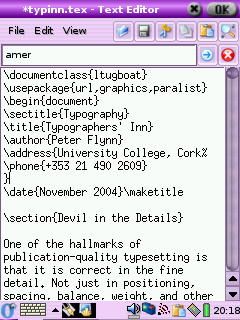
- Create a sample document
Open your editor and type in
the text exactly as shown in Figure 2.1. Do not make any
changes or miss anything out or add anything different at
this stage.
- Save the document
Save the document as
demo.tex
- Run LATEX or pdfLATEX
Click on the LATEX or
pdfLATEX toolbar icon or the
→ menu item; or type latex
demo or pdflatex demo in a
command window.
- Preview the typesetting
Click on the DVI or
PDFview toolbar icon or the
→ menu item; or type your previewer
command in a terminal shell.
(Note that there may be a pause the first time you use
your DVI viewer, while WYSIWYG font files are
created.2)
- Print it
Click on the Print toolbar icon
within the viewer, or use the
→
menu item, or type
dvips -f demo | lpr
(Unix/Linux).
If you encounter any errors, it means you
do need to study this chapter after
all!
All the text of your documents can be typed into your
LATEX document from a standard keyboard using any decent
plain-text editor. However, it is more convenient to use an
editor with special features to make using LATEX easier.
Some of the most popular are
TEXshellWinShell, TEXnic
Center, and WinEdt
(Windows only); and LYX and
Emacs (all platforms).
2.3.1 LYX
The LYX document editor (all platforms) is a special
case, as it uses the What You See Is
What You Mean (WYSIWYM) model of synchronous typographic
editing as opposed to What You See Is
What You Get (WYSIWYG), and many users prefer this
interface (but see the reservations in the item ‘Synchronous typographic displays’ in section 3).
LYX makes a strong case for using synchronous
typographical editing: it is possible to create even quite
large and complex documents without seeing a backslash very
often, although with math or complex macros there is
probably no way to avoid having to do some manual insertion
of
LATEX code.
The free availability on multiple platforms makes this a
clear answer to the myth of ‘having to edit like a
programmer’, and as it is an Open Source project,
there is constant improvement, both to the facilities and to
the interface.
Probably the only real reservation is that it does not
save native LATEX files by default. It uses its own
internal format, and it can export LATEX for use in other
editors, but the exported files are not designed for human
legibility, only for LATEX processing. In a co-operative
environment this would be a serious drawback, but for the
individual user this interface is an excellent tool.
This is one of the simplest of all the plaintext Windows
editors, but it has most of the tools needed to begin with.
Sectioning, lists, and graphics can be inserted from the
menus, and there are buttons for running LATEX on the
open document and for previewing the typeset
document.
The syntactic highlighting distinguishes between
commands and your text, and it comes with options for
spellchecking (you need to install
ispell), and for adding math,
Greek (math), and some symbol characters from a pickchart.
The typeset display is done using your installed DVI viewer (there is no provision for
PDF, although as it is
configurable, that could probably be edited into the
menus).
Download the .tar.gz file from CTAN in the
support/TeXshell/ directory and unwrap
it into somewhere like C:\Program
Files\TeXshell\.3 There is a tsconfig
program in the same directory on CTAN, which is designed to help with
reconfiguring TEXshell.
This is another free Windows editor for beginners with
LATEX. Despite its simplicity, it is capable of a
considerable amount of document management and assistance
with editing. As well as handling stand-alone LATEX
files, you can create a ‘Project’ for larger
documents, which helps you keep track of additional files
like separate chapters, illustrations, diagrams, indexes,
etc.
You run LATEX direct from the toolbar icons or with
F-key shortcuts. Both standard LATEX and
pdfLATEX are supported, as well
as creation and previewing of
PostScript and PDF output. There are additional toolbars
for math characters, and there is a ‘Table
Wizard’ for handling tables. The syntax
highlighting distinguishes between commands (in blue) and
delimiters (in red), leaving your text in black.
Download the
WinShellnn.exe
program (self-contained setup: the
nn changes with the version) from
CTAN in the
systems/win32/winshell/ directory and
double-click it to start the setup.
TEXnicCenter is a powerful
Windows editor suitable both for the beginner and the more advanced
user. Its ‘Project’ environment keeps track of
multiple files, and the processing function (the bit which
actually runs LATEX, here called
‘Build’) tries to ensure that all the files you
need for a large or complex document are in place before you
start typesetting, to avoid errors like missing
illustrations.
It's a much more wordprocessor-like control
interface, with configurable toolbars and button-controls
for lists, math, tables, and previewing options.
Download the
TXCSetupxxx.exe
program (self-contained setup: the
xxx bit changes with the version)
from CTAN in the
systems/win32/TeXnicCenter/ directory
and double-click it to start the setup.
WinEdt is a highly
configurable plain-text editor for Windows. It comes with a
host of special functions and shortcuts for
TEX and LATEX, based on the MikTEX distribution. It
is supplied on the TEX Collection 2004 DVD and the
proTEXt CD. You can also
download it from http://www.winedt.com — in either case
there's a 1-month free trial, then it reminds you to
buy it.
WinEdt uses a built-in
toolbar of configurable buttons, preset for use with
LATEX, and it provides syntactic coloring of
LATEX commands. Both the positioning and effect of the
buttons can be changed, using an editable file of icons and
a configuration panel. This flexibility lets you bind a
program and arguments (equivalent to a typed command) to a
particular icon.
There are default buttons on the toolbar for one-click
typesetting, previewing, and
PostScript or PDF generation from LATEX documents,
and it manages multi-file document projects like most of the
other editors. Winedt is also
used by many people for normal plaintext file-editing tasks,
in preference to more limited programs like
Notepad. If you're using the
fpTEX which came with the 2003 TEX
Collection, some editing of the menus is required (explained
in the local installation document) because the default
setup is for
MikTEX/proTEXt.
2.3.6 GNU Emacs
Emacs is a product of the
GNU Project.4 Versions are available for all makes and models
of computer, and it has a LATEX-mode which provides
syntactic colouring (‘fontification’
in Emacs-speak) and mouseclick
processing from a menu or toolbar.
Emacs
is a very large and powerful editor, with
‘modes’ (plug-ins) to handle almost
everything you do on a computer. Many users run
Emacs once on logging in, and
never leave it for the rest of the day — or month. As
well as edit, you can use it to read your mail, browse the
Web, read Usenet news, do wordprocessing and spreadsheets,
compile programs, help you write in any computer
language — including XML and
LATEX — and it provides a few games as well.
Emacs
knows about LATEX and how to process it, so it comes with
a menu full of LATEX operations to click on. If you are
editing complex documents with mathematics, there is a mode
(AUCTEX) which has even more
functionality. LATEX support is well-developed, and there
is a hierarchy of newsgroups for
Emacs support.
Because Emacs runs on
Microsoft Windows, Macs, Linux, and most other platforms,
many LATEX users who have multiple machines (and those
who have multiple users to support) prefer it to other
editors because it provides the same environment regardless
of which platform they are using.
It's sometimes criticised for a steep learning
curve, but in fact it's no worse in this respect than
any other editor, given the power that it provides, and it
is significantly better than most which lack many of the
authorial tools available in Emacs.
2.3.7 Mac editors
Mac users will be disappointed that I haven't included
any of the Mac interfaces here. It's simple: I don't have a
Mac right now to try them out on. I hope to remedy this for a
future edition.
LATEX commands all begin with a
backslash
(\)5 and are usually made up of lowercase
letters only, for example:
\tableofcontents
The
\tableofcontents command is an instruction
to LATEX to insert the Table of Contents at this point. You
would usually use this in a book or report (or perhaps a very
long article) somewhere close to the beginning. You don't have
to do anything else. Provided that you have used the
sectioning commands described in section 3.5,
all the formatting and numbering for the Table of Contents is
completely automated.
Simple one-word commands like
\tableofcontents must be separated from
any following text with white-space. This means a
normal space, or a newline [linebreak] or a TAB character.
For example either of these two forms will work:
\tableofcontents Thanks to Aunt Mabel for all her help
with this book.
\tableofcontents
Thanks to Aunt Mabel for all her help with this book.
If you forget the white-space, as in the following
example, LATEX will try to read it as a command
called \tableofcontentsThanks. There's no
such command, of course, so LATEX will complain at you by
displaying an error message (see section 4.2.3.2).
\tableofcontentsThanks to Aunt Mabel for all her help
with this book.
LATEX swallows any white-space which follows a command
ending in a letter. It does this automatically, so you
don't get unwanted extra space in your typeset output,
but it does mean that any simple command which ends in a
letter and has no arguments (see below) must be followed by
white-space before normal text starts again, simply to keep
it separate from the text.
Many LATEX commands are followed by one or more
arguments, a term from
the field of Computer Science, meaning information to be acted
upon. Here are two examples:
\chapter{Poetic Form}
\label{pform}
Such arguments always go in
{curly
braces} like
those shown above. Be careful not to confuse the
curly braces on your keyboard with round parentheses
( ), square brackets
[ ], or angle brackets
< >. They are all
different and they do different things.
With commands that take arguments you do
not need to use extra white-space after
the command, because there is an argument following it
which will keep it separate from any normal text with
follows after that. The following is therefore perfectly
correct (although unusual because it's harder to edit:
normally you'd leave a blank line between the chapter title or
label and the start of the first paragraph).
\chapter{Poetic Form}\label{pform}The shape of poetry
when written or printed distinguishes it from prose.
In LATEX documents, all multiple
spaces, newlines (linebreaks), and TAB characters are
treated as if they were a single space
or newline during typesetting. LATEX does its own spacing
and alignment using the instructions you give it, so you
have extremely precise control. You are therefore free to
use extra white-space in your editor for optical ease and
convenience when editing.
The following is therefore exactly equivalent to the example
in the preceding section:
\chapter        {Poetic
          Form}\label
            {pform}

The shape of poetry when written or printed
distinguishes it from prose.
That is, it will get typeset exactly the same. In
general, just leave a blank line between paragraphs and a
single space between words and sentences. LATEX will take
care of the formatting.
There are ten keyboard characters which have special
meaning to LATEX, and cannot be used on their own except for
the following purposes:
| \ |
The command character |
\textbackslash |
\ |
| $ |
Math typesetting delimiter |
\$ |
$ |
| % |
The comment character |
\% |
% |
| ^ |
Math superscript character |
\^ |
^ |
| & |
Tabular column separator |
\& |
& |
| _ |
Math subscript character |
\_ |
_ |
| ˜ |
Non-breaking space |
\˜ |
˜ |
| # |
Macro parameter symbol |
\# |
# |
| { |
Argument start delimiter |
$\{$ |
{ |
| } |
Argument end delimiter |
$\}$ |
} |
These characters were deliberately chosen, either because
they are rare in normal text, or (in the case of $,
#, &, and %) they already had an
established special meaning on computers as metacharacters (characters
standing as symbols for something else) by the time TEX was
written, and it would have been misleading to choose
others.
2.5.1 Using the special characters
We have already seen (the first paragraph in section 2.4) how
to use the backslash to start a command, and curly braces to
delimit an argument. The remaining special
characters are:
- $
-
Because of the special mathematical meaning
LATEX uses for the dollar-sign on its own, if you
want to print $35.99 you type
\$35.99
- %
-
The comment character makes
LATEX ignore the remainder of the line in your
document, so you can see it in your editor, but it
will never get typeset. For example
Today's price per kilo is £22.70 % get Mike to update this
If you want to print 45% you need
to type 45\%
- ^
-
The caret sign lets you type
\(E=mc^2\) to get E=mc2. If you need the circumflex accent
on a letter like ê, just type the letter or use the
symbolic notation \^e.
- &
-
The ampersand is used in tables to separate
columns (see section 6.3). If you want to
print AT&T you need to type
AT\&T.
- _
-
The underscore lets you type
\(r_2\) for r2. If you want to underline text
(extremely rare in typesetting) see the last paragraph in section 8.2.3.
- ˜
-
The tilde prints as a space, but prevents a
linebreak ever occurring at that point. It's often
used between a person's initials and their surname, eg
Prof D.E.~Knuth
- #
-
If you want a
hash mark (the
octothorpe or
American number or ‘pound’ [weight] sign)
you type \#. For a pound
(sterling)
sign £, now nearly obsolete except in the UK and
some of its former dependencies, use your
£ key or type
\textsterling.
While we're on the subject of money, an unusual but
interesting serif-font Euro sign €
is got with the \texteuro command from the
textcomp package. The standard
sans-serif € needs the
marvosym package and is done with
the \EUR command.6
Do not use the unidirectional
typewriter keyboard " key for quotation
marks. Correct typographic quotes are got with the ` key and the ' key, doubled if you want double
quotes:
He said, ``I'm just going out.''
He said,
‘‘I'm just going out.’’
This ensures you get real left-hand
and right-hand (opening and closing) quotes (usually shaped
like tiny
66 and 99
or as symmetrically-balanced strokes). If you are using
Emacs as your editor, the
" key is specially programmed in
LATEX-mode to think for itself and produce correct `` and
'' characters (so this is one occasion when
you can use the "
key).
If you are reading this in a
browser, or if you have reprocessed the file using different
fonts, it may not show you real quotes (some old browser
fonts are defective) and the \thinspace
below may be too wide. Download the typeset (PDF) version of this document to see the
real effect.
When typing one quotation inside another,
there is a special command \thinspace which
provides just enough separation between double and single
quotes (a normal space is too much and could allow an unwanted
linebreak):
He said, `Her answer was ``never''\thinspace'.
He said, ‘Her answer was
‘‘never’’ ’.
For accented letters in western
European languages7 or other Latin-alphabet character sets just use
the accented keys on your keyboard — if you have the right
ones. You must also tell LATEX what character repertoire
(‘input encoding’) you are using. You
specify this by using the inputenc
package8 in your preamble
with the relevant option. For example, to tell LATEX you
will be typing ISO Latin–1 accented characters,
use:
\usepackage[latin1]{inputenc}
If you have a real Unicode editor, which lets you insert
any letter or symbol from any language on the planet (for
example, mixed European, Asian, and other languages), use
utf8 instead of latin1.
The encoding definitions that are available on your system are
in /texmf/tex/latex/base (all files
ending in .def).
If you don't have accented letter keys on your
keyboard, you'll need to use your operating system's
standard keyboard Ctrl or
Alt key combinations to generate the
characters (see the panel ‘If you don't have accented letters’ in this section).
If you cannot generate accented characters from your
keyboard at all, or if you need additional accents or symbols
which are not in any of the keyboard tables, you can use the
symbolic notation in Table 2.1. In fact,
this can be used to put any accent over any letter: if you
particularly want a g˜ you can have one with the command
\˜g (and Welsh
users can get ŵ with
\^w).
If you use this symbolic method only, you do not need to
use the inputenc package. Before the
days of keyboards and screens with their own real accented
characters, the symbolic notation was the
only way to get accents, so you may come
across a lot of older documents (and users!) using this method
all the time: it does have the advantage in portability that
the LATEX file remains plain ASCII, which will work on all machines
everywhere, regardless of their internal encoding, and even
with very old TEX installations.9
Table 2.1. Built-in LATEX accents
| Acute (fada) |
é |
\'e |
| Grave |
è |
\`e |
| Circumflex |
ê |
\^e |
| Umlaut or diæresis |
ë |
\"e |
| Tilde |
ñ |
\~n |
| Macron |
ō |
\=o |
| Bar-under |
o |
\b o |
| Dot-over (séımhıú) |
 |
\.m |
| Dot-under |
 |
\d s |
| Breve |
ŭ |
\u u |
| Háček (caron) |
ŭ |
\v u |
| Long umlaut |
ő |
\H o |
| Tie-after |
 |
\t oo |
| Cedilla |
ç |
\c c |
| O-E ligature |
œ, Œ |
\oe,
\OE |
| A-E ligature |
æ, Æ |
\ae,
\AE |
| A-ring |
å, Å |
\aa,
\AA |
| O-slash |
ø, Ø |
\o,
\O |
| Soft-l |
ł, Ł |
\l,
\L |
| Ess-zet (scharfes-S) |
ß |
\ss |
Irish and Turkish dotless-ı is done with the
special command \i, so an í-fada
(which is normally typed with í)
requires \'\i if you need to type it in
the long format, followed by a backslash-space or dummy pair of
curly braces if it comes at the end of a word and there is no
punctuation, because of the rule that LATEX control
sequences which end in a letter (see the first paragraph in section 2.4.1) always absorb any following space. So
what you might see as Rí
Teamhraċ has to be R\'\i\
Tea\.mra\.c when typed in full (there are not
usually any keyboard keys for the dotless-ı or the
lenited characters). A similar rule applies to dotless-j and to uppercase
Í.
LATEX's internal measurement system is
extraordinarily accurate. The underlying TEX engine
conducts all its business in units smaller than the wavelength
of visible light, so if you ask for 15mm space, that's
what you'll get — within the limitations of your
screen or printer, of course. Most screens cannot show
dimensions of less than
1/96″ without resorting to magnification
or scaling; and on printers, even at 600dpi, fine oblique
lines or curves can still sometimes be seen to stagger the
dots.
At the same time, many dimensions in LATEX's
preprogrammed formatting are specially set up to be flexible:
so much space, plus or minus certain limits to allow the
system to make its own adjustments to accommodate variations
like overlong lines, unevenly-sized images, and non-uniform
spacing around headings.
TEX uses a very sophisticated
justification algorithm to achieve a smooth, even texture to
normal paragraph text. The programming for this has been
borrowed by a large number of other DTP systems, and users of
these are often quite unaware that they are in fact using a
significant part of TEX in their work.
Occasionally, however, you will need to hand-correct an
unusual word-break or line-break, and there are facilities for
doing this on individual occasions as well as throughout a
document.
Most people in printing and publishing habitually use
points and picas and ems. Some designers use cm and mm. Many
English-language speakers still use inches. You can specify
lengths in LATEX in any of these units, plus some others
(see Table 2.1).
Table 2.1. Units in LATEX
|
Printers' fixed measures |
| pt |
Anglo-American standard points (72.27 to the
inch)
|
| pc |
pica ems (12pt) |
| bp |
Adobe ‘big’ points (72
to the inch)
|
| sp |
TEX ‘scaled’ points
(65,536 to the pt)
|
| dd |
Didot (European standard) points (67.54 to the
inch)
|
| cc |
Ciceros (European pica ems, 12dd) |
|
Printers' relative measures |
| em |
ems of the current point size (historically the
width of a letter ‘M’ but see
below)
|
| ex |
x-height of the current font (height of letter
‘x’)
|
|
Other measures |
| cm |
centimeters (2.54 to the inch) |
| mm |
millimeters (25.4 to the inch) |
| in |
inches |
The em can cause beginners some puzzlement because
it's based on the ‘point size’
of the type, which is itself misleading. The point size
refers to the depth of the metal body on which foundry type
was cast in the days of metal typesetting,
not the printed height of the letters
themselves. Thus the letter-size of 10pt type in one face
can be radically different from 10pt type in another (look
at the table in section 8.2, where all the examples are
10pt). An em is the height of the type-body in a specific size,
so 1em of 10pt type is 10pt and 1em of 24pt type is
24pt.
Another name for a 1em space is a
‘quad’, and LATEX has a command
\quad for leaving exactly that much
horizontal space. A special name is given to the 12pt em, a
‘pica’ em, as it has become a fixed
measure in its own right.
If you are working with other DTP users, watch out for
those who think that Adobe points (bp) are the only ones.
The difference is only .27pt per inch, but in 10″ of
text (a full page of A4) that's 2.7pt, which is nearly
1mm, enough to be clearly visible if you're trying to
align one sample with another.
LATEX hyphenates automatically according to the
language you use (see section 2.8.6). To specify
different breakpoints for an individual word, you can insert
soft-hyphens (discretionary hyphens, done with
\-) wherever you need them, for
example:
When in Mexico, we visited Popoca\-tépetl by helicopter.
To specify hyphenation points for all occurrences of a
word, use the \hyphenation command in your
preamble (see the panel ‘The Preamble’ in section 3.4) with one or more
words in its argument, separated by spaces. This will even
let you break ‘helico-
pter’ correctly. In this command
you use normal hyphens, not soft-hyphens.
\hyphenation{helico-pter Popoca-tépetl
im-mer-sion}
If you have frequent hyphenation problems with long,
unusual, or technical words, ask an expert about changing
the value of \spaceskip,
which controls the flexibility of the space between words.
This is not something you would normally want to do, as it
can change the appearance of your document quite
significantly.
If you are using a lot of unbreakable text (see next
section and also section 6.6.1) it may also
cause justification problems. One possible solution to this
is shown in section 9.3.
2.8.3 Unbreakable text
To force LATEX to treat a word as unbreakable, use
the \mbox command:
\mbox{pneumonoultramicroscopicsilicovolcanoconiosis}.
This may have undesirable results, however, if
you change margins or the width of the text:
pneumonoultramicroscopicsilicovolcanoconiosis...
To tie two words together with an unbreakable
space (hard space), use a tilde (~)
instead of the space (see the item ‘˜’ in section 2.5.1). This
will print as a normal space but
LATEX will never break the line at that point. You should
make this standard typing practice for things like
people's initials followed by their surname, as in
Prof. D. E. Knuth:
Prof.\ D.~E.~Knuth.
Note that a full point after a lowercase letter is
treated as the end of a sentence, and creates more space
before the next word. Here, after
‘Prof.’, it's
not the end of a sentence, and the
backslash-space forces LATEX to insert just an ordinary
word-space because it's OK to break the line after
‘Prof.’, whereas it would look
wrong to have initials separated with Prof. D.
E. Knuth broken over a line-end.
2.8.4 Dashes
For a long dash — what printers call an
‘em rule’ like this — use three
hyphens typed together, like~--- this,
and bind them to the preceding word with a tilde to avoid
the line being broken before the dash. It's also common
to see the dash printed without spaces—like that: the
difference is purely æsthetic. Never
use a single hyphen for this purpose.
Between digits like page ranges (35–47), it is
normal to use the short dash (what printers call an en-rule)
which you get by typing two hyphens together, as in
35--47. If you want a minus sign, use math
mode (section 2.9).
2.8.5 Justification
The default mode for typesetting is justified (two
parallel margins, with word-spacing adjusted automatically
for the best optical fit). In justifying, LATEX will never
add space between letters, only between words. There is a
special package called so
(‘space-out’) if you need special
effects like letter-spacing, but these are best left to the
expert.
There are two commands
\raggedright and
\raggedleft which set ragged-right (ranged
left) and ragged-left (ranged right). Use them inside a
group (see the panel ‘Grouping’ in section 8.2.2) to confine their
action to a part of your text.
These modes also exist as
‘environments’ (see the last paragraph in section 3.2) called
raggedright and
raggedleft which are more convenient
when applying this formatting to a whole paragraph or more,
like this one.
\begin{raggedleft}
These modes also exist as environments called raggedright
and raggedleft which is more convenient when applying this
formatting to a whole paragraph or more, like this one.
\end{raggedleft}
Ragged setting turns off hyphenation. There is a package
ragged2e which retains hyphenation
in ragged setting, useful when you have a lot of long
words.
LATEX can typeset in the native manner for several
dozen languages. This affects hyphenation, word-spacing,
indentation, and the names of the parts of documents used as
headings (e.g. Table of Contents).
Most distributions of LATEX come with US English and
one or more other languages installed by default, but it is
easy to add the babel package and
specify any of the supported languages or variants, for
example:
\usepackage[frenchb]{babel}
...
\selectlanguage{frenchb}
Changing the language with
babel automatically changes the
names of the structural units and identifiers like
‘Abstract’,
‘Index’, etc. to their
translated version. For example, using French as above,
chapters will start with
‘Chapitre’.10
As explained in the text in the Preface, TEX was
originally written to automate the typesetting of books
containing mathematics. The careful reader will already have
noticed that mathematics is handled differently from normal
text, which is why it has to be typeset specially. This
document does not cover mathematical typesetting, which is
explained in detail in many other books and Web pages, so all
we will cover here is the existence of the math mode commands,
and some characters which have special meaning, so they
don't trip you up elsewhere.
In addition to the 10 special characters listed in section 2.5, there are three more characters which
only have any meaning inside mathematics mode:
| | |
Vertical bar |
| < |
Less-than |
| > |
Greater-than |
If you type any of these in normal text (ie outside math
mode), you will get very weird things happening and lots of
error messages. If you need to print these characters, you
must type them using math mode, or use
their symbolic names from the textcomp
package (\textbrokenbar,
\textlangle, and
\textrangle).
The hyphen also has an extra meaning in math mode: it
typesets as a minus sign, so if you want to write about
negative numbers you need to type the number in math mode so
the minus sign and the spacing come out right.
To use math mode within a paragraph, enclose your math
expression in \( and \)
commands. You can get the much-quoted equation
E=mc2 by typing
\(E=mc^2\), and to get a temperature like
−30° you need to type
\(-30\)°.11
To typeset a math expression as ‘displayed
math’ (centered between paragraphs), enclose it
in the commands \[ and
\].12
\[\bar n^*_j(s)=\frac{\left\{s\sum_{i=1}^k
n_i(0)p^*{i,k+1}(s)+M^*(s)\right\}\sum_{i=1}^k
p_{0i}p^*{ij}(s)}{1-s\sum_{i=1}^kp_{0i}p^*_{i,
k+1}(s)}+\sum_{i=1}^kn_i(0)p^*_{ij}(s)[j=
1,2,\dots,k].\]
Displayed equations can be auto-numbered with the
equation environment instead of the
\[ and \] commands.
LATEX's approach to formatting is to aim for
consistency. This means that as long as you identify each
element of your document
correctly, it will be typeset in the same way as all the other
elements like it, so that you achieve a consistent finish with
minimum effort. Consistency helps make documents easier to read
and understand.
Elements are the component parts of a document, all the
pieces which make up the whole. Almost everyone who reads books,
newspapers, magazines, reports, articles, and other classes of
documents will be familiar with the popular structure of
chapters, sections, subsections, subsubsections, paragraphs,
lists, tables, figures, and so on, even if they don't
consciously think about it.
Consistency is also what publishers look for. They have a
house style, and often a reputation to keep, so they rightly
insist that if you do something a certain way once, you should
do it the same way each time.
To help achieve this consistency, every LATEX document
starts by declaring what document
class it belongs to.
To tell LATEX what class of document you are going to
create, you type a special first line into your file which
identifies it.1 To start a report, for
example, you would type the \documentclass
command like this as your first line:
\documentclass{report}
There are four built-in classes provided, and many others
that you can download (some may already be installed for
you):
- report
-
for business, technical, legal, academic, or
scientific reports;
- article
-
for white papers, magazine or journal articles,
reviews, conference papers, or research notes;
- book
-
for books and theses;
- letter
-
for letters.2
The article class in particular
can be used (some would say ‘abused’) for almost
any short piece of typesetting by simply omitting the titling
and layout (see below).
The built-in classes are intended as starting-points,
especially for drafts and for compatibility when exchanging
documents with other LATEX users, as they come with every
copy of LATEX and are therefore guaranteed to format
identically everywhere. They are not intended as final-format
publication-quality layouts. For most other
purposes, especially for publication, you use
add-in packages to extend
these classes to do what you need:
-
The memoir and
komascript packages contain
more sophisticated replacements for all the built-in
classes;
-
Many academic and scientific publishers provide their
own special class files for articles and books (often on
their Web sites for download);
-
Conference organisers may also provide class files for
authors to write papers for presentation;
-
Many universities provide their own thesis document
class files in order to ensure exact fulfillment of their
formatting requirements;
-
Businesses and other organizations can provide their
users with corporate classes on a central server and
configure LATEX installations to look there first for
packages, fonts, etc.
Books and journals are not usually printed on office-size
paper. Although LATEX's layouts are designed to fit on
standard A4 or Letter stationery for draft purposes, it makes
them look odd: the margins are too wide, or the positioning is
unusual, or the font size is too small, because the finished
job will normally be trimmed to a different size
entirely — try trimming the margins of the PDF version of this book to 185mm by 235mm
(the same as The LATEX Companion series)
and you'll be amazed at how it changes the appearance!
The default layouts are designed to fit as drafts on US
Letter size paper.3 To create documents with the correct proportions
for standard A4 paper, you need to specify the paper size in
an optional argument in square brackets before the document
class name, e.g.
\documentclass[a4paper]{report}
The two most common options are a4paper
and letterpaper. However, many European
distributions of TEX now come preset for A4, not Letter, and
this is also true of all distributions of
pdfLATEX.
The other default settings are for: a) 10pt type (all document classes); b) two-sided printing (books and reports) or
one-sided (articles and letters); and c) separate title page (books and reports
only). These can be modified with the following
document class options which you can add in the same set of
square brackets, separated by commas:
- 11pt
-
to specify 11pt type (headings, footnotes,
etc. get scaled up or down in
proportion);
- 12pt
-
to specify 12pt type (again, headings
scale);
- oneside
-
to format one-sided printing for books and
reports;
- twoside
-
to format articles for two-sided printing;
- titlepage
-
to force articles to have a separate title
page;
- draft
-
makes LATEX indicate hyphenation and
justification problems with a small square in the
right-hand margin of the problem line so they can be
located quickly by a human.
If you were using pdfLATEX for a report to be in 12pt
type on Letter paper, but printed one-sided in draft mode, you
would use:
\documentclass[12pt,letterpaper,oneside,draft]{report}
There are extra preset options for other type sizes
which can be downloaded separately, but 10pt, 11pt, and 12pt
between them cover probably 99% of all document
typesetting. In addition there are the hundreds of add-in
packages which can automate other layout and formatting
variants without you having to program anything by hand or
even change your text.
 Exercise 1. Create a new document
-
Use your editor to create a new document.
-
Type in a Document Class Declaration as shown
above.
-
Add a font size option if you wish.
-
In North America, omit the
a4paper option or change it to
letterpaper.
-
Save the file (make up a name) ensuring the name
ends with .tex
After the Document Class Declaration, the text of your
document is enclosed between two commands which identify the
beginning and end of the actual document:
\documentclass[11pt,a4paper,oneside]{report}

\begin{document}
...
\end{document}
(You would put your text where the dots are.) The reason
for marking off the beginning of your text is that LATEX
allows you to insert extra setup specifications before it
(where the blank line is in the example above: we'll be
using this soon). The reason for marking off the end of your
text is to provide a place for LATEX to be programmed to do
extra stuff automatically at the end of the document, like
making an index.
A useful side-effect of marking the end of the document
text is that you can store comments or temporary text
underneath the \end{document} in the
knowledge that LATEX will never try to typeset them.
...
\end{document}
Don't forget to get the extra chapter from Jim!
This
\begin ...\end
pair of commands is an example of a common LATEX structure called an
environment.
Environments enclose text which is to be handled in a particular
way. All environments start with
\begin{...} and end with
\end{...} (putting the name of the
environment in the curly braces).
Exercise 2. Adding the document environment
-
Add the document environment to
your file.
-
Leave a blank line between the Document Class
Declaration and the \begin{document}
(you'll see why later).
-
Save the file.
The first thing you put in the
document environment is almost always the
document title, the author's name, and the date (except
in letters, which have a special set of commands for
addressing which we'll look at later). The title, author,
and date are all examples of metadata or metainformation (information
about information).
\documentclass[11pt,a4paper,oneside]{report}

\begin{document}

\title{Practical Typesetting}
\author{Peter Flynn\\Silmaril Consultants}
\date{December 2004}
\maketitle

\end{document}
The \title, \author,
and \date commands are
self-explanatory. You put the title, author name, and date in
curly braces after the relevant command. The title and author
are usually compulsory; if you omit the
\date command, LATEX uses today's
date by default.
You always finish the metadata with the
\maketitle command, which tells
LATEX that it's complete and it can typeset the titling
information at this point. If you omit
\maketitle, the titling will never be
typeset. This command is reprogrammable so you can alter the
appearance of titles (like I did for the printed version of
this document).
The double backslash (\\) is the
LATEX command for forced linebreak. LATEX normally decides by
itself where to break lines, and it's usually right, but
sometimes you need to cut a line short, like here, and start a
new one. I could have left it out and just used a comma, so my
name and my company would all appear on the one line, but I
just decided that I wanted my company name on a separate line.
In some publishers' document classes, they provide a special
\affiliation command to put your company
or institution name in instead.
When this file is typeset, you get something like this
(I've cheated and done it in
colour for fun — yours will be in black and white
for the moment):
Exercise 3. Adding the metadata
-
Add the \title,
\author, \date, and
\maketitle commands to your
file.
-
Use your own name, make up a title, and give a
date.
The order of the first three commands is not important,
but the \maketitle command must come
last.
The document isn't really ready for printing like this,
but if you're really impatient, look at Chapter 4 to see how to typeset and display
it.
In reports and articles it is normal for the author
to provide an Summary or Abstract, in which you describe
briefly what you have written about and explain its
importance. Abstracts in articles are usually only a few
paragraphs long. Summaries in reports can run to several
pages, depending on the length and complexity of the report
and the readership it's aimed at.
In both cases (reports and articles) the Abstract or
Summary is optional (that is, LATEX doesn't force you
to have one), but it's rare to omit it because readers want
and expect it. In practice, of course, you go back and type
the Abstract or Summary after having
written the rest of the document, but for the sake of the
example we'll jump the gun and type it now.
\documentclass[11pt,a4paper,oneside]{report}
\usepackage[latin1]{inputenc}
\renewcommand{\abstractname}{Summary}
\begin{document}

\title{Practical Typesetting}
\author{Peter Flynn\\Silmaril Consultants}
\date{December 2004}
\maketitle

\begin{abstract}
This document presents the basic concepts of
typesetting in a form usable by non-specialists. It
is aimed at those who find themselves (willingly or
unwillingly) asked to undertake work previously sent
out to a professional printer, and who are concerned
that the quality of work (and thus their corporate
æsthetic) does not suffer unduly.
\end{abstract}

\end{document}
After the \maketitle you use the
abstract environment, in which you simply
type your Abstract or Summary, leaving a blank line between
paragraphs if there's more than one (see section 3.6 for this convention).
In business and technical documents, the Abstract is often
called a Management Summary, or Executive Summary, or Business
Preview, or some similar phrase. LATEX lets you change the
name associated with the abstract
environment to any kind of title you want, using the
\renewcommand command to give the command
\abstractname a new value:
\renewcommand{\abstractname}{Executive Summary}
Exercise 4. Using an Abstract or Summary
-
Add the \renewcommand as shown
above to your Preamble.
The Preamble is at the start of the document, in
that gap after the
\documentclass line but
before the
\begin{document} (remember I said
we'd see what we left it blank for: see the panel ‘The Preamble’ in section 3.4).
-
Add an abstract environment
after the \maketitle and type in a
paragraph or two of text.
-
Save the file (no, I'm not paranoid, just
careful).
Notice how the name of the command you are renewing (here,
\abstractname) goes in the first set of
curly braces, and the new value you want it to have goes in
the second set of curly braces (this is an example of a
command with two arguments). The environment you use is still
called abstract (that is, you still type
\begin{abstract}...\end{abstract}).
What the \abstractname does is change the
name that gets displayed and printed, not the name of the
environment you store the text in.
If you look carefully at the example document, you'll
see I sneakily added an extra command to the Preamble.
We'll see later what this means (Brownie points for
guessing it, though, if you read section 2.7).
In the body of your document, LATEX provides seven
levels of division or sectioning for you to use in structuring
your text. They are all optional: it is perfectly possible to
write a document consisting solely of paragraphs of
unstructured text. But even novels are normally divided into
chapters, although short stories are often made up solely of
paragraphs.
Chapters are only
available in the book and
report document classes, because they
don't have any meaning in articles and letters. Parts are
also undefined in letters.4
In each case the title of the part, chapter, section,
etc. goes in curly braces after the command. LATEX
automatically calculates the correct numbering and prints the
title in bold. You can turn section numbering off at a
specific depth: details in section 3.5.1.
\section{New recruitment policies}
...
\subsection{Effect on staff turnover}
...
\chapter{Business plan 2005--2007}
There are packages5 to let you control the typeface, style, spacing,
and appearance of section headings: it's much easier to
use them than to try and reprogram the headings manually. Two
of the most popular are the ssection
and sectsty packages.
Headings also get put automatically into the Table of
Contents, if you specify one (it's optional). But if you
make manual styling changes to your heading, for example a
very long title, or some special line-breaks or unusual
font-play, this would appear in the Table of Contents as well,
which you almost certainly don't
want. LATEX allows you to give an optional extra version of
the heading text which only gets used in the Table of Contents
and any running heads, if they are in effect . This optional alternative
heading goes in [square brackets] before the curly
braces:
\section[Effect on staff turnover]{An analysis of the
effect of the revised recruitment policies on staff
turnover at divisional headquarters}
Exercise 5. Start your document text
-
Add a \chapter command after your
Abstract or Summary, giving the title of your first
chapter.
-
If you're planning ahead, add a few more
\chapter commands for
subsequent chapters. Leave a few blank lines between
them to make it easier to add paragraphs of text
later.
-
By now I shouldn't need to tell you what to do
after making significant changes to your document
file.
All document divisions get numbered automatically. Parts
get Roman numerals (Part I, Part II, etc.);
chapters and sections get decimal numbering like this
document, and Appendixes (which are just a special case of
chapters, and share the same structure) are lettered (A, B,
C, etc.).
You can change the depth to which section numbering
occurs, so you can turn it off selectively. In this document
it is set
to 3.
If you only want parts, chapters, and sections numbered, not
subsections or subsubsections etc., you can change the
value of the secnumdepth
counter using the the \setcounter command,
giving the depth value from the table in section 3.5:
\setcounter{secnumdepth}{1}
A related counter is tocdepth, which specifies what
depth to take the Table of Contents to. It can be reset in
exactly the same way as secnumdepth. The current setting
for this document is 2.
\setcounter{tocdepth}{3}
To get an unnumbered section
heading which does not go into the
Table of Contents, follow the command name with an asterisk
before the opening curly brace:
\subsection*{Shopping List}
All the divisional commands from
\part* to \subparagraph*
have this ‘starred’ version which can
be used on special occasions for an unnumbered heading when
the setting of secnumdepth
would normally mean it would be numbered.
After section headings comes your text. Just type it and
leave a blank line between paragraphs. That's all
LATEX needs.
The blank line means ‘start a new paragraph
here’: it does not (repeat:
not) mean you get a blank
line in the typeset output. Now read this paragraph
again and again until that sinks in.
The spacing between paragraphs is a separately definable
quantity, a dimension or
length called \parskip. This is normally zero
(no space between paragraphs, because that's how books
are normally typeset), but you can easily set it to any size
you want with the \setlength command in the
Preamble:
\setlength{\parskip}{1cm}
This will set the space between paragraphs
to 1cm. See section 2.8.1 for details of the
various size units LATEX can use. Leaving
multiple blank lines between paragraphs in your source
document achieves nothing: all extra blank lines
get ignored by LATEX because the space between paragraphs
is
controlled only by the value of \parskip.
White-space in LATEX can also be made flexible (what
Lamport calls
‘rubber’ lengths). This means that
values such as \parskip can
have a default dimension plus an amount of expansion minus an
amount of contraction. This is useful on pages in complex
documents where not every page may be an exact number of
fixed-height lines long, so some give-and-take in vertical
space is useful. You specify this in a
\setlength command like this:
\setlength{\parskip}{1cm plus4mm minus3mm}
Paragraph indentation can also be set with the
\setlength command, although you would
always make it a fixed size, never a flexible one, otherwise
you would have very ragged-looking paragraphs.
\setlength{\parindent}{6mm}
By default, the first paragraph after a heading follows
the standard Anglo-American publishers' practice of
no indentation. Subsequent paragraphs are
indented by the value of \parindent (default
18pt).6 You can change this in the same way as any other
length.
In the printed copy of this document, the paragraph
indentation is set to 12pt and the space
between paragraphs is set to 0pt. These values do not
apply in the Web (HTML) version because not all browsers are
capable of that fine a level of control, and because users can
apply their own stylesheets regardless of what this document
proposes.
Exercise 6. Start typing!
-
Type some paragraphs of text. Leave a blank line
between each. Don't bother about line-wrapping or
formatting — LATEX will take care of all
that.
-
If you're feeling adventurous, add a
\section command with the title of a
section within your first chapter, and continue typing
paragraphs of text below that.
-
Add one or more \setlength
commands to your Preamble if you want to experiment with
changing paragraph spacing and indentation.
To turn off indentation completely, set it to zero (but
you still have to provide units: it's still a
measure!).
\setlength{\parindent}{0in}
If you do this, though, and leave \parskip set to zero, your readers
won't be able to tell easily where each paragraph begins!
If you want to use the style of having no indentation with a
space between paragraphs, use the
parskip package, which does it for
you (and makes adjustments to the spacing of lists and other
structures which use paragraph spacing, so they don't get
too far apart).
All auto-numbered headings get entered in the Table of
Contents (ToC) automatically. You don't have to print a
ToC, but if you want to, just add the command
\tableofcontents at the point where you want
it printed (usually after the Abstract or Summary).
Entries for the ToC are recorded each time you process
your document, and reproduced the next
time you process it, so you need to re-run LATEX one extra
time to ensure that all ToC page-number references
are correctly calculated.
We've already seen in section 3.5 how
to use the optional argument to the sectioning commands to add
text to the ToC which is slightly different from the one
printed in the body of the document. It is also possible to
add extra lines to the ToC, to force extra or unnumbered
section headings to be included.
Exercise 7. Inserting the table of contents
-
Go back and add a \tableofcontents
command after the \end{abstract} command
in your document.
-
You guessed.
The commands \listoffigures
and \listoftables work in exactly the same
way as \tableofcontents to automatically
list all your tables and figures. If you use them, they
normally go after the \tableofcontents
command.
The \tableofcontents command normally
shows only numbered section headings, and only down to the
level defined by the tocdepth counter (see section 3.5.1), but you can add extra entries with the
\addcontentsline command. For example if you
use an unnumbered section heading command to start a
preliminary piece of text like a Foreword or Preface, you can
write:
\subsection*{Preface}
\addcontentsline{toc}{subsection}{Preface}
This will format an unnumbered ToC entry for
‘Preface’ in the
‘subsection’ style. You can use
the same mechanism to add lines to the List of Figures or List
of Tables by substituting lof or
lot for toc.
We've now got far enough to typeset what you've
entered. I'm assuming at this stage that you have typed
some sample text in the format specified in the previous
chapter, and you've saved it in a plain-text file with a
filetype of
.tex and a name of your own choosing.
Exercise 8. Saving your file
If you haven't already saved your file, do so now
(some editors and interfaces let you typeset the document
without saving it!).
Pick a sensible filename in a sensible directory. Names
should be short enough to display and search for, but
descriptive enough to make sense. See the panel ‘Picking suitable filenames’ in this chapter for more details.
Typesetting your document is usually done by clicking
on a button in a toolbar or an entry in a menu. Which one you
click on depends on what output you want — there are two
formats available:
-
The standard (default) LATEX program produces a
device-independent (DVI) file which
can be used with any TEX previewer or printer driver on any
make or model of computer. There are dozens of these
available: at least one of each (previewer and printer
driver) should have been installed with your distribution
of TEX.
-
The pdfLATEX program
produces an Adobe Acrobat PDF
file which can be used with any suitable previewer, such
as GSview,
PDFview,
Xpdf, the
Opera browser, or Adobe's
own Acrobat Reader.
Depending on which one you choose, you may have to
[re]configure your editor so that it runs the right program.
They can all do all of them, but they don't always come
pre-set with buttons or menus for every possible option,
because they can't guess which one you want.
4.1.1 Standard LATEX
There are also two ways of running LATEX: from the
toolbar or menu, or from the command line. Toolbars and
menus are most common in graphical systems, and are the
normal way to run LATEX. Command lines are used in
non-graphical systems and in automated processes where
LATEX is run
unattended (so-called ‘batch’ or
‘scripted’ processing).
Whichever way you run LATEX, it will process your
file and display a log or record of what it's doing
(see the example ‘Running LATEX in a terminal or console
window’ in section 4.1.2: it looks the
same no matter what system you use). This is to let you see
where (if!) there are any errors or problems.
Exercise 9. Running LATEX from the toolbar or menu
Run LATEX on your file. According to which system
you're using this will either be the
LATEX toolbar icon or the
→ menu item.
Your editor may suggest you save your file if you
haven't already done so. Do it.
If LATEX reports any errors — easily identifiable
as lines in the log beginning with an exclamation mark
(!) — don't panic! Turn to section 4.2, identify what went wrong, and fix it in
your input file. Then re-run LATEX. If there were no
errors, your file is ready for displaying or
printing.
This is worth practising even if you normally use a
GUI, so that you understand what it
does. See Figure 4.1 for an example.
Exercise 10. Running LATEX in a terminal or console
window
-
Under graphical Unix-based systems (Linux and Mac)
you open a command (shell) window by clicking on the
shell or screen icon in the control panel at the
bottom of your screen.
-
Under Microsoft Windows you open a command window
by clicking on the
→→
or
→ menu item.
When the command window appears, type
cd documents
latex mybook
Substitute the relevant directory and file name.
Remember to press the Enter key at the
end of each line.
4.1.3 pdfLATEX
If your editor is set up to generate PDF files direct instead of DVI files, then you can click the
pdfLATEX toolbar icon or type the
command pdflatex
filename in a terminal
(console) window. Emacs does not
have a default menu configured for
pdfLATEX but if you have
already run standard LATEX on the file, you can type ther
pdflatex command in the
*TeX-Shell* pane.
LATEX describes what it's typesetting while it does it,
and if it encounters something it doesn't understand or can't
do, it will display a message saying what's wrong. It may
also display warnings for less serious conditions.
Don't panic if you see error
messages: it's very common for beginners to
mistype or mis-spell commands, forget curly braces, type a
forward slash instead of a backslash, or use a special
character by mistake. Errors are easily spotted and easily
corrected in your editor, and you can then run LATEX again
to check you have fixed everything. Some of the most common
errors are described in section 4.2 with an
explanation of how to fix them.

The format of an error message is always the same. Error
messages begin with an exclamation mark at the start of the
line, and give a description of the error, followed by another
line starting with the number, which refers to the line-number
in your document file which LATEX was processing when the
error was spotted. Here's an example, showing that the user
mistyped the \tableofcontents
command:
! Undefined control sequence.
l.6 \tableofcotnetns
When LATEX finds an error like this, it displays the
error message and pauses. You must type one of the following
letters to continue:
| x |
Stop immediately and exit the program.
|
| q |
Carry on quietly as best you can and
don't bother me with any more error
messages.
|
| e |
Stop the program but re-position the text in my
editor at the point
where you found the error.a |
| h |
Try to give me more help.
|
| i |
(followed by a correction) means input the correction in
place of the error and carry on.b |
Some systems (Emacs is one
example) run LATEX with a
‘non-stop’ switch turned on, so it
will always process through to the end of the file,
regardless of errors, or until a limit is reached.
Warnings don't begin with an exclamation mark: they are
just comments by LATEX about things you might want to look
into, such as
overlong or underrun lines (often caused by unusual hyphenations, for
example), pages running short or long, and other typographical
niceties (most of which you can ignore until later).
Unlike other systems, which try to hide unevennesses in
the text — usually unsuccessfully — by interfering
with the letter-spacing, LATEX takes the view that the
author or editor should be able to contribute. While it is
certainly possible to set LATEX's parameters so that
the spacing is sufficiently sloppy that you will almost never
get a warning about badly-fitting lines or pages, you will
almost certainly just be delaying matters until you start to
get complaints from your readers or publishers.
4.2.3 Examples
Only a few common error messages are given here: those
most likely to be encountered by beginners. If you find
another error message not shown here, and it's not
clear what you should do, ask for help.
Most error messages are self-explanatory, but be aware
that the place where
LATEX spots and reports an error may be later in the file
than the place where it actually occurred. For example if
you forget to close a curly brace which encloses, say,
italics, LATEX won't report this until something else
occurs which can't happen until the curly brace is
encountered (eg the end of the document!) Some errors can
only be righted by humans who can read and understand what
the document is supposed to mean or look like.
Newcomers should remember to check the list of special
characters in : a very large
number of errors when you are learning LATEX are due to
accidentally typing a special character when you didn't
mean to. This disappears after a few days as you get used to
them.
! Too many }'s.
l.6 \date December 2004}
The reason LATEX thinks there are too many
}'s here is that the opening curly
brace is missing after the \date control
sequence and before the word December,
so the closing curly brace is seen as one too many (which
it is!).
In fact, there are other things which can follow the
\date command apart from a date in curly
braces, so LATEX cannot possibly guess that
you've missed out the opening curly brace — until
it finds a closing one!
! Undefined control sequence.
l.6 \dtae
         {December 2004}
In this example, LATEX is complaining that it has
no such command (‘control
sequence’) as \dtae.
Obviously it's been mistyped, but only a human can
detect that fact: all LATEX knows is
that \dtae is not a command it knows
about — it's undefined.
Mistypings are the commonest source of error. If your
editor has drop-down menus to insert common commands and
environments, use them!
Runaway argument?
{December 2004 \maketitle
! Paragraph ended before \date was complete.
<to be read again>
                   \par
l.8
In this error, the closing curly brace has been
omitted from the date. It's the opposite of the error in
section 4.2.3.1, and it results in
\maketitle trying to format the title
page while LATEX is still expecting more text for the
date! As
\maketitle creates new paragraphs on the
title page, this is detected and LATEX complains that
the
previous paragraph has ended but \date
is not yet finished.
Underfull \hbox (badness 1394) in paragraph
at lines 28--30
[][]\LY1/brm/b/n/10 Bull, RJ: \LY1/brm/m/n/10
Ac-count-ing in Busi-
[94]
This is a warning that LATEX cannot stretch the
line wide enough to fit, without making the spacing bigger
than its currently permitted maximum. The
badness (0–10,000) indicates
how severe this is (here you can probably ignore a badness
of 1394). It says what lines of your file it was
typesetting when it found this, and the number in square
brackets is the number of the page onto which the
offending line was printed.
The codes separated by slashes are the typeface and
font style and size used in the line. Ignore them for the
moment: details are in step 11 if you're
curious.
[101]
Overfull \hbox (9.11617pt too wide) in paragraph
at lines 860--861
[]\LY1/brm/m/n/10 Windows, \LY1/brm/m/it/10 see
\LY1/brm/m/n/10 X Win-
And the opposite warning: this line is too
long by a shade over 9pt. The chosen hyphenation point
which minimises the error is shown at the end of the line
(Win-). Line numbers and page numbers
are given as before. In this case, 9pt is too much to
ignore (over 3mm or more than 1/8″), and a manual correction needs
making (such as a change to the hyphenation), or the
flexibility settings need changing (outside the scope of
this book).
! LaTeX Error: File `paralisy.sty' not found.

Type X to quit or <RETURN> to proceed,
or enter new name. (Default extension: sty)

Enter file name:
When you use the \usepackage command
to request LATEX to use a certain package, it will look
for a file with the specified name and the filetype
.sty. In this case the user has
mistyped the name of the paralist
package, so it's easy to fix. However, if you get the name
right, but the package is not installed on your machine,
you will need to download and install it before continuing
(see Chapter 5).
Once the file has been processed without errors (or even
if there are still errors, but you want to see what it's
doing with them), standard LATEX will have created a
DVI file with the same name as your
document but the filetype
.dvi. If you're using
pdfLATEX, a PDF file will have been created, and you
can skip to
section 4.3.3.
To see the typeset output, click on the
dvi Preview toolbar icon or use the
→
menu item. A WYSIWYG preview window will appear with
your typeset display (see Figure 4.1).
The first time you display your DVI output with a new installation of
TEX, there may be a short pause if the previewer needs
to create the special bitmaps used for screen previews of
some fonts. These give greater accuracy on low-resolution
devices like screens. As you continue to work with
LATEX and your system accumulates these font files, the
pause for generating them will disappear. Recent versions
of TEX work directly with Type 1 fonts, however,
and don't have this delay.
Most previewers have a wide range of scaling, zooming,
and measuring functions, but remember this is a
picture of your output: you cannot edit
the image. To change it, you always edit your source text
and reprocess the file.
With xdvi and its derivatives
like dviview, you can leave the
display window open, and after you've reprocessed your
document through LATEX, moving your mouse back into the
window will make the display update automatically (click
your mouse if your windowing system needs a
click to focus).
Figure 4.1 shows
xdvi displaying a page. With a
standard three-button mouse you get three levels of
micro-zoom to let you inspect fine details.
PostScript is a page description
language invented by Adobe and used in laser printers and
high-end typesetters. It's been the universal standard
for electronically-formatted print files for nearly two
decades, and all printers and publishers are accustomed to
using it. PDF is a descendant of
PostScript, and is rapidly taking over, but
PostScript itself is still extremely
common, largely because it is very robust, and is usually an
ASCII file, which makes it very
portable and easy to generate (it is actually a programming
language in its own right). The drawback is the large size
of PostScript files, especially if
they contain bitmapped graphics.
The dvips program which comes
with all TEX systems is used to generate
PostScript files directly from your
DVI output. These
.ps files can be viewed, printed, sent
to a platemaker or filmsetter, or put online for
downloading.
DVI viewers cannot render some
PostScript graphical manipulations
like rotating and deforming, so an alternative to viewing
the DVI file direct is to generate a
PostScript file and use a
PostScript viewer. You may have to to
do this for your publisher anyway, and many editors can be
configured to do this by default. Look for a
dvips toolbar icon or menu entry and
click on it.
It's also very simple to do manually: let's
assume your LATEX file was called
mydoc.tex, so processing it has created
mydoc.dvi. Just type:
dvips -o mydoc.ps mydoc
in a command window (see the example ‘Running LATEX in a terminal or console
window’ in section 4.1.2 for how to use one)
and dvips will create
mydoc.ps which can be used both for
previewing and printing.
To view a PostScript file, you
need a PostScript previewer like
GSview, which works with the
PostScript interpreter
Ghostscript, which should have
been installed automatically along with your TEX system
(if not, install both now: GSview
is separately licensed and cannot legally be included in
some older TEX distributions, so you may have to download
it yourself).
GSview can be set to watch
the PostScript file and automatically
update the display any time the file is changed, without you
even having to click on the window.
The Portable Document Format (PDF)
is a derivative of PostScript.
Whereas PostScript is a programming
language in itself, PDF is in effect
the result of processing a document
through PostScript: it's a binary
file format, extremely compact, and well-supported on all
platforms.
If your system is configured to generate PDF files direct instead of DVI files, just open the
.pdf file using any PDF previewer or browser.
Most editors are configured to display a toolbar icon
which will pop up Acrobat Reader
or some other viewer with the current PDF output file.
Adobe's Acrobat Reader
cannot automatically update the view if you reprocess your
document, in the way that xdvi
and GSview can. You
have to close the display with Ctrl–W and reload the file with Alt–F 1.
Acrobat Reader is extremely poor at rendering
Type 3 (bitmap) fonts. If you are using these (either
in an old LATEX installation which has not been
upgraded to Type 1, or with files using specialist
fonts only available in Type 3 format), you will see
a very fuzzy display at low magnifications. It will print
perfectly, but Acrobat Reader's display is
disappointing. The solution is to use a better previewer
or to upgrade to the Type 1 versions of the fonts
if possible, or both. If you need to
use Type 3 fonts in PDFs,
you probably need to warn your readers to expect a fuzzy
display from Acrobat Reader (but good printout), and to
change to a better reader if they can.
TEX systems print on almost anything from the simplest
dot-matrix printers to the biggest phototypesetters, including
all the laser printers and a host of other devices in between.
How you do it varies slightly according
to how you do your typesetting and previewing:
- If you are using DVI
-
and you have a previewer which has a
print function configured for your
printer, you can use that. If not, create a
PostScript file and use
GSview instead.
- If you are using PDF
-
you can print directly from your PDF viewer. Be careful about using
the ‘Fit to page’ options, as they will
change the size of your document so all your
measurements will be different.
- Non-PostScript printers
-
You can create a PostScript
file with dvips (see section 4.3.2) and use
GSview to print it
(GSview can print
PostScript files to almost any
make or model of non-PostScript
printer).
- If you have a real PostScript
printer
-
or you are using a system with built-in
PostScript printing support (such
as Linux or Mac), you can create and send
PostScript output directly from
your editor to the printer without the need to open it
in a previewer first. In
Emacs, for example, this is
what happens when you use the
→ menu item.
Both the dvips program and all
the previewers that print tend to have facilities for printing
selected pages, printing in reverse, scaling the page size,
and printing only odd or even pages for two-sided
work. If you are using PostScript there
are programs for manipulating the output
(pstops), for example to perform
page imposition to get 4, 8, or 16 pages to a sheet for making
booklets (psnup).
Exercise 11. Print it!
Show that you have understood the process of
typesetting, previewing, and printing, by displaying your
document and printing it.
If you need a
non-PostScript/Ghostscript
solution, install a separate TEX print driver for your
printer. Some
may be supplied with your TEX installation, and there are
dozens more on CTAN. Their names all
start with dvi and are followed by an
abbreviation for the printer make or model like
dvieps for Epson,
dvihp for Hewlett-Packard,
dvialw for Apple LaserWriters,
etc.. Configure the driver to print directly to the print
queue, or pipe it to the print queue manually. On Linux with
an HP printer, for example, this would be
dvihp mydoc | lpr
Microsoft Windows has no easy way to bypass the print
spool, but you can do it from an MS-DOS command window
with (using a HP printer as an example):
dvihp mydoc -o mydoc.hp
copy /b mydoc.hp LPT1:
Read the documentation for the driver, as the options and
defaults vary.
The Comprehensive TEX Archive
Network (CTAN) is a repository of Web and FTP servers worldwide which contain copies of
almost every piece of free software related to TEX and
LATEX.
CTAN is based on three main
servers, and there are several online indexes available. There
are complete TEX and LATEX systems for all platforms,
utilities for text and graphics processing, conversion programs
into and out of LATEX, printer drivers, extra typefaces, and
(possibly the most important) the LATEX packages. The three
main servers are:
Add-on features for LATEX are known as packages. Dozens of these are
pre-installed with LATEX and can be used in your documents
immediately. They should all be stored in subdirectories of
texmf/tex/latex named after each package.
To find out what other packages are available and what they
do, you should use the CTAN search page which includes a
link to Graham Williams' comprehensive package
catalogue.
A package is a file or collection of files containing
extra LATEX commands and programming which add new styling
features or modify those already existing. Installed package
files all end with .sty (there may be
ancillary files as well).
When you try to typeset a document which requires a
package which is not installed on your system, LATEX will
warn you with an error message that it is missing (see section 4.2.3.6), and you can
then download the package and install it using the
instructions in section 5.2. You can also
download updates to packages you already have (both the ones
that were installed along with your version of LATEX as
well as ones you added).
There is no limit to the number of packages you can have
installed on your computer (apart from disk space!), but there
is probably a physical limit to the number that can be used
inside any one LATEX document at the same time, although it
depends on how big each package is. In practice there is no
problem in having even a couple of dozen packages active (the
style file for this document uses over 30).
To use a package already installed on your system,
insert a \usepackage command in your
document preamble with the package name in curly braces, as
we have already seen in earlier chapters. For example, to
use the color package, which lets
you typeset in colours (I warned you this was
coming!), you would type:
\documentclass[11pt,a4paper,oneside]{report}
\usepackage{color}
\begin{document}
...
\end{document}
You can include several package names in one
\usepackage command by separating the
names with commas, and you can have more than one
\usepackage command.
Some packages allow optional settings in square
brackets. If you use these, you must give the package its
own separate \usepackage command, like
geometry shown below:
\documentclass[11pt,a4paper,oneside]{report}
\usepackage{pslatex,palatino,avant,graphicx,color}
\usepackage[margin=2cm]{geometry}
\begin{document}

\title{\color{red}Practical Typesetting}
\author{\color{blue}Peter Flynn\\Silmaril Consultants}
\date{\color{green}December 2005}
\maketitle

\end{document}
(Incidentally, this is a rather crude way to do colours in
titling on a once-off basis: if it's for a repeatable
style we'll see in Chapter 9 how it can
be automated and kept out of the author's way.)
Many packages can have additional formatting
specifications in optional arguments in square brackets, in
the same way as geometry
does. Read the documentation for the package concerned to
find out what can be done.
Exercise 12. Add colour
Use the color package to add
some colour to your document. Stick with primary colours
for the moment.
Use the geometry
package to change the margins.
Reprocess and print your document if you have a colour
printer (monochrome printers should print it in shades of
grey).
CMYK and RGB are not the only colour
models. Uwe Kern's
xcolor package defines half a
dozen, and includes facilities for converting colour
values from one model to another.
To find out what commands a package provides (and thus
how to use it), you need to read the documentation. In the
texmf/doc subdirectory of your
installation there should be directories full of
.dvi files, one for every package
installed. These can be previewed or printed like any other
DVI file (see
section 4.3.1). If your installation
procedure has not installed the documentation, the DVI files can all be downloaded from
CTAN.
Before using a package, you should read the
documentation carefully, especially the subsection usually
called ‘User Interface’, which
describes the commands the package makes available. You
cannot just guess and hope it will work: you have to read it
and find out.
See the next section for details of how to create the
documentation .dvi file for additional
packages you install yourself.
Exercise 13. Read all about it
Find and view (or print) the documentation on the
geometry package you used in
the example ‘Add colour’ in section 5.1.1.
Investigate some of the other package documentation
files in the directory.
Once you have identified a package you need and
haven't already got (or you have got it and need to
update it), use the indexes on any CTAN server to find the package you need
and the directory where it can be downloaded from.
What you need to look for is always two
files, one ending in .dtx
and the other in .ins. The first is a
DOCTEX file, which combines the package program and its
documentation in a single file. The second is the
installation routine (much smaller). You must
always download both
files.
If the two files are not there, it means one of two
things:
-
Either the package is part of a
much larger bundle which you shouldn't normally update
unless you change version of LATEX;1
-
or it's one of a few rare or
unusual packages still supplied as a single
.sty file intended for the now
obsolete LATEX 2.09.2
Download both files to a temporary directory. If you use
Windows, keep a folder like C:\tmp or
C:\temp for this; Mac and Linux systems
already have a /tmp directory.
There are four steps to installing a LATEX
package:
- Extract the files
Run LATEX on the .ins file.
That is, open the file in your editor and process it as
if it were a LATEX document (which is it), or if you
prefer, type latex followed by the
.ins filename in a command window
in your temporary directory.
This will extract all the files needed from the
.dtx file (which is why you must
have both of them present in the temporary directory).
Note down or print the names of the files created if
there are a lot of them (read the log file if you want
to see their names again).
- Create the documentation
Run LATEX on the .dtx file
twice. This will create a .dvi file
of documentation explaining what the package is for and
how to use it. Two passes through LATEX are needed in
order to resolve any internal crossreferences in the
text (a feature we'll come onto later). If you
prefer to create PDF then run
pdfLATEX instead. View or
print this file in the usual manner (see section 4.3).
- Install the files
While the documentation is printing, move or copy
the files created in step 1
from your temporary directory to the right place[s] in
your TEX local installation
directory tree — always your ‘local’
directory tree, a) to prevent your new package accidentally
overwriting files in the main TEX
directories; and b) to avoid your newly-installed files being
overwritten when you next update your version of
TEX.
Table 5.1. Where to put files from packages
.cls |
tex/latex/base |
Document class file |
.sty |
tex/latex/packagename |
Style file: the normal package
content
|
.bst |
bibtex/bst/packagename |
BIBTEX style
|
.mf |
fonts/source/public/typeface |
METAFONT outline |
.fd |
tex/latex/mfnfss |
Font Definition files for METAFONT fonts |
.fd |
tex/latex/psnfss |
Font Definition files for PostScript
Type 1 fonts
|
.pfb |
/fonts/type1/foundry/typeface |
PostScript Type 1 outline |
.afm |
/fonts/afm/foundry/typeface |
Adobe Font Metrics for Type 1
fonts
|
.tfm |
/fonts/tfm/foundry/typeface |
TEX Font Metrics for METAFONT and
Type 1 fonts
|
.vf |
/fonts/vf/foundry/typeface |
TEX virtual fonts
|
.dvi |
/doc |
package documentation |
.pdf |
/doc |
package documentation |
| others |
tex/latex/packagename |
other types of file unless instructed
otherwise
|
‘The right place’ sometimes causes
confusion, especially if your TEX installation is old
or does not conform to the TEX
Directory Structure (UNDEFINED ACRONYM). For a TDS-conformant system, this is either
a) for LATEX packages, a suitably-named
subdirectory of
texmf-local/tex/latex/3; or b) a suitably-named subdirectory of
texmf-local/ for files like
BIBTEX styles which are not just for LATEX but can
be used in other TEX systems.
‘Suitably-named’ means sensible and
meaningful (and probably short). For a package like
paralist, for example, I'd call
the directory paralist.
Often there is just a .sty file
to move but in the case of complex packages there may be
more, and they may belong in different locations. For
example, new BIBTEX packages or font packages will
typically have several files to install. This is why it
is a good idea to create a subdirectory for the package
rather than dump the files into
misc along with other unrelated
stuff.
If there are configuration or other files, read the
documentation to find out if there is a special or
preferred location to move them to.
- Update your index
Finally, run your TEX indexer program to update
the package database. This program comes with every
modern version of TEX and is variously called
texhash,
mktexlsr, or even
configure, or it might just
be a mouse click on a button or menu in your editor.
Read the documentation that came with your installation
to find out which it is.
This last step is utterly
essential, otherwise nothing will
work.
Exercise 14. Install a package
Download and install the
paralist package (which
implements inline lists).
The reason this process has not been automated widely is
that there are still thousands of installations which do not
conform to the TDS, such as old
shared Unix systems and some Microsoft Windows systems, so
there is no way for an installation program to guess where
to put the files: you have to know
this. There are also systems where the owner, user, or
installer has chosen not to follow the
recommended TDS directory
structure, or is unable to do so for political or security
reasons (such as a shared system where she cannot write to a
protected directory).
The reason for having the
texmf-local directory (called
texmf.local on some systems) is to
provide a place for local modifications or personal updates,
especially if you are a user on a shared or managed system
(Unix, Linux, VMS, Windows NT/2000/XP, etc.) where you may
not have write-access to the main TEX
installation directory tree. You can also have a personal
texmf subdirectory in your own login
directory. Your installation must be configured to look in
these directories first, however, so that any updates to
standard packages will be found there
before the superseded copies in the
main texmf tree. All modern TEX
installations should do this anyway, but if not, you can
edit texmf/web2c/texmf.cnf yourself.
There is an example in this appendix.
The TEX Directory
Structure (TDS) is documented at http://www.tug.org/tds/. I find it useful to
make the directory structure of
texmf-local the same as that of
texmf. Examine the subdirectories of
texmf/tex/latex/ for examples. For
updates of packages which came with your LATEX
distribution (as distinct from new ones you are adding
yourself), you can then use the same subdirectory name and
position in texmf-local/... as the
original used in texmf/....
If you want to create the entire subdirectory structure
ready for use, you can do it under Unix with the following
commands:
cd /usr/TeX/texmf
find . -type d -exec mkdir -p /usr/TeX/texmf-local/{} \;
If you are using Microsoft Windows, you can download
Cygwin, which provides you with
the standard Unix tools in a shell window. The above command
should also work on a Mac running OS X. In all cases,
if your installation directory is not
/usr/TeX, you need to substitute the
actual paths to your texmf and
texmf-local directories.
The indexes and documentation files on CTAN are the primary online resource for
self-help on specific packages, and you should read these
carefully before asking questions about packages.
For general queries you should read the Frequently-Asked Questions (FAQ) document so
that you avoid wasting online time asking about things for
which there is already an easily-accessible answer.
The FAQ is managed by the UK
TEX Users Group and can be found at http://www.tex.ac.uk/faq/ .
5.3.2 The TEXhax mailing list
Another support resource is the mailing list texhax@tug.org. Again, feel free to ask
questions, but again, try to answer the question yourself
first (and say what you've tried in your
message).
5.3.3 Web sites
The TEX Users Group, as well as most local user
groups, maintains a web site (http://www.tug.org) with lots of information
about various aspects of the TEX
system. See this appendix for information on
joining TUG.
5.3.4 News
The Usenet newsgroup comp.text.tex is the principal forum for other
questions and answers about LATEX. Feel free to ask
questions, but
please do not ask frequently-asked questions: read the
FAQ instead. The people who answer
the questions do so voluntarily, unpaid, and in their own
time, so please don't treat this as a commercial
support service.
To access Usenet news, type the following URI into your browser's
‘Location’ or
‘Address’ window:
news:comp.text.tex (if your browser
doesn't support Usenet news properly, change it for one
that does, like Mozilla), or download one of the many free newsreaders.4
5.3.5 Commercial support
If you need commercial levels of support, such as
24-hour phone contact, or macro-writing services, you can
buy one of the several excellent commercial versions of
TEX, or contact a consultancy which deals with TEX
(details on the TUG Web site).
It is perfectly possible to write whole documents using
nothing but section headings and paragraphs. As mentioned in
section 3.5, novels, for example, usually consist
just of chapters divided into paragraphs. However, it's more
common to need other features as well, especially if the
document is technical in nature or complex in structure.
It's worth pointing out that
‘technical’ doesn't necessarily mean
‘computer technical’ or
‘engineering technical’: it just means it
contains a lot of τηχνε (tekne), the
specialist material or artistry of its field. A literary
analysis such as La Textualisation de Madame
Bovary (on the
marginal notes in the manuscripts of Flaubert's novel) is every bit as
technical in the literary or linguistic field as the maintenance
manual for the Airbus 380 is in the aircraft engineering
field.
This chapter covers the most common features needed in
writing structured documents: lists, tables, figures (including
images), sidebars like boxes and panels, and verbatim text
(computer program listings). In Chapter 7 we
will cover footnotes, cross-references, citations, and other
textual tools.
It's very easy to sit down at a keyboard with a
traditional wordprocessor and just start typing. If it's
a very short document, or something transient or relatively
unimportant, then you just want to type it in and make it look
‘right’ by highlighting with the mouse
and clicking on font styles and sizes.
In doing so, you may achieve the effect you wanted, but
your actions have left no trace behind of
why you made these changes. This is
usually unimportant for trivial or short-term documents, but
if you write longer or more complex documents, or if you often
write documents to a regular pattern, then making them
consistent by manual methods becomes a nightmare.
LATEX's facilities for automation are based on you
providing this ‘why’
information.
If your documents have any of the features below, then you
have probably already started thinking about structure.
-
The document naturally divides into sections (parts,
chapters, etc.).
-
The document is long.
-
There is lots of repetitive formatting in the
document.
-
The document is complex (intellectually or
visually).
-
There are lots of figures or tables (or examples,
exercises, panels, sidebars, etc.).
-
Accuracy is important in formatting the
document.
-
A master copy is needed for future reference or
reprinting.
-
This is a formal or official document needing special
care and attention.
-
It's my thesis, book,
leaflet, pamphlet, paper, article, etc.
That's why I care.
-
The document (or part of it) may need ongoing or
occasional re-editing and republishing.
If you've got that far, you're over half-way
done. Using a structural editor — even a simple
outliner — can make a huge difference to the quality of
your thinking because you are consciously organising your
thoughts before setting them down. And it can make just as big
a difference to your formatting as well: more consistent,
better presented, easier for the reader to navigate through,
and more likely to be read and understood — which is
presumably why you are writing the document in the first
place.
Lists are useful tools for arranging thoughts in a
digestible format, usually a small piece of information at a
time. There are four basic types of list, shown in Table 6.1.
Table 6.1. Types of lists
- Random or arbitrary lists
- (sometimes called
‘itemized’ or
‘bulleted’ lists) where the
order of items is unimportant. The
items are often prefixed with a bullet or other
symbol for clarity or decoration, but are
sometimes simply left blank, looking like
miniature paragraphs (when they are known as
‘simple’ or
‘trivial’ lists).
|
- Enumerated or sequential lists
- (sometimes called
‘numbered’ lists) where the
order of items is critical, such as sequences of
instructions or rankings of importance. The
enumeration can be numeric (Arabic or Roman), or
lettered (uppercase or lowercase), and can even be
programmed to be hierarchical (1.a.viii, 2.3.6,
etc.).
|
- Descriptive or labelled lists
- (sometimes called
‘discussion’ lists), which
are composed of subheadings or topic labels
(usually unnumbered but typographically distinct),
each followed by one or more indented paragraphs
of discussion or explanation.
|
- Inline lists
- which are sequential in nature, just like
enumerated lists, but are
a) formatted within
their paragraph; and b) usually labelled with letters, like this example. The items
are often mutually inclusive or exclusive, with
the final item prefixed by
‘and’ or
‘or’ respectively.
|
There are actually two other types, segmented lists and
reference lists, but these are much rarer, and outside the
scope of this document.
The structure of lists in LATEX is identical for each
type, but with a different environment name. Lists are another
example of this LATEX technique (environments), where a pair
of matched commands surrounds some text which needs special
treatment.
Within a list environment, list items are always
identified by the command \item (followed by
an item label in [square brackets] in the case of labelled
lists). You don't type the bullet or the number or the
formatting, it's all automated.
6.2.1 Itemized lists
To create an itemized list, use the the
itemize environment:
\begin{itemize}

\item Itemized lists usually have a bullet;

\item Long items use `hanging indentation',
whereby the text is wrapped with a margin
which brings it clear of the bullet used in
the first line of each item;

\item The bullet can be changed for any other
symbol, for example from the \textsf{bbding}
or \textsf{pifont} package.

\end{itemize}
-
Itemized lists usually have a bullet;
-
Long items use ‘hanging
indentation’, whereby the text is
wrapped with a margin which brings it clear of the
bullet used in the first line of each item;
-
The bullet can be changed for any other symbol,
for example from the bbding
or pifont package.
The default list bullet is round and solid1 (舦) which is also available with the
command \textbullet if you load the
textcomp package. See section 9.6.1 for details of how to change the
settings for list item bullets.
6.2.2 Enumerated lists
To create an enumerated list, use the
enumerate environment:
\begin{enumerate}

\item Enumerated lists use numbering on each
item (can also be letters or roman numerals);

\item Long items use `hanging indentation'
just the same as for itemized lists;

\item The numbering system can be changed for
any level.

\end{enumerate}
-
Enumerated lists use numbering on each
item (can also be letters or roman numerals);
-
Long items use ‘hanging
indentation’, just the same as for
itemized lists;
-
The numbering system can be changed for any
level.
See section 6.2.6 for details of how
to change the numbering schemes for each level.
In standard LATEX document classes, the vertical
spacing between items, and above and below the lists as a
whole, is more than between paragraphs. If you want
tightly-packed lists, use the
mdwlist package, which provides
‘starred’ versions
(itemize*,
enumerate*, etc).
To create a description list, use the
description environment:
\begin{description}

\item[Identification:] description lists
require a topic for each item given in
square brackets;

\item[Hanging indentation:] Long items use
this in the same way as all other lists;

\item[Reformatting:] Long topics can be
reprogrammed to fold onto multiple lines.

\end{description}
- Identification:
-
description lists require a topic for each item
given in square brackets;
- Hanging indentation:
-
Long items use this in the same way as all other
lists;
- Reformatting:
-
Long topics can be reprogrammed to fold onto
multiple lines.
All three of these types of lists can have multiple
paragraphs per item: just type the additional paragraphs in
the normal way, with a blank line between each. So long as
they are still contained within the enclosing environment,
they will automatically be indented to follow underneath their
item.
Inline lists are a special case as they require the use
of the paralist package which
provides the inparaenum environment
(with an optional formatting specification in square
brackets):
\usepackage{paralist}
...
\textbf{\itshape Inline lists}, which are
sequential in nature, just like enumerated
lists, but are \begin{inparaenum}[\itshape
a\upshape)]\item formatted within their
paragraph; \item usually labelled with
letters; and \item usually have the final
item prefixed with `and' or
`or'\end{inparaenum}, like this example.
Inline lists,
which are sequential in nature, just like enumerated
lists, but are a) formatted within their paragraph; b) usually labelled with letters; and c) usually have the final
item prefixed with ‘and’ or
‘or’, like this example.
See Chapter 8 for details of the
font-changing commands used in the optional argument to
inparaenum.
Exercise 15. List practice
Add some lists to your document. Pick any two of the
ones described here to practice with.
If you successfully installed
paralist in the example ‘Install a package’ in section 5.2.2 then you can use inline lists as
described in section 6.2.4.
6.2.5 Reference lists and segmented lists
Reference lists are visually indistinguishable from
numbered or lettered lists, but the numbering or lettering
does not imply a sequence. The numbers
or letters are just used as labels so that the items can be
referred to from elsewhere in the text (as in ‘see
item 501(c)3’). In this sense they are really a
kind of sub-sectional division, and LATEX's
\paragraph or
\subparagraph commands (with appropriate
renumbering) would probably be a far better solution than
using a list. Label them and refer to them with
\label and \ref as for
any other cross-reference (see section 7.4).
Segmented lists are a highly specialised structure and
outside the scope of this document. For details of their
usage, see the the chapter ‘Segmentation and
Alignment’ in Guidelines for the Text Encoding Initiative.
You can start a new list environment within the item of
an existing list, so you can embed one list inside another
up to four deep. The lists can be of any type, so you can
have a description list containing an item in which there is
a numbered sub-list, within which there is an item
containing a bulleted sub-sub-list.
-
by default an outer enumerated list is numbered in
Arabic numerals;
-
an embedded enumerated list is lettered in
lowercase;
-
a third level is numbered in lowercase Roman
numerals;
-
the fourth level uses uppercase
alphabetic letters.
Multiple embedded lists automatically change the bullet
or numbering scheme so that the levels don't get
confused, and the spacing between levels is adjusted to
become fractionally tighter for more deeply nested
levels.
These are only defaults and can easily be changed by
redefining the relevant set of values. You could also add a
fifth and further levels, although I suspect that would mean
your document structure needed some careful analysis, as
lists embedded five deep will probably confuse your
readers.
The values for lists come in pairs: for each level there
is a counter to count the items and a command to produce the
label:2
Note that each counter and command ends with the Roman
numeral value of its level (this is to overcome the rule
that LATEX commands can only be made of
letters — digits wouldn't work here). To
change the format of a numbered list item counter, just
renew the meaning of its label:
\renewcommand{\theenumi}{\Alph{enumi}}
\renewcommand{\theenumii}{\roman{enumii}}
\renewcommand{\theenumiii}{\arabic{enumiii}}
This would make the
outermost list use uppercase letters, the second level use
lowercase roman, and the third level use ordinary Arabic
numerals. The fourth level would remain unaffected.
Exercise 16. Nesting
Extend your use of lists by nesting one type inside a
different one.
Treat lists with care: people sometimes use tables for
labelled information which is really a list and would be
better handled as such. They often do this because their
wordprocessor has no way to do what they want (usually to
place the item label level with the description or
explanation) except by using a table,
hence they are misled into believing that their text is
really a table when it's actually not.
Tabular typesetting is the most complex and time-consuming
of all textual features to get right. This holds true whether
you are typing in plain-text form, using a wordprocessor,
using LATEX, using HTML or
XML, using a DTP system, or some other text-handling
package. Fortunately, LATEX provides a
table model with a mixture of defaults and configurability to
let it produce very high quality tables with a minimum of
effort.
LATEX, in common with standard typesetting
practice, uses the word ‘Table’ to
mean a formal textual feature, numbered and with a caption,
referred to from the text (as in ‘See
Table 5’). Sometimes you can get
‘informal’ tables, which simply occur
between two paragraphs, without caption or number.
The arrangement of information in rows and columns
within either of these structures is
called a ‘tabulation’ or
‘tabular matter’.
It is important to keep this distinction firmly in mind
for this section.
Tables and Figures are what printers refer to as
‘floats’. This means they are not
part of the normal stream of text, but separate entities,
positioned in a part of the page to themselves (top, middle,
bottom, left, right, or wherever the designer specifies).
They always have a caption describing them and they are
always numbered so they can be referred to from elsewhere in
the text.
LATEX automatically floats Tables and Figures,
depending on how much space is left on the page at the point
that they are processed. If there is not enough room on the
current page, the float is moved to the top of the next
page. This can be changed by moving the Table or Figure
definition to an earlier or later point in the text, or by
adjusting some of the parameters which control automatic
floating.
Authors sometimes have many floats occurring in rapid
succession, which raises the problem of how they are
supposed to fit on the page and still leave room for text.
In this case, LATEX stacks them all up and prints them
together if possible, or leaves them to the end of the
chapter in protest. The skill is to space them out within
your text so that they intrude neither on the thread of your
argument or discussion, nor on the visual balance of the
typeset pages. But this is a skill few authors have, and
it's one point at which professional typographic advice
or manual intervention may be needed.
There is a float package which lets
you create new classes of floating object (perhaps Examples
or Exercises).
6.3.2 Formal tables
To create a LATEX Table, use the table
environment containing a \caption command
where you type the caption, and a \label
command to give the Table a label by which you can refer to
it.
\begin{table}
\caption{Project expenditure to year-end 2006}
\label{ye2006exp}
...
\end{table}
Numbering is automatic, but the \label
command must follow the
\caption command, not precede it. The
numbering automatically includes the chapter number in
document classes where this is appropriate (but this can of
course be overridden). The \caption
command has an optional argument to provide a short caption
if the full caption would be too long for the List of Tables:
\caption[Something short]{Some very long caption that
will only look reasonable in the full figure.}
6.3.3 Tabular matter
Within a Table, you can either typeset the tabular
matter using LATEX, or include a table captured as an
image from elsewhere. We will see how to include images in
section 6.4 on Figures, where they are more
common.
To typeset tabular matter, use the
tabular environment. The
\begin{tabular} command must be followed
by a compulsory second argument in curly braces giving the
alignment of the columns. These are specified for each
column using one of single letters l,
c, and r for
left-aligned, centered, or right-aligned text, or the letter
p followed by a width argument if you
want a long entry to wrap to several lines (a miniature
paragraph as a single cell on each row).
TEX's original tabular settings were designed
for classical numerical tabulations, where each cell
contains a single value. The p
specification allows a cell to be a miniature paragraph set
to a specific width. These are p column
specifications are not multi-row
entries, they are single cells which contain multiple lines
of typesetting: the distinction is very important.
Auto-adjusting space between columns is possible with the
tabularx package, but the
auto-resizing column widths used in web pages are not
available in LATEX.
The array package provides for
many other typographic variations such as left-aligned,
right-aligned, and centred multi-line columns, and other
packages provide decimal-aligned columns, row-spanning and
column-spanning, multi-page, and rotated (landscape format)
tables.
Table 6.1. Project expenditure to year-end 2006
| a) |
Salaries (2 research assistants) |
28,000 |
|
Conference fees and travel expenses |
14,228 |
|
Computer equipment (5 workstations) |
17,493 |
|
Software |
3,562 |
| b) |
Rent, light, heat, etc. |
1,500 |
The Institute also contributes to (a) and
(b).
As an example, a tabular setting with three columns, the
first one centered, the second left-aligned, and the third
one right-aligned, would therefore be specified as
{clr}, as in the example below. Note the
use of indentation to make the elements of the table clear
for editing, and note also how the typeset formatting is
unaffected by this (see Table 6.1).
\begin{table}
  \caption{Project expenditure to year-end 2006}
  \label{ye2006exp}
  \begin{center}
    \begin{tabular}{clr}
      &Item&\EUR\ Amount\\
    \hline
      a)&Salaries (2 research assistants)&28,000\\
      &Conference fees and travel expenses&14,228\\
      &Computer equipment (5 workstations)&17,493\\
      &Software&3,562\\
      b)&Rent, light, heat, etc.&1,500\\\cline{3-3}
      &Total&64,783
    \end{tabular}
    \par\medskip\footnotesize
The Institute also contributes to (a) and (b).
  \end{center}
\end{table}
You do not need to format the tabular data in your
editor: LATEX does this for you when it typesets the
table, using the column specifications you provided. Extra
space is automatically added between columns, and can be
adjusted by changing the \tabcolsep dimension.
Takaaki Ota provides an excellent Tables mode for
Emacs which provides a
spreadsheet-like interface and can generate LATEX table
source code (see Figure 6.1).
It is conventional to centre the tabular setting within
the Table, using the center environment
(note US spelling) or the \centering
command. The entries for each cell are separated by an
ampersand character (&) and the end
of a row is marked by
the double-backslash (\\).
The \hline command draws a rule across
all columns and the \cline command draws a
rule across a range of columns (here, under column three
only — the argument needs a range). If used, these commands follow
the
\\ of the row they apply to. There are
some extra formatting commands after the tabular material in
the example. These are explained in
Chapter 8.
If there is no data for a cell, just don't type
anything — but you still need the
& separating it from the next
column's data. The astute reader will already have
deduced that for a table of
n columns, there must always be
n−1 ampersands in each row. The exception to
this is when the \multicolumn command is
used to create cells which span multiple columns. There is
also a package (multirow) to enable
cells to span multiple rows, but both of these techniques
are outside the scope of this document.
6.3.4 Tabular techniques for alignment
As mentioned earlier, it's also perfectly possible
to typeset tabular matter outside a formal Table, where you
want to lay out an informal tabulation between paragraphs
where a fully floating formal Table would be unnecessary
(these are usually quite short: there are several of them in
this document).
Tabular mode can also be used wherever you need to align
material side by side, such as in designing letterheads,
where you may want your company logo and address on one side
and some other information on the other.
By default, LATEX typesets
tabular environments inline to the
surrounding text, so if you want your alignment displayed by
itself, put it inside a positioning environment like
center,
flushright, or
flushleft, or leave a blank line or
\par before and after so it gets typeset
separately.
There is much more to tabular setting:
full details are in the manuals mentioned in
the last paragraph in the Foreword. One final note to remind you of the
automated crossreferencing features: because the example
table is labelled, it can be referenced from anywhere in the
document as Table 6.1 just by using
\ref{ye2006exp}, regardless of how much
the surrounding document or structure is moved or
edited.
Exercise 17. Create a tabulation
Create one of the following in your document:
-
a formal Table with a caption showing the number
of people in your class broken down by age and
sex;
-
an informal tabulation showing the price for three
products;
-
the logo ![\setlength{\fboxsep}{-3pt}\setlength{\fboxrule}{.4pt} \fbox{\begin{tabular}{cc}\tiny YEAR\\[-.8em]\tiny 2 0 0 0\vrule depth1em width0pt\end{tabular}}](y2klogo.png) (hint: section 6.7.2)
(hint: section 6.7.2)
As explained in section 6.3.1, Figures and
Tables float to a vacant part of the page, as they are not
part of the sequence of sentences making up your text, but
illustrative objects that you refer to.
Figures can contain text, diagrams, pictures, or any other
kind of illustration. To create a figure, use the
figure environment: like Tables, they
automatically get numbered, and must include a caption (with a
label after the caption, if needed, exactly the same as for
Tables)
\begin{figure}
\caption{Total variable overhead variance (after
         \citeauthor[p.191]{bull}}
\label{workeff}
\begin{center}
\includegraphics[width=.75\columnwidth]{diagram}
\end{center}
\end{figure}
You can see that the structure is very similar to the
table environment, but in this case we
have a graphic included. Details of this command
(\includegraphics) are in the next section.
Details of the bibliographic citation mechanism are in section 7.4.2
The content of the Figure could of course also be textual,
in the form of a list or a text diagram. LATEX has a simple
drawing environment called picture, which
lets you create a limited set of lines and curves, but for a
diagram of any complexity, you should use a standard vector
drawing program (see section 6.5.1).
Images (graphics) can be included anywhere in a LATEX
document, although in most cases of formal documents they will
occur in Figures (see preceding section). To use graphics, you
need to use the graphicx package in
your preamble:
\usepackage{graphicx}3
This enables the command
\includegraphics which is used to insert an
image in the document. The command is followed by the name of
your graphics file without the filetype,
for example: \includegraphics{myhouse}
(we'll see in a minute why you don't include the
filetype).
In most cases you should just make sure the image file is
in the same folder (directory) as the document you use it in.
This avoids a lot of messing around remembering where you put
the files. If you have images you want to use in several
different documents in different places on your disk, there is
a way to tell LATEX where to look (see section 6.5.2).
For standard LATEX with
dvips, graphics files
must be in Encapsulated
PostScript (EPS) format: this has been the publishing
industry standard for portable graphics for many years, and no
other format will work portably in standard LATEX.4
All good graphics packages can save images as EPS, but be very careful because some
packages, especially on Microsoft Windows platforms, use a
very poor quality driver, which creates very poor quality
EPS files. If in doubt, check with
an expert. If you find an EPS
graphic doesn't print, the chances are it's been
badly made by the graphics software. Download Adobe's own
PostScript driver from their Web site instead.
For pdfLATEX, graphics files
can be in Portable Network
Graphic (PNG), Joint Photographic
Experts Group (JPG), or PDF
format, not EPS. This means if you want to use both
standard LATEX as well
as pdfLATEX, you need to keep
your graphics in two formats, EPS
and one of the others. This is why you don't include the
filetype in the filename you give with
\includegraphics: LATEX will assume
EPS and
pdfLATEX will look for JPG, PNG or
PDF files matching the name.
The \includegraphics command can take
optional arguments within square brackets before the filename
to specify either the height or width, and the other dimension
will automatically change to scale. If you specify both, the
image will be distorted to fit. You can scale an image by a
factor instead of specifying height or width; clip it to
specified coordinates; and rotate it in either direction.
Multiple optional arguments are separated with commas.
\begin{center}
\includegraphics[width=3cm]{twithcat}
\end{center}
For details of all the arguments, see the documentation on
the graphicx package or a copy of the
The LATEX Companion. This package also
includes commands to  ,
,
![\scalebox{-1}[1]{mirror}](mirror.png) , and
, and
![\scalebox{2}[1]{scale}](scale.png) text.
text.
It is in fact possible to tell LATEX to generate the
right file format by itself, but this requires an external
command-line graphics converter, and as it gets done afresh
each time, it slows things down rather a lot.
EPS files, especially bitmaps,
can be very large indeed, because they are stored in ASCII format.
Staszek Wawrykiewicz has drawn my attention to a useful MS-DOS program to
overcome this, called cep
(‘Compressed Encapsulated Postscript’) available
from CTAN in the
support/pstools directory, which can
compress EPS files to a fraction of
their original size. The original file can be replaced by the
new smaller version and still used directly with
\includegraphics.
There are two types of image: bitmaps and
vectors.
- Bitmaps
-
Bitmap images are made of coloured dots, so if you
enlarge them, they go jagged at the edges, and if you
shrink them, they go blurry. Bitmaps are fine for
photographs, where every dot is a different colour,
and no-one will notice if you don't shrink or enlarge
too much. Bitmaps for diagrams and drawings, however,
are almost always the wrong choice, and
often disastrously bad.
- Vectors
-
Vector drawings are made from instructions (eg
‘draw this from here to here, using a line this
thick’). They can be enlarged or shrunk as
much as you like, and never lose accuracy, because
they get redrawn automatically at
any size. You can't do photographs as vectors, but
it's the only acceptable method for drawings or
diagrams.
Vector graphic packages are also better suited for
saving your image directly in EPS
or PDF format (both of which use
vectors internally). All the major graphics-generating
packages in all disciplines output vector formats:
AutoCAD,
ChemDraw,
MathCAD,
Maple,
Mathematica,
ArcInfo, and so on. EPS is the universally-accepted format
for creating vector graphics for publication, with PDF a close second. Most of the major
graphics (drawing) packages can also save as EPS, such as
PhotoShop, PaintShop
Pro, Adobe
Illustrator, Corel
Draw, and
GIMP. There are also some free
vector plotting and diagramming packages available like
tkPaint and
GNUplot which do the same. Never,
ever (except in the direst necessity) save any
diagram as a bitmap.
Bitmap formats like JPG and
PNG are ideal for photographs, as
they are also able to compress the data substantially
without too much loss of quality. However, compressed
formats are bad for screenshots, if you are documenting
computer tasks, because too much compression makes them
blurry. The popular Graphics Interchange
Format (GIF) is good for screenshots, but is not
supported by TEX: use PNG
instead, with the compression turned down to minimum. Avoid
uncompressible formats like BMP as
they produce enormous and unmanageable files. The Tagged Image File Format (TIFF), popular with
graphic designers, should also be avoided because far too
many companies have designed and implemented non-standard,
conflicting, proprietary extensions to the format, making it
virtually useless for transfer between different types of
computers (except in faxes, where it's still used in a
much stricter version).
Exercise 18. Adding pictures
Add \usepackage{graphicx} to the
preamble of your document, and copy or download an image
you want to include. Make sure it is a JPG, PNG, or
PDF image if you use
pdfLATEX, or an EPS image if you use standard
LATEX.
Add \includegraphics and the
filename in curly braces (without the filetype), and
process the document and preview or print it.
Make it into a figure following the example in section 6.4.
Be aware that some DVI
previewers are not able to display all types of graphics,
and some cannot display colour. For best results, use
PDF or
PostScript preview.
I mentioned earlier that there was a way to tell
LATEX where to look if you had stored images centrally
for use in many different documents. The answer is in a
command \graphicspath which you supply
with an argument giving the name of an additional directory
path you want searched when a file uses the
\includegraphics command, for
example:
\graphicspath{c:\mypict~1\camera}
\graphicspath{/var/lib/images}
\graphicspath{HardDisk:Documents:Reports:Pictures}
I've used the ‘safe’
(MS-DOS) form of the Windows My
Pictures folder because it's A Bad Idea to
use directory names containing spaces (see the panel ‘Picking suitable filenames’ in chapter 4). Using
\graphicspath does make your file less
portable, though, because file paths tend to be specific
both to an operating system and to your computer, like the
examples above.
If you are documenting computer procedures, you probably
need fixed-width type for examples of programming or data
input or output. Even if you are writing about completely
non-computer topics, you may often want to quote a URI or email address which needs to be
typeset specially. It is particularly important in these two
examples to avoid hyphenating them if they have to break over
a line-end, because the hyphen might be taken by the user as a
part of the address.
Standard LATEX includes two features for handling
fixed-format text, and there are many more available in
packages.
To specify a word or phrase as verbatim text in
typewriter type within a sentence, use the special command
\verb, followed by your piece of text
surrounded by any suitable character which does
not occur in the text itself. This is a
very rare exception to the rule that arguments go in curly
braces. I often use the plus sign for this, for example to
show a LATEX command, I type
\verb+\includegraphics[width=3in]{myhouse}+
in order to display
\includegraphics[width=3in]{myhouse}, but
sometimes I use the
grave accent (backtick or open-quote) or the
vertical bar when the phrase already has a plus sign in it,
like \verb|\(y=a+2x^2\)| when
illustrating the LATEX equation
\(y=a+x^2\).
This command has the advantage that it turns off all
special characters (see section 2.5) except
the one you use as the delimiter, so you can easily quote
sequences of characters in any computer syntax without
problems. However, LATEX will never break the argument of
\verb at a line-end when formatting a
paragraph, even if it contains spaces, so if it happens to
be long, and falls towards the end of a line, it will stick
out into the margin. See section 2.8.2 for more
information on line-ends and hyphenation.
The url package avoids this by
providing the command \url which works in
the same way as \verb, with the argument
enclosed in a pair of characters, but performs a hyphenless
break at punctuation characters, as in http://www.ucc.ie:8080/cocoon/cc/
docs/siteowner.xml.
It was designed for Web URIs,5 so it understands their syntax and will never
break mid-way through an unpunctuated word, only at slashes
and full points. Bear in mind, however, that spaces are
forbidden in URIs, so using spaces
in \url arguments will fail, as will using
other non-URI-valid
characters.
6.6.2 Display verbatim
For longer (multiline) chunks of fixed-format text, use
the verbatim environment:
\begin{verbatim}
\documentclass[11pt,a4paper,oneside]{report}
\begin{document}

\title{Practical Typesetting}
\author{Peter Flynn\\Silmaril Consultants}
\date{December 2004}
\maketitle

\end{document}
\end{verbatim}
Like \verb, this turns off all special
characters, so you can include anything at all in the
verbatim text except the exact line
\end{verbatim}
For more control over formatting, however, I recommend
the use of the fancyvrb package,
which provides a Verbatim environment
(note the capital letter) which lets you draw a rule round
the verbatim text, change the font size, and even have
typographic effects inside the Verbatim
environment. It can also be used in conjunction with the
fancybox package (see section 6.7.3), and it can add reference line numbers
(useful for chunks of data or programming), and it can even
include entire external files.
Exercise 19. Try some fixed-format text
Add your email address and home page URI using the \verb
and \url commands. You'll need to
\usepackage{url} for the latter.
If you know some programming, try a few lines enclosed
in verbatim and
Verbatim environments.
LATEX, like most typesetting systems, works by setting
text into boxes. The default box is the width of the current
page, and works like an old compositor's galley (tray)
from the days of metal type: it accumulates typeset text until
it's a bit longer than the specified page height. At this
stage LATEX works out how much of it really will fit on a
page, snips it off and ships it out to the DVI or PDF file,
and puts the rest back into the galley to accumulate towards
the following page.
Because of this ‘box’ model,
LATEX can typeset any text into a box of any width
wherever on the page you need it.
The simplest command for small amounts of text is
\parbox. This command needs two arguments
in curly braces: the first is the width you want the text
set to, and the second is the text itself, for
example:
\parbox{1in}{Please make sure you send in your
             completed forms by January 1st
             next year, or the penalty clause
             2(a) will apply}
| Please make sure you send in your completed
forms by January 1st next year, or the penalty
clause 2(a) will apply
|
The text is typeset to the required width, and the box
is extended downwards for as long as is required to fit the
text. Note that the baseline of a \parbox
is set to the midpoint of the box; that is, if you include a
\parbox in mid-sentence, the centre of the
box will be lined up with the line of type currently being
set. You can specify that it should be the top or
bottom by adding an optional t or
b in square brackets before the width. For
example,
You can specify that it should be the top or
bottom by adding an optional t or
b in square brackets before the width. For
example,
\parbox[t]{1in}{...} will produce
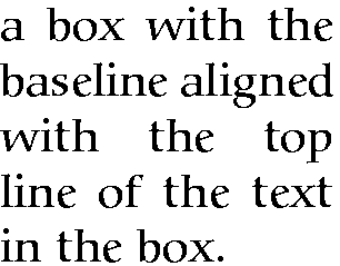
Notice that when setting very narrow measures with type
that is too large, the spacing may become uneven and there
may be too much hyphenation. Either use
\raggedright or reduce the type size, or
(in extreme cases) reword the text or break each line by
hand. It is rare for LATEX to need this: the example above
was deliberately chosen to be obtuse as an
illustration.
Where the contents is more extensive or more
complicated, you can use the minipage
environment.
Within this you can use virtually everything
that occurs in normal text (e.g. lists, paragraphs,
tabulations, etc.) with the exception of floats like
tables and figures. The minipage
environment has an argument just like
\parbox does, and it means the same: the
width you want the text set to.
Note that in minipages and
\parboxes, the paragraph indentation
(\parindent) is
reset to zero. If you need to change it, set it inside the
minipage or \parbox
using the \setlength command (see section 3.6).
\begin{minipage}{3in}
Please make sure you send in your completed
forms by January 1st next year, or the
penalty clause 2(a) will apply.
\begin{itemize}
\item Incomplete forms will be returned to
you unprocessed.
\item Forms must be accompanied by the
correct fee.
\item There is no appeal. The adjudicators'
decision is final.
\end{itemize}
\end{minipage}
|
Please make sure you send in your
completed forms by January 1st next year, or the
penalty clause 2(a) will
apply.
-
Incomplete forms will be returned to you
unprocessed.
-
Forms must be accompanied by the correct
fee.
-
There is no appeal. The
adjudicators' decision is final.
|
There are two other ways of typesetting text to widths
other than the normal text width: you can use a one-row,
one-cell tabular environment with the
p column type specification, or you
can use the \vbox command, which is raw
TEX, and outside the scope of this document.
To put a frame round  , use the
\fbox command:
\fbox{some text}. This works for a few
words in mid-line, but the framed box and its contents
won't break over the end of a line. To typeset
multiline text in a box, put it in a
\parbox, or use a
minipage or
tabular environment as described above,
and enclose the whole thing in a
\fbox.
\fbox{\begin{minipage}{3in}
This multiline text is more flexible than
a tabular setting:
\begin{itemize}
\item it can contain any type of normal
LATEX typesetting;
\item it can be any specified width;
\item it can even have its own
footnotes\footnote{Like this}.
\end{itemize}
\end{minipage}}
This multiline text is more flexible than a
tabular setting:
-
it can contain any type of normal LATEX
typesetting;
-
it can be any specified width;
-
it can even have its own footnotes.6
The spacing between text and box is controlled by the
value of \fboxsep, and
the thickness of the line by \fboxrule. The following values
were used above:
\setlength{\fboxsep}{1em}
\setlength{\fboxrule}{2pt}
As we saw before, setting justified text in narrow
measures will produce poor spacing: either use the
\raggedright command, or change the font
size, or add explicit extra hyphenation points.
Note the \begin{tabular} and
\begin{minipage} commands still need the
width specifying: in the case of the
\begin{tabular} by the use of the
p column type with its width
specification, and in the case of
\begin{minipage} by the second
argument.
\fbox{\begin{tabular}{p{1in}}
Multiline text in a box typeset using
\textsf{tabular}
\end{tabular}}
| Multiline text in a box typeset using
tabular |
The fancybox package lets you
extend the principle of \fbox with
commands to surround text in square, oval (round-cornered),
and drop-shadow boxes (e.g. \ovalbox,
\shadowbox, etc.: see the documentation
for details).
You can create panels of any size with these borders by
using the minipage environment to
typeset the text inside a special Sbox
environment which fancybox defines.
The minipage formats the text but the
Sbox ‘captures’
it, allowing you to put the frame round it as it
prints.
The printed version of this document uses this extensively and
there is a useful example shown in section 9.5.
Every text-handling system needs to support a repertoire of
tools for doing things with text. LATEX implements many
dozens, of which a small selection of the most frequently used
is given here:
-
offset quotations (sometimes called ‘block
quotes’);
-
footnotes and end-notes;
-
marginal notes;
-
cross-references, both normal ones and bibliographic
citations;
-
indexes and glossaries;
-
typesetting in multiple columns.
Direct speech and short quotes within a sentence
‘like this’ are done with simple
quotation marks as described in section 2.6. Sometimes, however, you may want longer
quotations set as a separate paragraph. Typically these are
indented from the surrounding text. LATEX has two
environments for doing this.
Such quotations are often set in a smaller size of type,
although this is not the default, hence the use of the
\small command in the second example. The
inclusion of the bibliographic citation at the end is
optional: here it is done with a non-standard command
\citequote which I invented for this example
(there is more about how to do things like this in Chapter 9).
- The quote
environment
-
is for up to a line of text each per (short)
quotation, with the whole thing indented from the
previous paragraph but with no additional indentation on
each quote;
\begin{quote}
Do, Ronny, Do. \textit{Nancy Reagan}

Da Do Ron Ron. \textit{The Crystals}
\end{quote}
Do, Ronny, Do. Nancy
Reagan
Da Do Ron Ron. The
Crystals
- The quotation
environment
-
is for longer passages (a paragraph or more) of a
single quotation, where not only is the block of text
indented, but each paragraph of it also has its own
extra indentation on the first line.
\begin{quotation}\small
At the turn of the century William Davy,
a Devonshire parson, finding errors in
the first edition of his \titleof{davy},
asked for a new edition to be printed.
His publisher refused and Davy purchased
a press, type, and paper. He harnessed
his gardener to the press and apprenticed
his housemaid to the typesetting. After
twelve years' work, a new edition
of fourteen sets of twenty-six volumes
was issued---which surely indicates that,
when typomania is coupled with religious
fervour, anything up to a miracle may be
achieved.\citequote[p.76]{ryder}
\end{quotation}
At the turn of the century William Davy, a
Devonshire parson, finding errors in the first
edition of his A System of Divinity,
asked for a new edition to be printed. His publisher
refused and Davy purchased a press, type, and paper.
He harnessed his gardener to the press and
apprenticed his housemaid to the typesetting. After
twelve years' work, a new edition of fourteen
sets of twenty-six volumes was issued---which surely
indicates that, when typomania is coupled with
religious fervour, anything up to a miracle may be
achieved.
John Ryder (1976), Printing for Pleasure, p.76
The command \footnote, followed by the
text of the footnote in curly braces, will produce an
auto-numbered footnote with a raised small number where you
put the command, and the numbered text automatically printed
at the foot of the page.1 The number is reset to 1 at the start of each
chapter (but you can override that and make them run
continuously throughout the document, or even restart at 1 on
each page or section).
LATEX automatically creates room for the footnote, and
automatically reformats it if you change your document in such
a way that the point of attachment and the footnote would move
to the next (or preceding) page.
Because of the way LATEX reads the whole footnote before
doing anything with it, you can't use
\verb (section 6.6.1) alone
in footnotes: either precede it with
\protect or use [abuse?] the
\url command instead, which you should be
using for Web and email addresses in any case).
Footnotes inside minipages (see section 6.7) produce lettered notes instead of
numbered ones, and they get printed at the bottom of the
minipage, not the bottom of the physical
page (but this too can be changed).
There is a package to hold over your footnotes and make
them print at the end of the chapter instead
(endnote) or at the end of the whole
document, and there is a package to print many short footnotes
in a single footnoted paragraph so they take up less space
(fnpara). It is also possible to have
several separate series of footnotes active simultaneously,
which is useful in critical editions or commentaries: a
numbered series may be used to refer to an original
author's notes; a lettered series can be used for notes
by a commentator or authority; and a third series is available
for your own notes. It is also possible to format footnotes
within footnotes.
If your footnotes are few and far between, you may want to
use footnote symbols instead of numbers. You can do this by
redefining the output of the footnote counter to be the
\fnsymbol command:
\renewcommand{\thefootnote{\fnsymbol{footnote}}
There are also ways to refer more than once to the
same footnote, and to defer the positioning of the footnote if
it occurs in a float like a Table or Figure, where it might
otherwise need to move to a different page.
| You can add marginal notes to your text↞ instead of
(or as well as) footnotes. You need to make sure that you have
a wide-enough margin, of course: use the
geometry package (see section 5.1.1) to allocate enough space, otherwise
the notes will be too cramped. There are several packages to
help with formatting marginal notes, but the simplest way is
to define it yourself. Add this new command to your
preamble:
|
Like this. |
\newcommand{\marginal}[1]{%
      \leavevmode\marginpar{\tiny\raggedright#1\par}}
Then you can use \marginal{Some
text}↞ Be careful, however, because marginal
notes are aligned with the line where the command starts, so a
very long one followed too closely by another will cause
LATEX to try and
adjust the position so they don't overlap.
|
Some text where you need
it. |
We're jumping ahead a bit here, as we haven't
covered how to define your own commands yet. I won't even
try to explain it here, although the attentive reader can
probably deduce some of it by inspection. See Chapter 9 for more information about making up your
own commands.
This is one of the most powerful features of LATEX. You
can label any point in a document with a name you make up, and
then refer to it by that name from anywhere else in the
document, and LATEX will always work out the cross-reference
number for you, no matter how much you edit the text or move
it around.
A similar method is used to cite documents in a
bibliography or list of references, and there are packages to
sort and format these in the correct manner for different
journals.
You label a place in your document by using the command
\label followed by a short name you make
up, in curly braces:2 we've already seen this done for labelling
Figures and Tables.
\section{New Research}
\label{newstuff}
You can then refer to this point from anywhere in the
same document with the command \ref
followed by the name you used, e.g.
In \S~\ref{newstuff} there is a list of recent
projects.
In § 7.4.1
there is a list of recent projects.
(The \S command produces a section
sign (§) and the
\P command produces a paragraph sign
(¶).)
If the label is in normal text, the reference will
provide the current chapter or section number or both
(depending on the current document
class).3 If the label
was inside a Table or Figure, the reference provides the
Table number or Figure number prefixed by the chapter
number. A label in an enumerated list will provide a
reference to the item number. If there is no apparent
structure to this part of the document, the reference will
be null. Labels must be unique (that is, each value must
occur only once as a label within a
single document), but you can have as many references to
them as you like.
Note the use of the unbreakable space
(~) between the \ref
and the word before it. This prints a space but prevents the
line ever breaking at that point, should it fall close to
the end of a line.
The command \pageref followed by any
of your label values will provide the page number where the
label occurred, regardless of the document structure. This
makes it possible to refer to something by page number as
well as its \ref number, which is useful
to readers in very long documents.
Unresolved references are printed as two question
marks, and also cause a warning message at the end of the
log file. There's never any harm in having
\labels you don't refer to, but using
\ref when you don't have a matching
\label is an error.
The mechanism used for references to reading lists and
bibliographies is almost identical to that used for normal
cross-references. Although it is possible to type the
details of each citation manually, there is a companion
program to LATEX called BIBTEX, which manages
bibliographic references automatically. This reduces the time
needed to maintain and format them, and dramatically
improves accuracy. Using BIBTEX means you only ever have
to type the bibliographic details of a work once. You can
then cite it in any document you write, and it will get
formatted automatically to the style you specify.
BIBTEX works exactly the same way as other
bibliographic databases: you keep details of every
document you want to refer to in a separate file, using
BIBTEX's own format (see example below). Many
writers make a habit of adding the details of every book
and article they read, so that when they write a document,
these entries are always available for reference. You give
each entry a short label, just like you do with normal
cross-references (see section 7.4.1), and
it is this label you use to refer to in your own documents
when you cite the work using the \cite
command:
...as has clearly been shown by Fothergill~\cite{fg}.
By default, this creates a cross-reference number in
square brackets [1] which is a common style in the
Natural Sciences (see section 7.4.2.5 for
details of how to change this). There are dozens of
alternative citation formats in extra packages, including
the popular author/year format:
...as has clearly been shown
by~\citeauthoryear{fg}.
...as has clearly been shown by Fothergill (1929).
Note that in this case you don't type the
author's name because it is automatically extracted
by BIBTEX. There are lots of variants on this technique
in many packages, allowing you to phrase your sentences
with references in as natural a way as possible, and rely
on BIBTEX to insert the right data. (If you examine the
source of this document you'll find I use some
homebrew commands like \authorof and
\titleof which I use for a similar
purpose.)
To print the bibliographic listing (usually called
‘References’ in articles and
‘Bibliography’ in books and
reports), add these two lines towards the end of your
document, or wherever you want it printed, substituting
the name of your own BIBTEX file and the name of your
chosen bibliography style:
\bibliographystyle{ieeetr}
\bibliography{mybib}
-
The \bibliography command is
followed by the filename of your BIBTEX file
without the
.bib extension.
-
The \bibliographystyle command
is followed by the name of any of LATEX's
supported bibliography styles, of which there are many
dozens available from CTAN.4
The styles plain and
alpha are two common generic styles used
for drafts. The example above uses Transactions of the Institute of Electrical
and Electronics Engineers (IEEETR).
When you run the bibtex
program, the details of every document you have cited will
be extracted from your database, formatted according to
the style you specify, and stored in a temporary
bibliographic (.bbl) file with a
label corresponding to the one you used in your citation,
ready for LATEX to use. This is entirely automatic: all
you do is cite your references in your LATEX document
using the labels you gave the entries in your BIBTEX
file, and run the bibtex
program.
After processing your file with LATEX, run
BIBTEX on it by clicking on the
BIBTEX toolbar icon (if your editor
has one), or use the
→ menu entry, or type the command
bibtex followed by the name of your
document (without the .tex
extension). When you run LATEX again it will use the
.bbl file which BIBTEX created,
and subsequent runs of LATEX will format the correct
citation numbers (or author/year, or whatever format you
are using).
$ latex mybook
$ bibtex mybook
$ latex mybook
$ latex mybook
Because of this three-stage process, you always get a
warning message about an ‘unresolved
reference’ the first time you add a new
reference to a previously uncited work. This will
disappear after subsequent runs of
bibtex and LATEX.
In practice, authors tend to run LATEX from time to
time during writing anyway, so they can preview the
document. Just run BIBTEX after adding a new
\cite command, and subsequent runs of
LATEX will incrementally incorporate all references
without you having to worry about it. You only need to
follow the full formal sequence (LATEX, BIBTEX,
LATEX, LATEX) when you have finished writing and
want to ensure that all references have been
resolved.
The format for the BIBTEX file is specified in the
BIBTEX documentation (see section 5.1.2
for how to find and print it). You create a file with a
name ending in .bib, and add your
entries, for example:
@book{fg,
   title        = {{An Innkeeper's Diary}},
   author       = {John Fothergill},
   edition      = {3rd},
   publisher    = {Penguin},
   year         = 1929,
   address      = {London}
}
There is a prescribed set of fields for each of a
dozen or so types of document: book, article (in a
journal), article (in a collection), chapter (in a book),
thesis, report, paper (in a Proceedings), etc. Each entry
identifies the document type after the
‘@’ sign,
followed by the entry label that you make up, and then
each field (in any order), using the format:
keyword = {value},
Most TEX-sensitive editors have a BIBTEX mode
which understands these entries.
Emacs automatically uses its
bibtex-mode whenever you open a
filename ending in .bib. When editing
BIBTEX databases, the rules are simple:
-
Omit the comma after the last field in the entry
(only — eg after {London} in
the example).
-
Titles may have their case changed in some styles:
to prevent this, enclose the title in double curly
braces as in the example.
-
Values which are purely numeric (e.g. years)
may omit the curly braces.
-
Fields can occur in any order but the format must
otherwise be strictly observed.
-
Fields which are not used do not have to be
included (so if your editor automatically inserts them
as blank or prefixed by OPT
[optional], you can safely delete them as unused
lines).
To help with this, there are several interfaces to
creating and maintaining BIBTEX files, such as
tkbibtex (see Figure 7.1), or
pybliographic.
To change the title printed over the reference
listing, just change the value of
\refname (articles) or
\bibname (books and reports) by adding a
line like this in your preamble:
\renewcommand{\bibname}{Reading List}
The formatting specifications (BIBTEX styles) are
based on standard settings for journals and books from
dozens of publishers: you just pick the one you want by
name. The texmf/bib/bst subdirectory
of your installation contains the ones installed by
default, and you can search on CTAN
for others (look for .bst files).
Many of them are named after university press styles
(e.g. harvard,
oxford) or the publisher or
journal which specified them (e.g.
elsevier,
kluwer, etc.).
Some of them have an accompanying package
(.sty) file which
you need to include with the normal
\usepackage command in your preamble. In
this case the format may be distributed as
.dtx and .ins
files and will need installing in the same way as any
other package (see section 5.2). Always read
the documentation, because most of the formats are very
specific to the journal they were designed for, and may have
fairly absolute requirements.
If you are writing for a specific publisher, you
should remember that the rules or formats are laid down
by the typographic designer of that journal or
publisher: you cannot arbitrarily change the format just
because you don't happen to like it: it's not
your choice!
It is also possible to write your own BIBTEX
(.bst) style files, although it uses
a language of its own which really needs a computer
science background to understand. However, this is
rendered unnecessary in most cases: there is an extensive
program (actually written in LATEX) called
makebst, which makes
.bst files by asking you a (long)
series of questions about exactly how you want your
citations formatted. Just type
latex makebst in a command window, but
give it a dummy run first, because some of the questions
are very detailed, so you need to have thought through how
you want your citations to appear before you start.
The method of citing a work by numeric reference is
common in the Natural Sciences but is not used in Law or
the Humanities. In these fields, citations are usually
done with short references (author/short-title/year) in a
numbered footnote. Sometimes they are actually called
‘footnotes’ to the exclusion of
ordinary footnotes, although they are really citations
which happen by convention to be
displayed as footnotes: an important
distinction rarely appreciated by authors until they come
to need a normal footnote.
For these fields, the bibliography at the back of the
document is printed unnumbered in
alphabetic order of author, or perhaps chronologically if
the time-frame is very large. This unnumbered format is
why it is conventionally called
‘References’ rather than
‘Bibliography’: a sufficient working
citation has already been provided in the footnote, and
the list at the back is for reference purposes only;
whereas in the Natural Sciences, the citation is just a
number, or possibly an author and year only, so the full
listing is called a Bibliography.
The jurabib package
(originally intended for German law articles but now
extended to other fields in the Humanities, and to other
languages) has extensive features for doing this style of
citation and is strongly recommended.
LATEX has a powerful, automated indexing facility which
uses the standard makeindex
program. To use indexing, use the package
makeidx and include the
\makeindex command in your preamble:
\usepackage{makeidx}
\makeindex
When you want to index something, using the command
\index followed by the entry in curly
braces, as you want it to appear in the index, using one of
the following formats:
- Plain entry
-
Typing \index{beer} will create
an entry for ‘beer’ with the
current page
number.
- Subindex entry
-
For an entry with a subentry use an exclamation mark
to separate them:
\index{beer!lite}. Subsubentries like
\index{beer!lite!American} work to
another level deep.
- Cross-references
-
‘See’ entries are done with
the vertical bar (one of the rare times it does
not get interpreted as a math
character):
\index{Microbrew|see{beer}}
- Font changes
-
To change the style of an entry, use the @-sign
followed by a font change command:
\index{beer!Rogue!Chocolate
       Stout@\textit{Chocolate Stout}}
This example indexes ‘Chocolate
Stout’ and italicises it
at the same time. Any of the standard
\text... font-change commands work
here: see the table in section 8.2.3 for details.
You can also change the font of the index number on
its own, as for first-usage references, by using the
vertical bar in a similar way to the
‘see’ entries above, but
substituting a font-change command name
(without a backslash) such as
textbf for bold-face text (see the
index):
\index{beer!Rogue!Chocolate Stout|textbf}
- Out of sequence
-
The same method can be used as for font changes,
but using the alternate index word instead of the font
command name, so
\index{Oregon Brewing Company@Rogue} will add an entry for
‘Rogue’ in the
‘O’ section of the index, as if
it was spelled ‘Oregon Brewing
Company’.
When the document has been processed through LATEX it
will have created a .idx file, which you
run through the makeindex program
by typing (for example):
makeindex mythesis
Some editors may have a button or menu entry for this. The
program will look for the .idx file and
output a .ind file. This gets used by the
command \printindex which you put at the end
of your document, where you want the index printed. The
default index format is two columns.
Glossaries are done in a similar manner using the command
\makeglossary in the preamble and the
command \glossary in the same way as
\index. There are some subtle differences in
the way glossaries are handled: both the books by Lamport (1994) and by Mittelbach et al (2004) duck the issue, but
there is some documentation on glotex on
CTAN.
Use the multicol package: the
environment is called multicols (note the
plural form) and it takes the number of columns as a separate
argument in curly braces:
\usepackage{multicol}
...
\begin{multicols}{3}
...
\end{multicols}
LATEX has built-in support for two-column typesetting
via the twocolumn option in the standard
Document Class Declarations, but it is relatively inflexible
in that you cannot change from full-width to double-column
and back again on the same page, and the final page does not
balance the column heights. However, it does feature special
figure* and table*
environments which typeset full-width figures and tables
across a double-column setting.
The more extensive solution is the
multicol package, which will set up
to 10 columns, and allows the number of columns to be
changed or reset to one in mid-page, so that full-width
graphics can still be used. It also balances the height of
the final page so that all columns are the same
height — if possible: it's not always
achievable — and you can control the width of the gutter
by setting the \columnsep length to a new
dimension.
Multi-column work needs some skill in typographic
layout, though: the narrowness of the columns makes
typesetting less likely to fit smoothly because it's hard to
hyphenate and justify well when there is little space to
manœuvre in.
This is the chapter that most users want first, because they
come to structured documents from a wordprocessing environment
where the only way to convey different
types of information is to fiddle with the font and size
drop-down menus.
As I hope you have seen, this is normally completely
unnecessary in LATEX, which does most of the hard work for you
automatically. However, there are occasions when you need to
make manual typographic changes, and this chapter is about how
to do them.
The design of the page can be a very subjective matter,
and also rather a subtle one. Many organisations large and
small pay considerable sums to designers to come up with page
layouts to suit their purposes. Styles in page layouts change
with the years, as do fashions in everything else, so what may
have looked attractive in 1991 may look rather dated in
2011.
As with most aspects of typography, making the document
readable involves making it consistent, so the reader is not
interrupted or distracted too much by apparently random
changes in margins, widths, or placement of objects. However,
there are a number of different occasions where the layout
usually does change, related to the
frequency with which the format appears.
-
The title page, the half-title, copyright page,
dedication, and other one-page preliminaries (if you use
them) are usually designed individually, as the information
on it only occurs once in that format anywhere in the
document.
-
The table of contents and other related lists like
figures and tables all need to share one
design.
-
The prelims like Foreword, Introduction, and Preface
should likewise follow the same format between
them.
-
Chapter and Appendix start pages usually share a
layout.
-
Other (normal) pages have a single layout, but it may
specify individual variations to handle tables, lists,
figures, sidebars, exercises, footnotes, etc.
If you are going to design a whole document, it's
probably a good idea to read a couple of books on layout
design first, to get a feel for the conventions which
contribute to making the reader comfortable reading.
While unusual or radical layouts have an important role in
attention-grabbing, or in making a socio-political statement
(WIRED magazine is an obvious
recent example), they are usually out of place in business
reports, white papers, books, theses, and journals. In
ephemera, on the other hand, as in advertising, they are
probably critical.
We mentioned in section 7.3 and
elsewhere the existence of the
geometry package which lets you
change margins. It also lets you set the text-area height
and width and a lot of other layout settings: read the
documentation for details (see section 5.1.2 for how to read package
documentation).
\usepackage[left=2cm,top=1cm,bottom=2cm,right=3cm,
            nohead,nofoot]{geometry}
The spacing around the individual textual components
(headings, paragraphs, lists, footnotes, etc.) can
also be changed on a document-wide basis, as we saw with
paragraph spacing and indentation in the text in section 3.6.
Changing the spacing of section headings for the whole
document can be done with the
sectsty package, designed to let
you adjust section-head spacing without having to know about
the internal LATEX coding, which is quite complex.
The spacing for lists can be adjusted with the
mdwlist package. In both cases the
user with highly specific requirements such as a
publisher's Compositor's Specification should read
the relevant sections in the The LATEX Companion or ask for expert help, as
there are many internal settings which can also be changed
to fine-tune your design, but which need some knowledge of
LATEX's internals.
All the above are for automating changes so that they
occur every time in a consistent manner. You can also make
manual changes whenever you need:
- Flexible vertical space
There are three commands
\smallskip,
\medskip, and
\bigskip. These output flexible
(dynamic, or ‘rubber’) space,
approximately 3pt, 6pt, and 12pt high respectively,
and they will automatically compress or expand a
little, depending on the demands of the rest of the
page (for example to allow one extra line to fit, or a
heading to be moved to the next page without anyone
except a typographer noticing the change). These
commands can only be used after a paragraph break (a
blank line or the command
\par).
- Fixed vertical space
For a fixed-height space which will
not stretch or shrink, use the
command \vspace followed by a length
in curly braces, e.g. \vspace{18pt}
(again, this has to be after a paragraph break). Bear
in mind that extra space which ends up at a page-break
when the document is formatted will get
discarded entirely to make the bottom and
top lines fall in the correct places. To force a
vertical space to remain and be taken into account
even after a page break (very rare), use the starred
variant \vspace*, e.g.
\vspace*{19pt}.
- Double spacing
Double-spacing normal lines of text is usually a
bad idea, as it looks very ugly. It is still
unfortunately a requirement in some universities for
thesis submission, a historical relic from the days of
typewriters. Nowadays, 1⅓ or 1½ line
spacing is considered acceptable, according to your
font size. If your institution still thinks they
should have double line spacing, they are probably
wrong, and just don't understand that the world has
moved on since the typewriter. Show them this
paragraph and explain that they need to enter the 21st
century and adapt to the features of computer
typesetting. If they still insist, use the
setspace package,which has
commands for double line-spacing and one-and-a-half
line spacing, but be prepared for some very ugly
output (so warn your supervisor and extern).
The space between lines is defined by the value of
the length variable \baselineskip multiplied
by the value of the \baselinestretch
command. In general, don't meddle with
\baselineskip at
all, and with
\baselinestretch only if you know
what you are doing. (Both can, however, safely be used
as reference values in commands like
\vspace{\baselineskip} to leave a
whole line space.)
The value of \baselineskip changes with
the font size (see section 8.2.4) but is conventionally set to
1.2 times the current nominal font size. This is a
value derived from long experience: only change it if
you understand what it means and what effect it will
have.
Quite separately, there are some perfectly genuine
and normal reasons for wanting wide line spacing,
for example when typesetting a proof of a
critical or variorum edition, where editors and
contributors are going to want to add notes manually
by writing between the lines, or where the text is
going to be overprinted by something else like
Braille, or in advertising or display text for special
effects.
- Horizontal space
There is a horizontal equivalent to the
\vspace command:
\hspace, which works in the same
way, so I can force a 1″ space like
this in
mid-paragraph. There are also some predefined
(shorter) spaces available:
in
mid-paragraph. There are also some predefined
(shorter) spaces available:
-
\thinspace (1/6em),
which we saw between single and double quotes in
the last paragraph in section 2.6. It's also
sometimes used between the full point after
abbreviations and a following number, as in page
references like p. 199, where a word space
would look too big, and setting it solid would
look too tight.
-
\enspace (½em).
There is no direct equivalent predefined in
LATEX for mid and thick spaces as used by metal
typesetters, although it would be possible to
define them. The en as a unit is often used as the
width of a single digit in some fonts, as a
convenience so that tables of figures are easy to
line up.
-
\quad (1em).
-
\qquad (2em).
Beyond this, all horizontal space within
paragraphs is automatically flexible,
as this is what
LATEX uses to achieve justification. Never be
tempted to try and change the spacing between letters
unless you have some professional training in
typography. Some systems use letterspacing
(incorrectly called ‘tracking’) as an aid
to justification and it is almost always wrong to do
so (and looks it). While it is
possible to change letterspacing (with the
soul package), it should only
be done by a typographer, and then only very rarely,
as the settings are very subtle and beyond the scope
of this book.
LATEX has built-in settings to control the page style
of its default page layouts. These are implemented with the
\pagestyle command, which can take one of
the following arguments.
- plain
-
for a page number centered at the bottom;
- empty
-
for nothing at all, not even a page number;
- headings
-
for running heads based on the current chapter and
section;
- myheadings
-
which lets you use your own reprogrammed
definitions of how \markright and
\markboth commands, which control
how chapter and section titles get into page
headers.
The command \thispagestyle (taking the
same arguments) can be used to force a specific style for
the current page only.
However, the easiest way is to use the
fancyhdr package, which lets you
redefine the left-hand, centre, and right-hand page headers
and footers for both odd and even pages (twelve objects in
all). These areas can contain a page number, fixed text,
variable text (like the current chapter or section title, or
the catch-words of a dictionary), or even a small image.
They can also be used to do page backgrounds and frames, by
making one of them the top corner of an invisible box which
‘hangs’ text or images down over the whole
page.
The settings for the downloadable version of this
document can be used as an example: for the whole story you
have to read the documentation.
\pagestyle{fancy}\fancyhead{}
\renewcommand\headrulewidth{.1pt}
\fancyhead[LO,RE]{\footnotesize\sffamily\lite\leftmark}
\fancyhead[LE,RO]{\footnotesize\sffamily\lite\itshape
                  \rightmark}
\fancyfoot[C]{}
\fancyfoot[LE,RO]{\setlength{\fboxsep}{2pt}\ovalbox%
                  {\footnotesize\sffamily\thepage}}
\fancyfoot[LO,RE]{\footnotesize\sffamily\lite\@title}
\fancypagestyle{plain}{\fancyhf{}
    \fancyfoot[R]{\setlength{\fboxsep}{2pt}\ovalbox{%
                  \footnotesize\sffamily\thepage}}
    \fancyfoot[L]{\footnotesize\sffamily\lite\@title}
    \renewcommand{\headrulewidth}{0pt}}
This is probably more complex than most documents, but
it illustrates some common requirements:
-
Settings are prefixed by making the
\pagestyle ‘fancy’
and setting the \fancyhead to
null to zap any predefined values.
-
The thickness of the rule at the top of the page can
be changed (or set to 0pt to make it disappear).
-
The header and footer settings are specified with L,
C, and R for left, centre, and right; and with O and E
for Odd and Even numbered pages. In each setting, the
typeface style, size, and font can be specified along
with macros which implement various dynamic texts (here,
the current chapter and section titles, which LATEX
stores in \rightmark and
\leftmark).
-
The ‘plain’ variant is used for chapter
starts, and resets some of the parameters
accordingly.
The default typeface in LATEX is Computer Modern (CM). This typeface was
designed by Knuth for use with TEX because it is a book
face, and he designed TEX originally for typesetting books.
Because it is one of the very few book typefaces with a
comprehensive set of fonts, including a full suite of
mathematics, it has remained the default, rather than the
Times you find in wordprocessors, because until recently the
mathematical symbols for Times were a commercial product often
unavailable to users of free software.

If you are reading this in a web browser, the above
paragraph is only a low-resolution copy because browsers
don't usually have the Computer Modern font available.
All the rest of this document is set in your current browser serif font, with
your current browser sans-serif font for some of the headings and your current browser monospace font for the
fixed-width type.
In addition to CM, there are
many other METAFONT fonts which can be downloaded from
CTAN, including a large collection
of historical, symbol, initial, and non-Latin fonts. LATEX
also comes with the ‘Adobe 35’
typefaces which are built into laser printers and other
DTP systems, and some more fonts
donated by the X Consortium. Plus, of course, standard
LATEX can use any of the thousands of
Type 1 fonts available, and
pdfLATEX can use any of the
thousands of TrueType fonts as well.
In the following lists, if there is a package available,
its name is given in parentheses after the name of the
typeface. The font-family name is shown on the right-hand
side. If a non-standard font-encoding is needed, its name is
shown before the font-family name.
Latin-alphabet typefaces (METAFONT)
| Computer Modern Roman |
cmr |

| Computer Modern Sans |
cmss |

| Computer Modern Typewriter |
cmtt |


As mentioned in section 4.4, the
‘Adobe 35’ fonts can be used with any
printer, not just a laser printer or typesetter. The
Ghostscript interpreter and the
GSview viewer come with a large set
of printer drivers, so you just create PostScript output and
print from GSview.
Incidentally, the 35 refers to the total number of fonts
for the 10 typefaces, including their bold, italic, and
bold-italic variants.
Postscript Type 1 fonts have been the mainstay of the
graphic arts industries for many years, as they allow much
better definition of variance
(‘hinting’) than most other formats.
However, the font format remains proprietary to Adobe, even
though they have released it for public use, which means they
could change it without warning. A new format called
‘OpenType’ is designed to overcome
this, and some versions of TEX are
already able to use OpenType fonts.
Non-Latin-alphabet typefaces (METAFONT)


Just to make it clear: standard LATEX uses only
METAFONT and PostScript Type 1
fonts. pdfLATEX can use TrueType
fonts as well.
8.2.1 Changing the default font family
LATEX expects to work with three font families as
defaults:
| Roman (serif, with tails on the uprights), the
default
|
rm |
| Sans-serif, with no tails on
the uprights
|
sf |
| Monospace (fixed-width or
typewriter)
|
tt |
The start-up default for LATEX equates the
rm default with the
cmr font-family (Computer Modern Roman),
sf with cmss, and
tt with cmtt. If you
use one of the packages listed in the table in section 8.2, it will
replace the defaults of the same type: for example,
\usepackage{bookman} makes the default
rm font-family Bookman
(pbk), but leaves the sans-serif
(sf) and monospace
(tt) families untouched. Equally,
\usepackage{helvet} changes the default
sans-serif family to Helvetica but leaves the serif (Roman)
and monospace families untouched. Using both commands will
change both defaults because they operate
independently.
However...as it is common to
want to change all three defaults at the same time, some of
the most common ‘suites’ of typefaces
are provided as packages:
- times
-
changes to Times/Helvetica/Courier.
- pslatex
-
same as times but uses a
specially narrowed Courier to save space (normal
Courier is rather inelegantly wide). This is the
preferred setting if you want Times.1
- newcent
-
changes to New Century
Schoolbook/Helvetica/Courier.
- palatino
-
changes to Palatino/Avant Garde/Courier.
- palatcm
-
changes the roman to Palatino only, but with
CM mathematics
Where no package name is given in the table in section 8.2, it means the
font is rarely used as a default by itself except in special
cases like users' own homebrew packages. To use such a
font you have to specify it manually, or make a little macro
for yourself if you use it more than once.
To shift to another font family on a temporary basis,
use the commands \fontencoding (if
needed), \fontfamily, and
\selectfont, and enclose the
commands and the text in curly
braces. Note that this is a
different way of using curly braces to
how we have used them before: it limits the effect of a
change to the material inside the braces.
{\fontfamily{phv}\selectfont
Helvetica looks like this}:
{\fontencoding{OT1}\fontfamily{bch}\selectfont
Charter looks like this}.
Helvetica
looks like this: Charter looks like
this.
In this example, the \fontencoding
command has been used to ensure that the typeface will work
even if the sentence is used in the middle of something
typeset in a different encoding (like this
document).2
In a normal document, of course, random typeface changes
like this are rather rare. You select your typeface[s] once
at the start of the document, and stick with them.
Most cases where people want to do unusual typeface
changes involve things like special symbols on a repetitive
basis, and LATEX provides much easier programmable ways
to make these changes into shorthand commands (called
macros: see Chapter 9). You could, for
example, make a macro called \product
which would let you typeset product names in a distinct
typeface:
Andlinger, Inc., has replaced \product{Splosh} with
\product{SuperSplosh}.
This is one of LATEX's most powerful features.
It means that if you needed to change your
\product command at some later stage to
use a different font, you only have to change three
characters in the macro (the font-family name), and
you don't need to edit your document text at all!
What's more, a macro could do other things at the same time,
like add an entry to an index of products.
However, vastly more common are changes to type
style, while staying with the same
font-family.
8.2.3 Changing font style
Within each typeface or font family there are usually
several different ‘looks’ to the type
design. LATEX distinguishes between font family, font shape, and font series:
- *) Not all typefaces have all
variants! Some only have bold and italics.
- †) Some typefaces do not have
both bold and bold extended: by default LATEX uses
\bfseries for bold
extended.
These ‘shape’,
‘series’, and
‘family’ commands are commutative, so you can
combine a shape with a series and/or a family, without the
need to use \selectfont:
This gives you {\bfseries\itshape\sffamily bold
italic sans-serif type}, but beware
This gives you bold italic sans-serif type, but
beware of pushing your fonts beyond their limits unless you
are a typographer. It is not normally meaningful to combine
one shape or series class with another of the same class,
such as trying to get slanted-italics. It's an
impossibility to combine one family with another (such as a
seriffed sans-serif typeface!). Slanted plus italics, for
example, doesn't make sense, as italics are already
slanted (although it is technically possible); and while
some typefaces may well possess italic small caps, they are
not in common use. Sans-serif and monospace (typewriter) are
different fonts, and often different typeface families
entirely.3
There is an alternative syntax for the most common type
shape and series commands which uses curly braces in the
normal ‘argument’ manner:
| Italic |
\textit{text} |
puts text
into italics
|
| Slanted |
\textsl{text} |
puts text into
slanted type*
|
| Small Capitals |
\textsc{text} |
puts TEXT into
small caps
|
| Bold |
\textbf{text} |
puts text into
bold type
|
| Sans-serif |
\textsf{text} |
puts text
into sans-serif type
|
| Monospace |
\texttt{text} |
puts text into
typewriter type
|
- *) If slanted is available separately
from italics.
You can nest these inside one another too:
...\textbf{\itshape\textsf{bold italic
sans-serif type}}...
Underlining isn't a font, and it is extremely
rare in typography except for special purposes. If you think
you need it, use the ulem package
with the normalem option, and the
\uline command.
LATEX has built into its defaults a set of predefined
font size steps corresponding more or less to the
traditional sizes available to metal typesetters. This is
deliberate, as these sizes have grown up over 500 years of
printing as those which go best together for book-work,
which is where TEX originated.
These sizes are also reflected in the size steps at
which Computer Modern was designed. It often comes as a
surprise to new users that many typefaces are not designed
as a single font and just scaled up or down, but specially
drawn at different sizes to make them more legible.
As an example,  , and
, and  , and
, and
 so you can see there really is a
significant difference. In general, you probably don't
want to go scaling fonts too much beyond their design size
because they will start to look very odd.
so you can see there really is a
significant difference. In general, you probably don't
want to go scaling fonts too much beyond their design size
because they will start to look very odd.
The default sizes (and the commands that operate them)
are based on the use of a 10pt font, which is the normal
size for most texts. Using the larger defaults (11pt and
12pt) for the body font will use 11pt and 12pt designs, with
other sizes (eg headings) resized to match. The exact sizes
used are listed in the macros in the Class Option files
size10.clo,
size11.clo and
size12.clo. TEX's default fonts
above 10pt are in fact scaled by a factor of 1.2, as shown
in the fourth column of the table below.
\tiny |
The quick brown fox
jumps over the lazy dog |
5 |
5 |
\scriptsize |
The quick brown
fox jumps over the laz |
7 |
7 |
\footnotesize |
The quick
brown fox jumps over the l |
8 |
8 |
\small |
The quick brown fox
jumps over th |
9 |
9 |
\normalsize |
The quick
brown fox jumps over |
10 |
10 |
\large |
The quick brown fox
jumps |
12 |
12 |
\Large |
The quick brown fox
ju |
14 |
14.40 |
\LARGE |
The quick brown
fo |
18 |
17.28 |
\huge |
The quick
brown |
20 |
20.74 |
\Huge |
The quick
bro |
24 |
24.88 |
While these ‘shorthand’ commands
relieve the beginner of having to worry about the
‘right’ size for a given task, when
you need a specific size there is the
\fontsize command:
\fontsize{22}{28}\selectfont This is 22pt
type 6pt leaded
‘Leading’ comes from the old metal-type
practice of adding a lead strip between lines to increase the
spacing.
The \fontsize command takes two
arguments: the point size and the baseline distance. The
above example gives you 22pt type on a 28pt baseline
(i.e. with 6pt extra space or
‘leading’ between the lines).
Computer Modern fonts (the default) come fixed at the
named size steps shown in the table, and if you try to use
an odd size in between, LATEX will pick the closest
step instead. If you really need to use CM at arbitrary sizes there is a
package type1cm which lets you
override the default steps. If you use
PostScript (Type 1) fonts, the
step sizes do not apply and the font scaling is infinitely
variable.
8.2.5 Logical markup
All this playing around with fonts is very pretty but
you normally only do it for a reason, even if that reason is
just to be decorative. Italics, for example, are used for
many things:
| Foreign words |
ex officio |
| Scientific names |
Ranunculus ficaria |
| Emphasis |
must not |
| Titles of documents |
The LATEX Companion
|
| Product names |
Corel's WordPerfect |
| Variables in maths |
E=mc2 |
| Subtitles or headings |
How to get started |
| Decoration |
FREE UPGRADE!!! |
Humans usually have no problem telling the difference
between these reasons, because they can read and understand
the meaning and context. Computers cannot (yet), so it has
become conventional to use descriptive names which make the
distinction explicit, even though the appearance may be the
same.
LATEX has some of these built in, like
\emph, which provides
emphasis. This has a special feature
because when the surrounding text is
already italic, emphasis
automatically reverts to upright
type, which is the normal practice
for typesetting.
This has a special feature because {\itshape when the
surrounding text is already italic, \emph{emphasis}
automatically reverts to upright type, which is the
This sensitivity to logic is programmed into
the definition of \emph and it's not
hard to make up other commands of your own which could do
the same, such as \foreign or
\product.
But why would you bother? In a short document it's
probably not important, but if you're writing a long
report, or a formal document like an article, a book, or a
thesis, it makes writing and editing hugely easier if you
can control whole groups of special effects with a single
command, such as italicising, indexing, or cross-referencing
to a glossary. If a format needs changing, you only have to
change the definition, and every occurrence automatically
follows suit.
Beware of this ‘vaine conceipt of simple men,
which judge things by ther effects, and not by ther
causes’. (Edmund Spenser, 1633) It's hugely
more efficient to have control of the cause than the
effect.
It also makes it possible to find and act on groups of
meanings — such as making an index of scientific names
or product names (as in this document) — if they are
identified with a special command. Otherwise you'd
spend weeks hunting manually through every
\textit command to find the ones you
wanted. This is the importance of automation: it can save
you time and money.
In Chapter 9 we will see how to make your
own simple commands like this.
8.2.6 Colour
You can typeset anything in LATEX in any colour you
want using the color package.
First, you need to add the command
\usepackage{color} to your preamble (note
the US spelling of color!). This makes available a default
palette of primary colours: red, green, and blue for the RGB colour model used for emitted light
(television screens), and cyan, magenta, yellow, and black for the
CMYK colour model used for
reflected light (printing).
For the occasional word or phrase in colour, use the
command \textcolor with two arguments, the
colour name and the text: \textcolor{red}{like
this}. There is a \color
command as well, for use within groups:
...{\color{blue}some text in blue}...
If you have the PostScript
printer driver dvips installed,
you also get a separate 64-colour palette of predefined
color names. These
represent approximately the colours in the big box of
Crayola colouring pencils much
favoured by artists and designers. This adds a new colour
model called ‘named’, so if
you want the Crayola colour
RubineRed, you can use the
\color or \textcolor
commands with a preceding optional argument
‘named’:
\color[named]{RubineRed}
\textcolor[named]{RubineRed}{some red text}
As some of the ‘named’
colour names are quite long, you can create a short name of
your own for colours you use frequently, using the
\definecolor command:
\definecolor{mb}{named}{MidnightBlue}
The \definecolor command needs three
arguments: your shorthand name, the name of the colour model,
and the colour specification. In the case of the
‘named’ model, the last
argument is one of the 64 colour names. To
use these names with pdfLATEX,
you need to use the pdftex option to the
color package.
Using the \definecolor command, you
can define any colour you want by giving it a name,
specifying which colour model, and providing the Red-Green-Blue (RGB) or Cyan-Magenta-Yellow-Black (CMYK) colour
values expressed as decimals, separated by commas. For
example, an RGB shade given as
(37,125,224) in decimal (#250FE0 in hexadecimal as used
on the Web) can be given as
\definecolor{midblue}{rgb}{0.145,0.490,0.882}
(divide each value by 255, the maximum for
each of the hues in the Red-Green-Blue colour model). You
can then use
\textcolor with your new
colour name:
the midblue looks like
this if you're reading in colour.
The color package also provides
a colour version of \fbox (see section 6.7.2) called
\colorbox:
\colorbox{midblue}{\color{magenta}Magenta on midblue}
Magenta on midblue: you can
see how careful you need to be with colours!
Different fonts come in a variety of packagings: the three
most common used with TEX systems are
PostScript fonts, TrueType fonts, and
METAFONT fonts. How you install them and where they go
depends on how you installed LATEX: all I can deal with here
are the standard locations within the TDS.
Typefaces come supplied as one or more font
‘outline’ files and a number of
ancillary files:
- METAFONT typefaces
-
have a number of .mf source
(outline) files, possibly also some
.fd (font definition) files and a
.sty (style) file. The
.tfm (TEX font metric) files are
not needed, as they can be generated from the
outlines.
- PostScript typefaces
-
come as a pair of files: a .pfb
(PostScript font binary) or .pfa
(PostScript font ASCII)
outline, and an .afm (Adobe font
metric) file. There may also be
.inf and other files but these are
not needed for use with TEX systems.
- TrueType typefaces
-
are a single .ttf file, which
combines outline and metrics in one.
The instructions here assume the use of the New Font Selection Scheme (NFSS) used in
LATEXε. If you are running the obsolete LATEX 2.09,
upgrade it now.
This is the simplest installation. When you download
METAFONT fonts from CTAN,
you'll usually find a large number of outline files
(.mf files) and maybe some other types
as well (see below).
-
Create a new subdirectory named after the typeface
you're installing in
texmf-local/fonts/source/public/:
-
Copy all the .mf
files to this directory.
-
Copy the .fd (Font Definition)
file[s] and the .sty (style) file
to your texmf/tex/latex/mfnfss
directory.
-
Run your TEX indexer program (see step 4 in the procedure in section 5.2.2).
That's it. Unlike PostScript
fonts, METAFONT fonts can be used to generate the font
metric file (.tfm files) automatically
on-the-fly the first time the typeface is used, so there
should be nothing else to install.
Now you can put a \usepackage command
in your preamble with whatever name the
.sty file was called, and read the
documentation to see what commands it gives to use the font
(refer to the last paragraph in section 5.2.1 and step 2).
If the font came without.fd or .sty files,
you'll need to find someone who can make them for you
(or follow the outline in section 8.3.2, step 11).
8.3.1.1 Pre-generated metrics (optional)
Some METAFONT fonts come with pre-generated
.tfm files which you can install if
your system is slow at generating them itself:
-
Create a new subdirectory within
texmf-local/fonts/tfm/public/
named the same as the one you created for the
.mf files above.
-
Copy all the .tfm files into
this subdirectory.
-
Run your TEX indexer program (see step 4 in the procedure in section 5.2.2).
8.3.1.2 Pre-generated bitmaps (optional)
In some rare cases, pre-generated packed bitmap fonts
(.pk files) are also available from
CTAN (normally your previewer
and print driver creates these automatically, but you can
use the pre-generated ones if you have a very slow
system). If you really want to install these, it's a
similar procedure to the .tfm
files:
-
Create a new subdirectory within
texmf-local/fonts/pk/modeless/
named the same as the one you created for the
.mf and .tfm
files above.
-
Copy all the .nnnpk files
into this subdirectory (nnn is
a number reflecting the dot-density of the bitmap). On
Microsoft systems the files may just end in
.pk and be kept in subdirectories
named after the dot-density, e.g.
dpi360.
-
Run your TEX indexer program (see step 4 in the procedure in section 5.2.2).
Lots of people will tell you that
PostScript fonts and PostScript
output are dead and that TrueType or OpenType fonts and PDF
output are the way to go. While this is true for many cases,
standard LATEX does not work with TrueType fonts and does
not produce PDF directly. Only
pdfLATEX does that, and there are
still many printers whose typesetters and platemakers use
PostScript rather than PDF. In addition, operating system
support for scalable fonts is still very poor on Unix
systems (including Linux), despite the advances in recent
years, so in many cases it still makes sense to use
TEX's built-in support for PostScript.
Two files are needed for each font: the
.afmAdobe Font
Metric (AFM) and the .pfbPostScript Font Binary (PFB) files.
You must have both for each font before you
start. If you only have the near-obsolete
.pfaPostScript Font
ASCII (PFA) files, it may be possible to generate the
.pfb files using the
t1binary program from the
t1utils suite (see http://gnuwin32.sourceforge.net/packages/t1utils.htm)
or the excellent PFAedit font
editor (from http://pfaedit.sourceforge.net). There are
unfortunately still some companies distributing Type 1
fonts in .pfa format (Mathematica is
one reported recently).
The installation method I described in earlier
editions has worked perfectly for me for years, but I have
updated it here to use the facilities of the
updmap program (which comes
with your TEX installation). This removes the need for
one of the steps I gave before, which required editing the
psfonts.map file, as this is now
recreated by updmap. The
procedure below is not the official
way (that's fontinst), but
it is the basis for a script I am working on called
Gutta-Percha4, which automates the whole process.
I'll repeat this: before you start, make sure you
have all the .afm and
.pfb files for the typeface you want.
In the example below, I'm going to use a single font
from an imaginary typeface called Foo, so I have
foo.afm and
foo.pfb files.
- Put the files in your temporary directory
This is /tmp on Linux, and
should be C:\tmp or
C:\temp or even
C:\Windows\temp on Microsoft
Windows.
- Decide on the short font name to use
inside LATEX.
This is not the full
descriptive name (e.g. Baskerville Italic Bold
Extended) but an encoded font name in the format
fnnsseec, devised by Karl Berry, which stores the same information in no
more than eight characters for compatibility with
systems which cannot handle long filenames. The letters
in the format above have the following meanings (see the
fontname documentation on
your computer for more details):
f |
foundry |
b=Bitstream,
m=Monotype,
p=Adobe
|
nn |
typeface |
ba=Baskerville,
tm=Times,
pl=Palatino
|
ss |
series/shape |
r=roman,
bi=bold italic, etc.
|
ee |
encoding |
8a=default 8-bit ANSI,
ly=Y&Y's
TEX'n'ANSI
|
c |
[small]caps |
(this is a literal
‘c’ character, used only
if needed)
|
The texmf/fontname directory in
your installation of LATEX has files for several
foundries giving fully-formed names like these for
common fonts (e.g. ptmr8a is [Adobe]
PostScript
Times
Roman in an
8–bit ANSI
encoding;
bgslly is Bitstream
Gill Sans
Light in Y&Y's
TEX'n'ANSI encoding
[LY1]).5 Read the documentation in Fontname: Filenames for TEX fonts to find out how to make up
your own short names if the foundry and font you want is
not shown in the fontname
directory.
In this example we'll call our mythical example
typeface ‘zork’ (standing for
Zfonts Ordinary
Bookface, because
k is the letter used for Book
fonts, b being already the code
for bold) and we'll assume the font comes in the two
files foo.afm and
foo.pfb that I mentioned
above.
While the fontname
directories have ready-made lists of these names for
popular collections of typefaces, making them up
requires some knowledge of typographic terms and a
careful reading of the
fontname
documentation.
- Decide on your encoding
This is what tripped me up the first few times until
someone pointed me at Y&Y's6TEX'n'ANSI encoding which (to me) seems to
be the only one that includes the glyphs I want where I
want them.7 Your mileage may vary. This encoding is
referred to as LY1 within LATEX and
the encoding file is in
texmf/dvips/base/texnansi.enc.
Encoding is needed because Adobe fonts store their
characters in different places to the TEX
standard.
Copy this encoding file to the temporary directory
where you're doing all this stuff. If you're
using the 8a or 8r encoding (or some other encoding),
then copy that file instead
(8a.enc,
8r.enc).
- Convert
.afm files to
.tfm
The afm2tfm program is a
standard utility in the bin
directory of your TEX installation. If it's not,
update your installation.
In a command window, type:
(Here and elsewhere I have sometimes had to break
the line to fit it on the printed page. It's actually
all typed as one long line if you omit the
backslash.)
This creates a special ‘raw’TEX Font Metric file (hence the special
r prefix) that LATEX can use, with
a list of all its properties encoded with LY1 (the
.vpl or Virtual Property List
file). Many people will tell you that virtual fonts are
dead and that this is the wrong way to do it, but no-one
has ever shown me an alternative that works, so I stick
with it.
- Small caps (optional)
If you want a small caps variant faked up (perhaps
because the typeface family doesn't have a special
small-caps font), repeat the medicine like this:
Note the capital V option here.
Yes, it does overwrite the
rzorkly.tfm created in the first
command. Let it. And those are two
of the ‘greater-than’ signs
before the zork.id filename because
we want to append to it, not overwrite it.
- Create the virtual font
Turn the .vpl files into
.vf and .tfm
pairs. LATEX uses these to convert from Adobe's
encoding to its own.
vptovf zorkly.vpl zorkly.vf zorkly.tfm
vptovf zorklyc.vpl zorklyc.vf zorklyc.tfm
Again, the vptovf program is a
standard part of your TEX distribution.
- Make directories to hold the files
Under your texmf-local
directory there should be a fonts
directory, and in there there should be
afm, tfm,
type1, and vf
directories. Create them if they do not already
exist.
In each of these four, create a directory for the
foundry, and within them create a directory for the
typeface (using a human-readable typeface name, not the
short Karl Berry fontname). In our example, this
means:
cd /usr/TeX/texmf-local/fonts
mkdir -p afm/zfonts/ordinary
mkdir -p tfm/zfonts/ordinary
mkdir -p type1/zfonts/ordinary
mkdir -p vf/zfonts/ordinary
cd /tmp
Or if you're lazy like me:
(cd /usr/TeX/texmf-local/fonts;\
for d in afm tfm type1 vf;\
do mkdir -p $d/zfonts/ordinary;done)
For Microsoft Windows users, the path before
texmf-local may look something like
C:\Program Files\TeXLive\, depending
on how and where you have installed your TEX
system.
The -p is a Unix feature: it
automatically creates any missing intervening
subdirectories. If your directory-making command
doesn't do this, you'll have to make the
intervening directories by hand first.
- Copy the files to their rightful places
Copy the four groups of files to the four new
directories:
cp *.afm /usr/TeX/texmf/fonts/afm/zfonts/ordinary/
cp *.tfm /usr/TeX/texmf/fonts/tfm/zfonts/ordinary/
cp *.pfb /usr/TeX/texmf/fonts/type1/zfonts/ordinary/
cp *.vf /usr/TeX/texmf/fonts/vf/zfonts/ordinary/
You can of course do all this with a directory
window and mouse if you find it easier.
- Create a font map
The font map is what tells
dvips which PFB file to use for which font. The
configuration file for dvips
is texmf/dvips/config/config.ps and
it gets its entries from the program
updmap which reads map files
for each typeface. The configuration file for
updmap is
texmf-var/web2c/updmap.cfg8, so it needs an entry for our new font,
using the three-letter font family abbreviation (the
first three letters of the Berry fontname (here
‘zor’):
Map zor.map
We also have to create this map file
(zor.map) in a subdirectory of
texmf-local/dvips/config/ named
after the foundry, so we need to create
texmf-local/dvips/config/zfonts as
well.
-
Open
/usr/TeX/texmf-var/web2c/updmap.cfg
in your editor.
-
At the bottom, add the line:
Map zor.map
-
Save and close the file.
The font entries in our
zor.map will be on a
single line each, with no
line-wrapping. Each entry gives the short name of the
font, the long (Adobe) name, the
PostScript encoding parameters
(in quotes), and then two filenames prefixed by input
redirects (less-than signs): the encoding file and the
PostScript outline file.
-
First create the directory if it doesn't already
exist:
mkdir -p /usr/TeX/texmf-local/dvips/config/zfonts
-
Use your editor to open (create) the file
/usr/TeX/texmf-local/dvips/config/zfonts/zor.map.
-
Insert the line:
rzorkly Ordinary-Blackface "TeXnANSIEncoding ReEncodeFont" <texnansi.enc <foo.pfb
-
Save and close the file.
You get the full font name (here,
‘Ordinary-Blackface’) from the
zork.id which was created back in
step 4 when we ran
afm2tfm. You must get this
exactly right, because it's the
‘official’ full name of the font,
and PostScript files using this
font need to match it.
- Create a style file
LATEX needs a style file to implement the
interface to the font. Call it after the typeface or
something related; in this example we'll call it
foozork.sty. In it go some details
of the name and date we did this, what version of
LATEX it needs, and any other command necessary to
operate the font, like the font encoding and whether it
is to supersede the current default Roman font.
-
Use your editor to open (create)
foozork.sty in your
texmf-local/tex/latex/psnfss
directory.
-
Insert the following lines:
% foozork - created from foo for Zork
\def\fileversion{1.0}
\def\filedate{2002/12/03}
\def\docdate{2002/12/03}
\NeedsTeXFormat{LaTeX2e}
\ProvidesPackage{foozork}
 [\filedate\space\fileversion\space
  Zfonts Ordinary PSNFSS2e package]
\RequirePackage[LY1]{fontenc}
\renewcommand{\rmdefault}{zor}
\endinput
Note the following:
-
The first argument to
\ProvidesPackage
must be the same as this
style file name; and that the font family is
referred to as zor, being the
foundry letter plus the fontname abbreviation.
This acts as a prefix for any/all font variants
(bold, italic, etc.).
-
If you are not using Y&Y encoding,
omit the line referring to LY1 font
encoding.
-
If this is a typewriter font, make the
renewed command \rmdefault
into \ttdefault.
-
If it's a sans-serif font, make it
\sfdefault instead.
-
Omit the command completely if you
don't want the style file to supersede the
current defaults but simply to make the font
available. If you do this, you probably want to
write a new command or two to use it, typically
one for grouped use and one for argument
use:
-
Save and close the file.
- Create the Font Definition file
The last file to create is the font definition
(.fd) file. This is named
following the pattern eeefnn.fd,
using the same conventions as before, by prepending the
(lowercase) encoding abbreviation to the foundry letter
and fontname abbreviation, so our example would be
ly1zor.fd for the LY1 encoding and
the zor short font name.
-
Use your editor to open (create)
texmf-local/tex/latex/psnfss/ly1zor.fd
-
Enter the following lines:
\ProvidesFile{ly1zor.fd}[2002/03/03 v0.1 manual
              font definitions for LY1/zor.]

\DeclareFontFamily{LY1}{zor}{}

\DeclareFontShape{LY1}{zor}{k}{n}{<-> zorkly}{}
\DeclareFontShape{LY1}{zor}{k}{sc}{<-> zorklyc}{}
-
Save and close the file.
FD files typically use one
\DeclareFontFamily command which
specifies the encoding and the short font name. Then as
many pairs of \DeclareFontShape
commands as you converted fonts (assuming you did both
normal and small caps for each font: see
step 5; if you didn't, then only one
such command per font is needed here). The arguments to
the \DeclareFontShape command to watch
are the 3rd (weight/width), 4th (shape), and 5th (font
outline name): the rest are static for each
.fd file and simply identify the
encoding and the font family.
The codes to use are given on
pages 414–15 of the The LATEX Companion and should also be in
your copies of
texmf/fontnames/weight.map and
texmf/fontnames/width.map. The
rules for combining weight and width need care: RTFM for
fontname. There is no
shape.map in
fontname because it's not
part of font file names, it's purely a LATEX
creation, so here's what the same book says:
n |
normal (upright) |
it |
italic |
sl |
slanted |
sc |
small caps |
ui |
upright italic |
ol |
outline |
Add your own for other oddities, but be consistent:
I use cu for cursive (scripts), for
example, and k for blackletter faces
(not to be confused with k as a
width for
‘book’).
The default fontspec
<-> in the 5th argument
in the \DeclareFontShape command means
that all sizes are to come from the same font outline
(remember if this was a METAFONT font with different
design sizes like CM it would
be much more complex).
If the face has only a few variants, you can create
any other entries for bold, italic, slanted, etc. with
the relevant weight and width and shape values pointing
at the relevant outline file.
If you want one font to substitute for a missing one
(for example italics to substitute for slanted in a
typeface which has no slanted variant of its own) give
the
ssub (‘silent
substitution’) command in the fontspec:
for example to make all references to
sl (slanted) type use an existing
italic font, make the 5th argument like this:
{<-> ssub * zor/m/it}
If you find the x-height of a font too big or too
small to sort well with another font you are using, you
can specify an s
(‘scale’) factor in this argument
instead: this example will shrink the result to
80% of normal:
{<-> s * [0.8] zorkly}
- Update the index and the map files
Run your TEX indexer program (see step 4 in the procedure in section 5.2.2) so that
updmap can find the files it
needs.
Then run updmap (just
type updmap). This updates the
maps and runs the TEX indexer program again
automatically.
Now you can \usepackage{foozork} in
your LATEX file to make it the default font. To use the
font incidentally instead of as the default, you can
say:
This is {\zorkfamily ZORK} or \textzork{ZORK}
Most new distributions of LATEX use the
PostScript Type 1 versions of
the Computer Modern fonts. If your LATEX installation
uses the METAFONT (bitmap) versions of CM, you may want to switch to the
Type 1 version, especially if you are going to be using
pdfLATEX instead of standard
LATEX, because Acrobat Reader makes such a hames of
displaying Type3 fonts. GSview
and pdfview handle them
correctly.
To do this, install one of the sets of CM PostScript fonts. There are several
available:
The BaKoMa fonts include the American
Mathematical Society (AMS) fonts for extended
mathematics, but are more complex to install because they
come with a special set of TFM files.
The BlueSky fonts are just PFB
and AFM files, and are a drop-in replacement requiring no
further changes, as they use the same TFM files as the
METAFONT version. Follow the README
file in the downloadable archive for installation
instructions.
The Latin Modern and CM-Super fonts are new and I
haven't tested them but they are well spoken of.
Feedback on this is very welcome.
The TEX Live and TEX Collection distributions use
Type 1 versions of Computer Modern by default. There
are more details in the FAQ at http://www.tex.ac.uk/cgi-bin/texfaq2html?label=uselmfonts .
We've touched several times on the ability of LATEX
to be reprogrammed. This is one of its central features, and one
that still, after nearly a quarter of a century, puts it well
above many other typesetting systems, even those with macro
systems of their own. It's also the one that needs most
foreknowledge, which is why this chapter is in this
position.
LATEX is in fact itself just a collection of
macros — rather a big collection — written in
TEX's internal typesetting language. These macros are little program-like sets of
instructions with a name which can be used as shorthand for an
operation you wish to perform more than once.
Macros can be arbitrarily complex. Many of the ones used in
the standard LATEX packages are several pages long, but as we
will see, even short ones can very simply automate otherwise
tedious chores and allow the author to concentrate on
writing.
In its simplest form, a LATEX macro can just be a
straightforward text replacement of a phrase to avoid
misspelling something each time you need it, e.g.
\newcommand{\ef}{European Foundation for the
    Improvement of Living and Working Conditions}
Put this in your preamble, and you can then use
\ef in your document and it will typeset it
as the full text. Remember that after a command ending in a
letter you need to leave a space to avoid the next word
getting gobbled up as part of the command (see
the first paragraph in section 2.4.1). And when you want to force a space
to be printed, use a backslash followed by a space,
e.g.
The \ef\ is an institution of the Commission of the
 European Union.
As you can see from this example, the
\newcommand command takes two arguments:
a) the name you want to give the new command; and b) the expansion to be performed when you use it, so there are always two sets of curly braces
after \newcommand.
A more complex example is the macro
\maketitle which is used in almost every
formal document to format the title block. In the basic
document classes (book, report, and article) it performs small
variations on the layout of a centred block with the title
followed by the author followed by the date, as we saw in
section 3.3.
If you inspect one of these document class files, such as
texmf/tex/latex/base/report.cls you will
see \maketitle defined (and several variants
called \@maketitle for use in different
circumstances). It uses the values for the title, author, and
date which are assumed already to have been stored in the
internal macros \@title,
\@author, and \@date by
the author using the matching \title,
\author, and \date
commands in the document.
This use of one command to store the information in
another is a common way of gathering the information from the
user. The use of macros containing the
@ character prevents their accidental
misuse by the user: in fact to use them in your preamble we
have to allow the @ sign to become a
‘letter’ so it can be recognised in a
command name, and remember to turn it off again afterwards
(see item 1 below).
\makeatletter
\renewcommand{\maketitle}{%
   \begin{flushleft}%
      \sffamily
      {\Large\bfseries\color{red}\@title\par}%
      \medskip
      {\large\color{blue}\@author\par}%
      \medskip
      {\itshape\color{green}\@date\par}%
      \bigskip\hrule\vspace*{2pc}%
   \end{flushleft}%
}
\makeatother
Insert this in the sample file on immediately before the
\begin{document} and remove the
\color{...} commands from the title,
author, and date. Re-run the file through LATEX, and you
should get something like this:
In this redefinition of \maketitle,
we've done the following:
-
Enclosed the changes in
\makeatletter and
\makeatother to allow us to use the
@ sign in command names;1
-
Used \renewcommand and put
\maketitle in curly braces after
it;
-
Opened a pair of curly braces to hold the new
definition. The closing curly brace is immediately before
the \makeatother;
-
Inserted a flushleft environment
so the whole title block is left-aligned;
-
Used \sffamily so the whole title
block is in the defined sans-serif typeface;
-
For each of \@title,
\@author, and \@date,
we have used some font variation and colour, and enclosed
each one in curly braces to restrict the changes just to
each command. The closing \par makes
sure that multiline title and authors and dates get
typeset with the relevant line-spacing;
-
Added some flexible space between the lines, and
around the \hrule (horizontal rule) at
the end;
Note the % signs after any line ending
in a curly brace, to make sure no intrusive white-space find
its way into the output. These aren't needed after simple
commands where there is no curly brace because excess
white-space gets gobbled up there anyway.
But macros are not limited to text expansion. They can
take arguments of their own, so you can define a command to do
something with specific text you give it. This makes them much
more powerful and generic, as you can write a macro to do
something a certain way, and then use it hundreds of times
with a different value each time.
We looked earlier (the text in section 8.2.5) at making new
commands to put specific classes of words into certain fonts,
such as product names into italics, keywords into bold, and so
on. Here's an example for a command
\product, which also indexes the product
name and adds a trademark sign:
\newcommand{\product}[1]{%
        \textit{#1}\texttrademark%
        \index{#1@\textit{#1}}%
}
If I now type \tmproduct{Velcro} then I
get Velcro™ typeset, and if
you look in the index, you'll find this page referenced
under ‘Velcro’. Let's
examine what this does:
-
The macro is specified as having one argument
(that's the [1] in the
definition). This will
be the product name you type in curly braces when you use
\product. Macros can have up to nine
arguments.
-
The expansion of the macro is contained in the second
set of curly braces, spread over several lines (see item 5 for why).
-
It prints the value of the first argument (that's
the #1) in italics, which is
conventional for product names, and adds the
\texttrademark command.
-
Finally, it creates an index entry using the same
value (#1), making sure that it's
italicised in the index (see the item ‘Font changes’ in section 7.5 to remind yourself of how indexing
something in a different font works).
-
Typing this macro over several lines makes it easier
for humans to read. I could just as easily have
typed
but it wouldn't have been as clear what I was
doing.
One thing to notice is that to prevent unwanted spaces
creeping into the output when LATEX reads the macro, I
ended each line with a comment character
(%). LATEX normally treats
newlines as spaces when formatting (remember the first paragraph in section 2.5.1), so this stops the end of line
being turned into an unwanted space when the macro is
used. LATEX always ignores spaces at the
start of macro lines anyway, so
indenting lines for readability is fine.
In we mentioned the problem
of frequent use of unbreakable text leading to poor
justification or to hyphenation problems. A solution is to
make a macro which puts the argument into an
\mbox with the appropriate font change, but
precedes it all with a conditional
\linebreak which will make it more
attractive to TEX to start a new line.
\newcommand{\var}[1]{\linebreak[3]\mbox{\ttfamily#1}}
This only works effectively if you have a reasonably wide
setting and paragraphs long enough for the differences in
spacing elsewhere to get hidden. If you have to do this in
narrow journal columns, you may have to adjust wording and
spacing by hand occasionally.
Here's a slightly more complex example, where one
macro calls another. It's common in normal text to refer
to people by their forename and surname (in that order), for
example Don Knuth, but to have them indexed as surname,
forename. This pair of macros,
\person and \reindex,
automates that process to minimize typing and indexing.
\newcommand{\person}[1]{#1\reindex #1\sentinel}
\def\reindex #1 #2\sentinel{\index{#2, #1}}
-
The digit 1 in square brackets means that
\person has one argument, so you put the
whole name in a single set of curly braces, e.g.
\person{Don Knuth}.
-
The first thing the macro does is output
#1, which is the value of what you typed,
just as it stands, so the whole name gets typeset exactly
as you typed it.
-
But then it uses a special feature of Plain TEX
macros (which use \def instead of
LATEX's \newcommand2): they too can have multiple arguments but you
can separate them with other characters (here a space) to
form a pattern which TEX will recognise when reading the
arguments.
In this example (\reindex) it's
expecting to see a string of characters
(#1) followed by a space, followed by
another string of characters (#2)
followed by a dummy command (\sentinel).
In effect this makes it a device for splitting a name into
two halves on the space between them, so the two halves
can be handled separately. The \reindex
command can now read the two halves of the name
separately.
-
The \person command invokes
\reindex and follows it with the name
you typed plus the dummy command
\sentinel (which is just there to signal
the end of the name). Because \reindex
is expecting two arguments separated by a space and
terminated by a \sentinel, it sees
‘Don and
Knuth’ as two separate
arguments.
It can therefore output them using
\index in reverse order, which is
exactly what we want.
A book or report with a large number of personal names to
print and index could make significant use of this to allow
them to be typed as
\person{Leslie Lamport} and printed as
Leslie Lamport, but have them indexed as
‘Lamport, Leslie’ with virtually no effort
on the author's part at all.
Exercise 20. Other names
Try to work out how to make this
\person feature work with names
like:
- Blanca Maria Bartosova de Paul
- Patricia Maria Soria de Miguel
- Arnaud de la Villèsbrunne
- Prince
- Pope John Paul II
Hints: the command \space produces a
normal space, and one way around LATEX's requirements
on spaces after command names ending with a letter is to
follow such commands with an empty set of curly braces
{}.
As mentioned in section 6.7.3, it is possible
to define macros to capture text in an environment and reuse
it afterwards. This avoids any features of the subsequent use
affecting the formatting of the text.
One example of this uses the facilities of the
fancybox package, which defines a
variety of framed boxes to highlight your text, and a special
environment Sbox which
‘captures’ your text for use in these
boxes.
\begin{Sbox}
\begin{minipage}{3in}
This text is formatted to the specifications
of the minipage environment in which it
occurs.

Having been typeset, it is held in the Sbox
until it is needed, which is after the end
of the minipage, where you can (for example)
align it and put it in a special framed box.
\end{minipage}
\end{Sbox}
\begin{flushright}
\shadowbox{\theSbox}
\end{flushright}
By putting the text (here in a
minipage environment because we want to
change the width) inside the Sbox
environment, it is typeset into memory and stored in the macro
\theSbox. It can then be used afterwards as
the argument of the \shadowbox command (and
in this example it has also been centred).
LATEX's internal macros can also be reprogrammed or
even rewritten entirely, although doing this can require a
considerable degree of expertise. Simple changes, however, are
easily done.
Recall that LATEX's default document structure for
the Report document class uses Chapters as the main unit of
text, whereas in reality most reports are divided into
Sections, not Chapters (footnote 24 in section 3.5). The result
of this is that if you start off your report with
\section{Introduction}, it will print
as
0.1 Introduction
which is not at all what you want. The zero is
caused by it not being part of any chapter. But this numbering
is controlled by macros, and you can redefine them. In this
case it's a macro called \thesection
which reproduces the current section number counter (see the last paragraph in section 6.2.6). It's redefined afresh in each
document class file, using the command
\renewcommand (in this case in
texmf/tex/latex/base/report.cls):
\renewcommand \thesection
   {\thechapter.\@arabic\c@section}
You can see it invokes \thechapter
(which is defined elsewhere to reproduce the value of the
chapter counter), and it
then prints a dot, followed by the Arabic value of the counter
called section (that
\c@ notation is LATEX's internal way
of referring to counters). You can redefine this in your
preamble to simply leave out the reference to chapters:
\renewcommand{\thesection}{\arabic{section}}
I've used the more formal method of enclosing the
command being redefined in curly braces. For largely
irrelevant historical reasons these braces are often omitted
in LATEX's internal code (as you may have noticed in
the example earlier). And I've also used the
‘public’ macro
\arabic to output the value of section (LATEX's internals
use a ‘private’ set of control
sequences containing @-signs, designed to
protect
them against being changed accidentally).
Now the introduction to your report will start
with:
1 Introduction
What's important is that you don't
ever need to alter the original document class
file report.cls: you just copy the
command you need to change into your own document preamble,
and modify that instead. It will then override the
default.
As mentioned earlier,
here's how to redefine a bullet for an itemized list,
with a slight tweak:
\usepackage{bbding}
\renewcommand{\labelitemi}{%
        \raisebox{-.25ex}{\PencilRight}}
Here we use the bbding package
which has a large selection of
‘dingbats’ or little icons, and we
make the label for top-level itemized lists print a
right-pointing pencil (the names for the icons are in the
package documentation: see section 5.1.2 for
how to get it).
In this case, we are using the
\raisebox command within the redefinition
because it turns out that the symbols in this font are
positioned slightly too high for the typeface we're
using. The \raisebox command takes two
arguments: the first is a dimension, how much to raise the
object by (and a negative value means
‘lower’: there is no need for a
\lowerbox command); and the second is
the text you want to affect. Here, we are shifting the
symbol down by ¼ex (see section 2.8.1
for a
list of dimensions LATEX can use).
There is a vast number of symbols available: see
A comprehensive list of symbols in TEX for a
comprehensive list.
As we saw in Chapter 2, LATEX uses
plain-text files, so they can be read and written by any
standard application that can open text files. This helps
preserve your information over time, as the plain-text format
cannot be obsoleted or hijacked by any manufacturer or sectoral
interest, and it will always be readable on any computer, from
your handheld (yes, LATEX is available for some PDAs, see Figure 10.1) to the
biggest supercomputer.
However, LATEX is intended as the last stage of the
editorial process: formatting for print or display. If you have
a requirement to re-use the text in some other
environment — a database perhaps, or on the Web or a
CD-ROM or DVD, or in Braille or voice output — then
it should probably be edited, stored, and maintained in
something neutral like the Extensible Markup
Language (XML), and only converted to LATEX when a
typeset copy is needed.
Although LATEX has many structured-document features in
common with SGML and XML, it can still only be processed by the
LATEX and pdfLATEX programs.
Because its macro features make it almost infinitely
redefinable, processing it requires a program which can unravel
arbitrarily complex macros, and LATEX and its siblings are
the only programs which can do that effectively. Like other
typesetters and formatters (Quark
XPress,
PageMaker,
FrameMaker, Microsoft
Publisher, 3B2 etc.), LATEX is largely a
one-way street leading to typeset printing or display
formatting.
Converting LATEX to some other format therefore means you
will unavoidably lose some formatting, as LATEX has features
that others systems simply don't possess, so they cannot be
translated — although there are several ways to minimise
this loss. Similarly, converting other formats into LATEX
often means editing back the stuff the other formats omit
because they only store appearances, not structure.
However, there are at least two excellent systems for
converting LATEX directly to HyperText
Markup Language (HTML) so you can publish it on the web, as
we shall see in section 10.2.
There are several systems which will save their text in
LATEX format. The best known is probably the LYX editor
(see Figure 2.1), which is a wordprocessor-like
interface to LATEX for Windows and Unix. Both the
AbiWord and
Kword wordprocessors on Linux
systems have a very good Save
As...LATEX output, so they can be used to
open Microsoft Word documents and
convert to
LATEX. Several maths packages like the
EuroMath editor, and the
Mathematica and
Maple analysis packages, can also
save material in LATEX format.
In general, most other wordprocessors and DTP systems
either don't have the level of internal markup
sophistication needed to create a LATEX file, or they lack
a suitable filter to enable them to output what they do have.
Often they are incapable of outputting any kind of structured
document, because they only store what the text looks like,
not why it's there or what role it fulfills. There are
two ways out of this:
-
Use the → menu item to save the
wordprocessor file as HTML,
rationalise the HTML using
Dave Raggett's HTML
Tidy, and convert the resulting
Extensible HyperText Markup
Language (XHTML) to LATEX with any of the standard
XML tools (see below).
-
Use a specialist conversion tool like EBT's
DynaTag (supposedly available
from Enigma, if you can persuade them they have a copy to
sell you; or you may still be able to get it from Red Bridge
Interactive in Providence, RI). It's
expensive and they don't advertise it, but for bulk
conversion of consistently-marked
Word files into XML it beats
everything else hands down. The
Word files
must be consistent, though, and must
use named styles from a stylesheet, otherwise no system on
earth is going to be able to guess what it means.
There is of course a third way, suitable for large volumes
only: send it off to the Pacific Rim to be retyped into XML or
LATEX. There are hundreds of companies from India to
Polynesia who do this at high speed and low cost with very
high accuracy. It sounds crazy when the document is already in
electronic form, but it's a good example of the problem
of low quality of wordprocessor markup that this solution
exists at all.
You will have noticed that most of the solutions lead to
one place: SGML1 or XML. As explained
above and elsewhere, these formats are the only ones devised
so far capable of storing sufficient information in
machine-processable, publicly-accessible form to enable your
document to be recreated in multiple output formats. Once
your document is in XML, there is a
large range of software available to turn it into other
formats, including LATEX. Processors in any of the common
SGML/XML
processing languages like the Document
Style Semantics and Specification Language (DSSSL), the
Extensible Stylesheet Language
[Transformations] (XSLT),
Omnimark,
Metamorphosis,
Balise, etc. can easily be written
to output LATEX, and this approach is extremely
common.
Much of this will be simplified when wordprocessors
support native, arbitrary XML/XSLT as a
standard feature, because LATEX output will become much
simpler to produce.
-
Sun's Star Office and
its Open Source sister,
OpenOffice, have used XML as
their native file format for several years, and there is a
project at the Organisation for the
Advancement of Structured Information Systems (OASIS)
for developing a common XML
office file format based on those used by these two
packages, which has been proposed to the International Organization for
Standardization (ISO) in Geneva as a candidate for
an International Standard.
-
WordPerfect has also had a
native SGML (and now XML) editor for many years, which will
work with any Document Type
Definition (DTD) (but not a Schema; and at the time
of writing (2005) it still used a proprietary stylesheet
format).
-
Microsoft has had a half-hearted ‘Save
As...XML’ for a while, using an
internal and formerly largely undocumented Schema
(recently published at last). The
‘Professional’ versions of
Word and
Excel in
Office 11 (Office 2003 for
XP) now have full support for arbitrary Schemas and a real
XML editor, albeit with a rather
primitive interface, but there is no conversion to or from
Word's
.doc format.2
However, help comes in the shape of Ruggero Dambra's
WordML2LATEX, which is an
XSLT stylesheet to transform an
XML document in this internal
Schema (WordML) into LATEXε format.
Download it from any CTAN server
in /support/WordML2LaTeX.
-
Among the conversion programs on CTAN is Ujwal Sathyam's
rtf2latex2e, which converts
Rich Text Format (RTF) files (output
by many wordprocessors) to LATEXε. The package
description says it has support
for figures and tables, equations are read as figures, and
it can the handle the latest RTF
versions from Microsoft Word 97/98/2000, StarOffice, and
other wordprocessors. It runs on Macs, Linux, other Unix
systems, and Windows.
When these efforts coalesce into generalised support for
arbitrary DTDs and Schemas, it will
mean a wider choice of editing interfaces, and when they
achieve the ability to run XSLT
conversion into
LATEX from within these editors, such as is done at the
moment with Emacs or
XML Spy, we will have full
convertability.
10.1.1 Getting LATEX out of XML
Assuming you can get your document out of its
wordprocessor format into XML by
some method, here is a very brief example of how to turn it
into LATEX.
You can of course buy and install a fully-fledged
commercial XML editor with
XSLT support, and run this
application within it. However, this is beyond the reach of
many users, so to do this unaided you just need to install
three pieces of software: Java,
Saxon
and the DocBook
4.2 DTD (URIs are
correct at the time of writing). None of these has a visual
interface: they are run from the command-line in the same
way as is possible with LATEX.
As an example, let's take the above paragraph, as
typed or imported into AbiWord
(see
Figure 10.1). This is stored as a single
paragraph with highlighting on the product names (italics),
and the names are also links to their Internet sources, just
as they are in this document. This is a convenient way to
store two pieces of information in the same place.
AbiWord can export in DocBook
format, which is an XML vocabulary
for describing technical (computer)
documents–it's what I use for this book.
AbiWord can also export LATEX,
but we're going make our own
version, working from the XML
(Brownie points for the reader who can guess why I'm
not just accepting the LATEX conversion output).
Although AbiWord's
default is to output an XML book document
type, we'll convert it to a LATEX article document
class. Notice that AbiWord has
correctly output the expected section and title markup
empty, even though it's not used. Here's the
XML output (I've changed the
linebreaks to keep it within the bounds of this page
size):
<!DOCTYPE book PUBLIC "-//OASIS//DTD DocBook XML V4.2//EN"
        "http://www.oasis-open.org/docbook/xml/4.2/docbookx.dtd">
<book>
<!-- ===================================================================== -->
<!-- This DocBook file was created by AbiWord.                    -->
<!-- AbiWord is a free, Open Source word processor.                -->
<!-- You may obtain more information about AbiWord at www.abisource.com -->
<!-- ===================================================================== -->
  <chapter>
    <title></title>
    <section role="unnumbered">
      <title></title>
      <para>You can of course buy and install a fully-fledged commercial XML
editor with XSLT support, and run this application within it. However, this
is beyond the reach of many users, so to do this unaided you just need to
install three pieces of software: <ulink
url="http://java.sun.com/j2se/1.4.2/download.html"><emphasis>Java</emphasis></ulink>,
<ulink
url="http://saxon.sourceforge.net"><emphasis>Saxon</emphasis></ulink>, and
the <ulink url="http://www.docbook.org/xml/4.2/index.html">DocBook 4.2 DTD</ulink>
(URIs are correct at the time of writing). None of these has a visual
interface: they are run from the command-line in the same way as is possible
with L<superscript>A</superscript>T<subscript>E</subscript>X.</para>
    </section>
  </chapter>
</book>
The XSLT language lets us
create templates for each type of element in an XML document. In our example, there are
only three which need handling, as we did not create chapter
or section titles (DocBook requires them to be present, but
they don't have to be used).
-
para, for the
paragraph[s];
-
ulink, for the URIs;
-
emphasis, for the
italicisation.
I'm going to cheat over the superscripting and
subscripting of the letters in the LATEX logo, and use my
editor to replace the whole thing with the
\LaTeX command. In the other three cases,
we already know how LATEX deals with these, so we can
write our templates (see Figure 10.2).
If you run this through
Saxon, which is an XSLT processor, you can output a LATEX
file which you can process and view (see Figure 10.3).
$ java -jar /usr/local/saxonb8-0/saxon8.jar -o para.ltx \
para.dbk para.xsl
$ latex para.ltx
This is TeX, Version 3.14159 (Web2C 7.3.7x)
(./para.ltx
LaTeX2e <2001/06/01>
Loading CZ hyphenation patterns: Pavel Sevecek, v3, 1995
Loading SK hyphenation patterns: Jana Chlebikova, 1992
Babel <v3.7h> and hyphenation patterns for english,
dumylang, nohyphenation, czech, slovak, german, ngerman,
danish, spanish, catalan, finnish, french, ukenglish, greek,
croatian, hungarian, italian, latin, mongolian, dutch,
norwegian, polish, portuguese, russian, ukrainian,
serbocroat, swedish, loaded.
(/usr/TeX/texmf/tex/latex/base/article.cls
Document Class: article 2001/04/21 v1.4e Standard LaTeX
document class (/usr/TeX/texmf/tex/latex/base/size10.clo))
(/usr/TeX/texmf/tex/latex/ltxmisc/url.sty) (./para.aux)
[1] (./para.aux) )
Output written on para.dvi (1 page, 1252 bytes).
Transcript written on para.log.
$ xdvi para &
Writing XSLT is not hard, but
requires a little learning. The output method here is
text, which is LATEX's file
format (XSLT can also output
HTML and other formats of
XML).
-
The first template matches
‘/’, which is
the document root (before the book
start-tag). At this stage we output the text
\documentclass{article} and
\usepackage{url}. The
‘apply-templates’
instructions tells the processor to carry on processing,
looking for more matches. XML
comments get ignored, and any elements which don't
match a template simply have their contents passed
through until the next match occurs.
-
The book template outputs the
\begin{document} and the
\end{document} commands, and between
them to carry on processing.
-
The para template just outputs
its content, but follows it with a linebreak (using the
hexadecimal character code x000A (see
the ASCII chart in Table C.1).
-
The ulink template outputs its
content but follows it with a footnote using the
\url command to output the value of
the url attribute.
-
The emphasis template surrounds
its content with \emph{ and
}.
This is a relatively trivial example, but it serves to
show that it's not hard to output LATEX from
XML. In fact there is a set of
templates already written to produce LATEX from a DocBook
file at
http://www.dpawson.co.uk/docbook/tools.html#d4e2905
This is much harder to do comprehensively. As noted
earlier, the LATEX file format really requires the LATEX
program itself in order to process all the packages and
macros, because there is no telling what complexities authors
have added themselves (what a lot of this book is
about!).
Many authors and editors rely on custom-designed or
homebrew converters, often written in the standard shell
scripting languages (Unix shells, Perl, Python, Tcl, etc).
Although some of the packages presented here are also written
in the same languages, they have some advantages and
restrictions compared with private conversions:
-
Conversion done with the standard utilities (eg awk,
tr, sed, grep, detex, etc) can be faster for
ad hoc translations, but it
is easier to obtain consistency and a more sophisticated
final product using
LATEX2HTML or
TEX4ht — or one of the other systems
available.
-
Embedding additional non-standard control sequences in
LATEX source code may make it harder to edit and
maintain, and will definitely make it harder to port to
another system.
-
Both the above methods (and others) provide a fast and
reasonable reliable way to get documents authored in
LATEX onto the Web in an acceptable — if not
optimal — format.
-
LATEX2HTML was written to
solve the problem of getting LATEX-with-mathematics
onto the Web, in the days before MathML and math-capable
browsers.
TEX4ht was written to turn LATEX documents into Web
hypertext — mathematics or not.
10.2.1 Conversion to Word
There are several programs on CTAN to do
LATEX-to-Word and similar
conversions, but they do not all handles everything LATEX
can throw at them, and some only handle a subset of the
built-in commands of default
LATEX. Two in particular, however, have a good
reputation, although I haven't used either of them (I
stay as far away from Word as
possible):
One easy route into wordprocessing, however, is the
reverse of the procedures suggested in the preceding
section: convert LATEX to HTML,
which many wordprocessors read easily. The following
sections cover two packages for this.
As its name suggests, LATEX2HTML is a system to convert LATEX
structured documents to HTML. Its
main task is to reproduce the document structure as a set of
interconnected HTML files. Despite
using Perl,
LATEX2HTML relies very heavily
on standard Unix facilities like the
NetPBM graphics package and the
pipe syntax. Microsoft Windows is not well suited to this
kind of composite processing, although all the required
facilities are available for download in various forms and
should in theory allow the package to run — but reports
of problems are common.
-
The sectional structure is preserved, and
navigational links are generated for the standard Next,
Previous, and Up directions.
-
Links are also used for the cross-references,
citations, footnotes, ToC, and lists of figures and
tables.
-
Conversion is direct for common elements like lists,
quotes, paragraph-breaks, type-styles, etc, where there
is an obvious HTML
equivalent.
-
Heavily formatted objects such as math and diagrams
are converted to images.
-
There is no support for homebrew macros.
There is, however, support for arbitrary hypertext
links, symbolic cross-references between ‘evolving
remote documents’, conditional text, and the
inclusion of raw HTML. These are
extensions to
LATEX, implemented as new commands and
environments.
LATEX2HTML outputs a
directory named after the input filename, and all the output
files are put in that directory, so the output is
self-contained and can be uploaded to a server as it
stands.
TEX4ht operates differently from
LATEX2HTML: it uses the TEX
program to process the file, and handles conversion in a set
of postprocessors for the common LATEX packages. It can
also output to XML, including
Text Encoding Initiative (TEI) and
DocBook, and the OpenOffice and WordXML formats, and it can
create TEXinfo format
manuals.
By default, documents retain the single-file structure
implied by the original, but there is again a set of
additional configuration directives to make use of the
features of hypertext and navigation, and to split files for
ease of use.
10.2.4 Extraction from PS and PDF
If you have the full version of Adobe
Acrobat, you can open a PDF file created by
pdfLATEX, select and copy all
the text, and paste it into Word
and some other wordprocessors, and retain some common
formatting of headings, paragraphs, and lists. Both
solutions still require the wordprocessor text to be edited
into shape, but they preserve enough of the formatting to
make it worthwhile for short documents. Otherwise, use the
pdftotext program to extract
everything from the PDF file as
plain (paragraph-formatted) text.
10.2.5 Last resort: strip the markup
At worst, the detex program
on CTAN will strip a LATEX file
of all markup and leave just the raw unformatted text, which
can then be re-edited. There are also programs to extract
the raw text from DVI and PostScript (PS) files.
TEX systems run on a huge variety of platforms, and are
typically made up of a large number of rather small files. Some
computer operating systems have problems with packages like
this, as their built-in methods for searching for a file when
needed are poor.
To get around this, TEX uses a technique borrowed from the
Unix world, based on a simple hash index for each directory they
need to look in. This is known as the ls-R database, from the
Unix command (ls -R) which creates it. The
program which does this for TEX is actually called after this
command: mktexlsr, although it may be
renamed texhash or something else on
your system. This is the program referred to in step 4.
However, to know where to make these indexes, and thus where
to search, TEX needs to be told about them. In a standard
TEX installation this information is in
texmf/web2c/texmf.cnf. The file is similar
to a Unix shell script, but the only lines of significance for
the search paths are the following (this is how they appear in
the default Unix installation, omitting the comments):
TEXMFMAIN = /usr/TeX/texmf
TEXMFLOCAL = /usr/TeX/texmf-local
HOMETEXMF = $HOME/texmf
TEXMF = {$HOMETEXMF,!!$TEXMFLOCAL,!!$TEXMFMAIN}
SYSTEXMF = $TEXMF
VARTEXFONTS = /var/lib/texmf
TEXMFDBS = $TEXMF;$VARTEXFONTS
As you can see, this defines where the main TEX/METAFONT
directory is, where the local one is, and where the user's
personal (home) one is. It then defines the order in which they
are searched, and makes this the system-wide list. A temporary
directory for bitmap fonts is set up, and added to the list,
defining the places in which texhash
or mktexlsr creates its
databases.
In some installations, the local directory is set up in
/usr/local/share/texmf or
/usr/share/texmf.local or similar
variations, so you would substitute this name for
/usr/TeX/texmf-local. Under Microsoft
Windows, the names will be full paths such as
C:\Program Files\TeXLive\texmf. On an Apple
Mac, it might be Hard
Disk:TeX:texmf.
If you edit plain-text configuration files with anything
other than a plain-text editor (e.g. a wordprocessor), or
if you edit them with a plain-text editor which has been set to
word-wrap long lines, make sure you turn line-wrapping
off so that any long lines are preserved in
their correct format.
The TEX Users Group (TUG) was
founded in 1980 for educational and scientific purposes: to
provide an organization for those who have an interest in
typography and font design, and are users of the TEX
typesetting system invented by Donald Knuth.
TUG is run by and for its members and represents the interests
of TEX users worldwide.
TUG membership benefits
Members of TUG help to support and promote the use of
TEX, METAFONT, and related systems worldwide. All members
receive TUGboat,
the journal of the TEX Users Group, the TEX Live software
distribution (a runnable TEX system), and the CTAN software distribution (containing most
of the CTAN archive).
In addition, TUG members vote in TUG elections, and
receive discounts on annual meeting fees, store purchases, and
TUG-sponsored courses. TUG membership (less benefits) is
tax-deductible, at least in the USA. See the TUG Web site for
details.
Becoming a TUG member
Please see the forms and information at http://www.tug.org/join.html. You can join
online, or by filling out a paper form. The NTG (Dutch) and
UKTUG (United Kingdom) TEX user groups have joint membership
agreements with TUG whereby you can receive a discount for
joining both user groups. To do this, please join via http://www.ntg.nl/newmember.html (the NTG
membership page) or http://uk.tug.org/Membership/ (the UKTUG
page), respectively, and select the option for joint
membership.
Each year's membership entitles you to the software and
TUGboat produced for that year (even if it is produced in a
subsequent calendar year, as is currently the case with
TUGboat). You can order older issues of TUGboat and TEX
memorabilia through the TUG store (http://www.tug.org/store).
The current TUG membership fee is $65 (US) per year
for individuals and $35 for students and seniors. Add
$10 to the membership fee after May 31 to cover
additional shipping and processing costs. The current rate for
non-voting subscription memberships (for libraries, for
example) is $85. The current institutional rate is
$500, which includes up to seven individual
memberships.
Privacy
TUG uses your personal information only to mail you
products, publications, notices, and (for voting members)
official ballots. Also, if you give explicit agreement, we may
incorporate it into a membership directory which will be made
available only to TUG members.
TUG neither sells its membership list nor provides it to
anyone outside of its own membership.
The American Standard Code for Information Interchange was
invented in 1963, and after some redevelopment settled down in
1984 as standard X3.4 of American National
Standards Institute (ANSI). It represents the 95 basic
codes for the unaccented printable characters and punctuation of
the Latin alphabet, plus 33 internal ‘control
characters’ originally intended for the control of
computers, programs, and external devices like printers and
screens.
Many other character sets (strictly speaking,
‘character repertoires’) have been standardised for
accented Latin characters and for all other non-Latin writing
systems, but these are intended for representing the symbols
people use when writing text on computers. Most programs and
computers use ASCII internally for all
their coding, the exceptions being XML-based languages like XSLT, which are inherently designed to be
usable with any writing system, and a few specialist systems
like APL.
Although the TEX and LATEX file formats can easily be
used with many other encoding systems (see the discussion of the
inputenc in section 2.7), they are based on ASCII. It is therefore important to know
where to find all 95 of the printable
characters, as some of them are not often used in other
text-formatting systems. The following table shows all 128
characters, with their decimal, octal (base-8), and hexadecimal
(base-16) code numbers.
Table 1. The ASCII characters
| '00↑ |
NUL |
SOH |
STX |
ETX |
EOT |
ENQ |
ACK |
BEL |
''0↑ |
| '01↑ |
BS |
HT |
LF |
VT |
FF |
CR |
SO |
SI |
''0↓ |
| '02↑ |
DLE |
DC1 |
DC2 |
DC3 |
DC4 |
NAK |
SYN |
ETB |
''1↑ |
| '03↑ |
CAN |
EM |
SUB |
ESC |
FS |
GS |
RS |
US |
''1↓ |
| '04↑ |
|
! |
" |
# |
$ |
% |
& |
' |
''2↑ |
| '05↑ |
( |
) |
* |
+ |
, |
- |
. |
/ |
''2↓ |
| '06↑ |
0 |
1 |
2 |
3 |
4 |
5 |
6 |
7 |
''3↑ |
| '07↑ |
8 |
9 |
: |
; |
< |
= |
> |
? |
''3↓ |
| '10↑ |
@ |
A |
B |
C |
D |
E |
F |
G |
''4↑ |
| '11↑ |
H |
I |
J |
K |
L |
M |
N |
O |
''4↓ |
| '12↑ |
P |
Q |
R |
S |
T |
U |
V |
W |
''5↑ |
| '13↑ |
X |
Y |
Z |
[ |
\ |
] |
^ |
_ |
''5↓ |
| '14↑ |
` |
a |
b |
c |
d |
e |
f |
g |
''6↑ |
| '15↑ |
h |
i |
j |
k |
l |
m |
n |
o |
''6↓ |
| '16↑ |
p |
q |
r |
s |
t |
u |
v |
w |
''7↑ |
| '17↑ |
x |
y |
z |
{ |
| |
} |
˜ |
DEL |
''7↓ |
The index numbers in the first and last columns are for
finding the octal (base-8) and hexadecimal (base-16) values
respectively. Replace the arrow with the number or letter from
the top of the column (if the arrow points up) from the bottom
of the column(if the arrow points down).
Example: The Escape character (ESC) is octal '033 (03 for
the row, 3 for the number at the top of the column because the
arrow points up) or hexadecimal "1B (1 for the row, B for the
letter at the bottom of the column because the arrow points
down).
For the decimal value, multiply the Octal row number by
eight and add the column number from the top line (that makes
ESC 27).
Copyright (C) 2000,2001,2002 Free Software Foundation,
Inc. 59 Temple Place, Suite 330, Boston, MA 02111-1307 USA
Everyone is permitted to copy and distribute verbatim copies
of this license document, but changing it is not
allowed.
The purpose of this License is to make a manual, textbook,
or other functional and useful document ‘free’ in
the sense of freedom: to assure everyone the effective freedom
to copy and redistribute it, with or without modifying it,
either commercially or noncommercially. Secondarily, this
License preserves for the author and publisher a way to get
credit for their work, while not being considered responsible
for modifications made by others.
This License is a kind of ‘copyleft’, which
means that derivative works of the document must themselves be
free in the same sense. It complements the GNU General Public
License, which is a copyleft license designed for free
software.
We have designed this License in order to use it for
manuals for free software, because free software needs free
documentation: a free program should come with manuals
providing the same freedoms that the software does. But this
License is not limited to software manuals; it can be used for
any textual work, regardless of subject matter or whether it
is published as a printed book. We recommend this License
principally for works whose purpose is instruction or
reference.
This License applies to any manual or other
work, in any medium, that contains a notice placed by the
copyright holder saying it can be distributed under the terms
of this License. Such a notice grants a world-wide,
royalty-free license, unlimited in duration, to use that work
under the conditions stated herein. The
‘Document’, below, refers to any such manual or
work. Any member of the public is a licensee, and is
addressed as ‘you’. You accept the license if
you copy, modify or distribute the work in a way requiring
permission under copyright law.
A ‘Modified Version’ of the
Document means any work containing the Document or a portion
of it, either copied verbatim, or with modifications and/or
translated into another language.
A ‘Secondary Section’ is
a named appendix or a front-matter section of the Document
that deals exclusively with the relationship of the publishers
or authors of the Document to the Document's overall
subject (or to related matters) and contains nothing that
could fall directly within that overall subject. (Thus, if
the Document is in part a textbook of mathematics, a Secondary
Section may not explain any mathematics.) The relationship
could be a matter of historical connection with the subject or
with related matters, or of legal, commercial, philosophical,
ethical or political position regarding them.
The ‘Invariant Sections’
are certain Secondary Sections whose titles are designated, as
being those of Invariant Sections, in the notice that says
that the Document is released under this License. If a
section does not fit the above definition of Secondary then it
is not allowed to be designated as Invariant. The Document
may contain zero Invariant Sections. If the Document does not
identify any Invariant Sections then there are none.
The ‘Cover Texts’ are
certain short passages of text that are listed, as Front-Cover
Texts or Back-Cover Texts, in the notice that says that the
Document is released under this License. A Front-Cover Text
may be at most 5 words, and a Back-Cover Text may be at most
25 words.
A ‘Transparent’ copy of
the Document means a machine-readable copy, represented in a
format whose specification is available to the general public,
that is suitable for revising the document straightforwardly
with generic text editors or (for images composed of pixels)
generic paint programs or (for drawings) some widely available
drawing editor, and that is suitable for input to text
formatters or for automatic translation to a variety of
formats suitable for input to text formatters. A copy made in
an otherwise Transparent file format whose markup, or absence
of markup, has been arranged to thwart or discourage
subsequent modification by readers is not Transparent. An
image format is not Transparent if used for any substantial
amount of text. A copy that is not ‘Transparent’
is called ‘Opaque’.
Examples of suitable formats for Transparent copies
include plain ASCII without markup, Texinfo input format,
LaTeX input format, SGML or XML using a publicly available
DTD, and standard-conforming simple HTML,
PostScript or PDF designed for human
modification. Examples of transparent image formats include
PNG, XCF and JPG. Opaque formats include proprietary formats
that can be read and edited only by proprietary word
processors, SGML or XML for which the DTD and/or processing
tools are not generally available, and the machine-generated
HTML, PostScript or PDF produced by
some word processors for output purposes only.
The ‘Title Page’ means,
for a printed book, the title page itself, plus such following
pages as are needed to hold, legibly, the material this
License requires to appear in the title page. For works in
formats which do not have any title page as such, ‘Title
Page’ means the text near the most prominent
appearance of the work's title, preceding the beginning
of the body of the text.
A section ‘Entitled XYZ’
means a named subunit of the Document whose title either is
precisely XYZ or contains XYZ in parentheses following text
that translates XYZ in another language. (Here XYZ stands for
a specific section name mentioned below, such as
‘Acknowledgements’, ‘Dedications’,
‘Endorsements’, or ‘History’.) To
‘Preserve the Title’ of such a section when you
modify the Document means that it remains a section
‘Entitled XYZ’ according to this
definition.
The Document may include Warranty Disclaimers next to the
notice which states that this License applies to the Document.
These Warranty Disclaimers are considered to be included by
reference in this License, but only as regards disclaiming
warranties: any other implication that these Warranty
Disclaimers may have is void and has no effect on the meaning
of this License.
You may copy and distribute the Document in any medium,
either commercially or noncommercially, provided that this
License, the copyright notices, and the license notice saying
this License applies to the Document are reproduced in all
copies, and that you add no other conditions whatsoever to
those of this License. You may not use technical measures to
obstruct or control the reading or further copying of the
copies you make or distribute. However, you may accept
compensation in exchange for copies. If you distribute a
large enough number of copies you must also follow the
conditions in section 3.
You may also lend copies, under the same conditions stated
above, and you may publicly display copies.
If you publish printed copies (or copies in media that
commonly have printed covers) of the Document, numbering more
than 100, and the Document's license notice requires
Cover Texts, you must enclose the copies in covers that carry,
clearly and legibly, all these Cover Texts: Front-Cover Texts
on the front cover, and Back-Cover Texts on the back cover.
Both covers must also clearly and legibly identify you as the
publisher of these copies. The front cover must present the
full title with all words of the title equally prominent and
visible. You may add other material on the covers in
addition. Copying with changes limited to the covers, as long
as they preserve the title of the Document and satisfy these
conditions, can be treated as verbatim copying in other
respects.
If the required texts for either cover are too voluminous
to fit legibly, you should put the first ones listed (as many
as fit reasonably) on the actual cover, and continue the rest
onto adjacent pages.
If you publish or distribute Opaque copies of the Document
numbering more than 100, you must either include a
machine-readable Transparent copy along with each Opaque copy,
or state in or with each Opaque copy a computer-network
location from which the general network-using public has
access to download using public-standard network protocols a
complete Transparent copy of the Document, free of added
material. If you use the latter option, you must take
reasonably prudent steps, when you begin distribution of
Opaque copies in quantity, to ensure that this Transparent
copy will remain thus accessible at the stated location until
at least one year after the last time you distribute an Opaque
copy (directly or through your agents or retailers) of that
edition to the public.
It is requested, but not required, that you contact the
authors of the Document well before redistributing any large
number of copies, to give them a chance to provide you with an
updated version of the Document.
You may copy and distribute a Modified Version of the
Document under the conditions of sections 2 and 3 above,
provided that you release the Modified Version under precisely
this License, with the Modified Version filling the role of
the Document, thus licensing distribution and modification of
the Modified Version to whoever possesses a copy of it. In
addition, you must do these things in the Modified
Version:
- Use in the Title Page (and on the covers,
if any) a title distinct from that of the Document, and
from those of previous versions (which should, if there
were any, be listed in the History section of the
Document). You may use the same title as a previous
version if the original publisher of that version gives
permission.
- List on the Title Page, as authors, one or
more persons or entities responsible for authorship of the
modifications in the Modified Version, together with at
least five of the principal authors of the Document (all
of its principal authors, if it has fewer than five),
unless they release you from this requirement.
- State on the Title page the name of the
publisher of the Modified Version, as the
publisher.
- Preserve all the copyright notices of the
Document.
- Add an appropriate copyright notice for
your modifications adjacent to the other copyright
notices.
- Include, immediately after the copyright
notices, a license notice giving the public permission to
use the Modified Version under the terms of this License,
in the form shown in the Addendum below.
- Preserve in that license notice the full
lists of Invariant Sections and required Cover Texts given
in the Document's license
notice.
- Include an unaltered copy of this License.
- Preserve the section Entitled
‘History’, Preserve its Title, and add to it
an item stating at least the title, year, new authors, and
publisher of the Modified Version as given on the Title
Page. If there is no section Entitled
‘History’ in the Document, create one stating
the title, year, authors, and publisher of the Document as
given on its Title Page, then add an item describing the
Modified Version as stated in the previous sentence.
- Preserve the network location, if any,
given in the Document for public access to a Transparent
copy of the Document, and likewise the network locations
given in the Document for previous versions it was based
on. These may be placed in the ‘History’
section. You may omit a network location for a work that
was published at least four years before the Document
itself, or if the original publisher of the version it
refers to gives permission.
- For any section Entitled
‘Acknowledgements’ or
‘Dedications’, Preserve the Title of the
section, and preserve in the section all the substance and
tone of each of the contributor acknowledgements and/or
dedications given therein.
- Preserve all the Invariant Sections of the
Document, unaltered in their text and in their titles.
Section numbers or the equivalent are not considered part
of the section titles.
- Delete any section Entitled
‘Endorsements’. Such a section may not be
included in the Modified Version.
- Do not retitle any existing section to be
Entitled ‘Endorsements’ or to conflict in
title with any Invariant Section.
- Preserve any Warranty Disclaimers.
If the Modified Version includes new front-matter sections
or appendices that qualify as Secondary Sections and contain
no material copied from the Document, you may at your option
designate some or all of these sections as invariant. To do
this, add their titles to the list of Invariant Sections in
the Modified Version's license notice. These titles must
be distinct from any other section titles.
You may add a section Entitled
‘Endorsements’, provided it contains nothing but
endorsements of your Modified Version by various parties--for
example, statements of peer review or that the text has been
approved by an organization as the authoritative definition of
a standard.
You may add a passage of up to five words as a Front-Cover
Text, and a passage of up to 25 words as a Back-Cover Text, to
the end of the list of Cover Texts in the Modified Version.
Only one passage of Front-Cover Text and one of Back-Cover
Text may be added by (or through arrangements made by) any one
entity. If the Document already includes a cover text for the
same cover, previously added by you or by arrangement made by
the same entity you are acting on behalf of, you may not add
another; but you may replace the old one, on explicit
permission from the previous publisher that added the old
one.
The author(s) and publisher(s) of the Document do not by
this License give permission to use their names for publicity
for or to assert or imply endorsement of any Modified
Version.
You may combine the Document with other documents released
under this License, under the terms defined in section 4 above for modified
versions, provided that you include in the combination all of
the Invariant Sections of all of the original documents,
unmodified, and list them all as Invariant Sections of your
combined work in its license notice, and that you preserve all
their Warranty Disclaimers.
The combined work need only contain one copy of this
License, and multiple identical Invariant Sections may be
replaced with a single copy. If there are multiple Invariant
Sections with the same name but different contents, make the
title of each such section unique by adding at the end of it,
in parentheses, the name of the original author or publisher
of that section if known, or else a unique number. Make the
same adjustment to the section titles in the list of Invariant
Sections in the license notice of the combined work.
In the combination, you must combine any sections Entitled
‘History’ in the various original documents,
forming one section Entitled ‘History’; likewise
combine any sections Entitled ‘Acknowledgements’,
and any sections Entitled ‘Dedications’. You
must delete all sections Entitled
‘Endorsements’.
You may make a collection consisting of the Document and
other documents released under this License, and replace the
individual copies of this License in the various documents
with a single copy that is included in the collection,
provided that you follow the rules of this License for
verbatim copying of each of the documents in all other
respects.
You may extract a single document from such a collection,
and distribute it individually under this License, provided
you insert a copy of this License into the extracted document,
and follow this License in all other respects regarding
verbatim copying of that document.
A compilation of the Document or its derivatives with
other separate and independent documents or works, in or on a
volume of a storage or distribution medium, is called an
‘aggregate’ if the copyright resulting from the
compilation is not used to limit the legal rights of the
compilation's users beyond what the individual works
permit. When the Document is included an aggregate, this
License does not apply to the other works in the aggregate
which are not themselves derivative works of the
Document.
If the Cover Text requirement of section 3 is applicable
to these copies of the Document, then if the Document is less
than one half of the entire aggregate, the Document's
Cover Texts may be placed on covers that bracket the Document
within the aggregate, or the electronic equivalent of covers
if the Document is in electronic form. Otherwise they must
appear on printed covers that bracket the whole
aggregate.
Translation is considered a kind of modification, so you
may distribute translations of the Document under the terms of
section 4. Replacing Invariant Sections with translations
requires special permission from their copyright holders, but
you may include translations of some or all Invariant Sections
in addition to the original versions of these Invariant
Sections. You may include a translation of this License, and
all the license notices in the Document, and any Warranty
Disclaimers, provided that you also include the original
English version of this License and the original versions of
those notices and disclaimers. In case of a disagreement
between the translation and the original version of this
License or a notice or disclaimer, the original version will
prevail.
If a section in the Document is Entitled
‘Acknowledgements’, ‘Dedications’,
or ‘History’, the requirement (section 4) to
Preserve its Title (section 1) will typically require changing
the actual title.
You may not copy, modify, sublicense, or distribute the
Document except as expressly provided for under this License.
Any other attempt to copy, modify, sublicense or distribute
the Document is void, and will automatically terminate your
rights under this License. However, parties who have received
copies, or rights, from you under this License will not have
their licenses terminated so long as such parties remain in
full compliance.
The Free Software Foundation may publish new, revised
versions of the GNU Free Documentation License from time to
time. Such new versions will be similar in spirit to the
present version, but may differ in detail to address new
problems or concerns. See
http://www.gnu.org/copyleft/.
Each version of the License is given a distinguishing
version number. If the Document specifies that a particular
numbered version of this License ‘or any later
version’ applies to it, you have the option of
following the terms and conditions either of that specified
version or of any later version that has been published (not
as a draft) by the Free Software Foundation. If the Document
does not specify a version number of this License, you may
choose any version ever published (not as a draft) by the Free
Software Foundation.
To use this License in a document you have written,
include a copy of the License in the document and put the
following copyright and license notices just after the title
page:
Copyright (c) YEAR YOUR NAME. Permission is granted to
copy, distribute and/or modify this document under the terms
of the GNU Free Documentation License, Version 1.2 or any
later version published by the Free Software Foundation;
with no Invariant Sections, no Front-Cover Texts, and no
Back-Cover Texts. A copy of the license is included in the
section entitled ‘GNU Free Documentation
License’.
If you have Invariant Sections, Front-Cover Texts and
Back-Cover Texts, replace the
‘with...Texts.’ line with this:
with the Invariant Sections being LIST THEIR TITLES, with
the Front-Cover Texts being LIST, and with the Back-Cover
Texts being LIST.
If you have Invariant Sections without Cover Texts, or
some other combination of the three, merge those two
alternatives to suit the situation.
If your document contains nontrivial examples of program
code, we recommend releasing these examples in parallel under
your choice of free software license, such as the GNU General
Public License, to permit their use in free software.
American Mathematical Society: Short Math Guide for LATEX. AMS, Providence, RI, http://www.ams.org/tex/short-math-guide.html, 2001. [(Introduction)] [(Foreword)]
Anon: Táin bó Cúailnge55Leabhar na h-Uidhri: The Book of the Dun Cow. Royal Irish Academy, Dublin, 1100. [(2.1)]
Free Software Foundation: The GNU Free Documentation License. Free Software Foundation, Boston, MA, http://www.fsf.org/copyleft/fdl.html, 2003/02/10
23:42:49. [(UNKNOWN DIV)]
TEX Users Group: Getting Started with TEX, LATEX, and friends. TEX Users Group, Portland, OR, http://www.tug.org/begin.html, November 2003. [(Introduction)]
Anderson, Chris (Ed.): WIRED. Condé Nast, San Francisco, CA, 1059-1028, 1993--. [(8.1)]
Beeton, Barbara (Ed.): TUGboat. TEX Users Group, Portland, OR, 0896-3207, Since 1980. [(Release Info)] [(Revision Info)] [(B)]
Berry, Karl: Fontname: Filenames for fonts. , http://www.ctan.org/tex-archive/info/fontname/TEX Users Group, Portland, OR, June 2001. [(8.3.2)]
Bull, RJ: Accounting in Business. Butterworths, London, 1972, 0-406-70651-4. [(6.4)]
Burnard, Lou and Sperberg-McQueen, Michael: Guidelines for the Text Encoding Initiative. OUP, Oxford, 1995. [(6.2.5)]
Carnes, Lance and Berry, Karl (Eds.): The PracTEX Journal. TEX Users Group, Portland, OR, http://www.tug.org/pracjourn/, 2004. [(UNKNOWN DIV)]
Davy, William: A System of Divinity. Published by the author, Lustleigh, Devon, 1806. [(7.1)]
Doob, Michael (University of Manitoba, Winnipeg, Manitoba, Canada): A Gentle Introduction to TEX: A Manual for Self-Study. TEX Users Group, Portland, OR, 2002, http://www.ctan.org/tex-archive/info/gentle/. [(Introduction)]
Flaubert, Gustave: Madame Bovary. , Paris, 1857. [(6)]
Flynn, Peter: The HTML Handbook. International Thompson Computer
Press, London, 1-85032-205-8, 1995. [(UNKNOWN DIV)]
Flynn, Peter: The XML FAQ. University College Cork, Cork, Ireland, http://www.ucc.ie/xml/, January 2005. [(UNKNOWN DIV)]
Flynn, Peter: Understanding SGML and XML Tools. Kluwer, Boston, 0-7923-8169-6, 1998. [(UNKNOWN DIV)]
Fothergill, John: An Innkeeper's Diary. Penguin, London3rd, 1929. [(7.4.2.1)]
Goossens, Michel; Rahtz, Sebastian; and Mittelbach, Frank: The LATEX Graphics Companion. Addison-Wesley, Reading, MA, 0-201-85469-4, 1997. [(Foreword)]
Goossens, Michel; Rahtz, Sebastian; Moore, Ross; and Sutor, Bob: The LATEX Web Companion. Addison-Wesley, Reading, MA, 0-201-43311-7, 1999. [(Foreword)]
Goreham, Anthony: Re: Installing a new font: PFM, PFB‘comp.text.tex’. , m3r8qj42o3.fsf@micawber.queens.ox.ac.uk, (all pages), 28 November 2001.
Heller, Robert: New To LATEX...Unlearning Bad Habits‘comp.text.tex’. , MPG.18d82140d65ddc5898968c@news.earthlink.net, (all pages), 11 March 2003. [(Preface)]
Jeffrey, Alan and McDonnell, Rowland: Font installation software for TEX. , http://www.tex.ac.uk/tex-archive/fonts/utilities/fontinst/TEX Users Group, 30 June 1998.
Knuth, Donald E; Larrabee, Tracey; and Roberts, Paul M: Mathematical Writing. Mathematical Association of America, Washington, DCMAA Notes 14, 0-88385-063-X, 1989. [(Preface)]
Knuth, Donald Ervin: The Art of Computer Programming. Addison-Wesley, Reading, MA2nd1, 0-201-89685-0, 1980. [(Preface)]
Lamport, Leslie: LATEX: A Document Preparation System. Addison-Wesley, Reading, MA, 0-201-52983-12nd, 1994. [(Foreword)] [(3.6)] [(7.5)]
Mac Namara, Matthew: La Textualisation de Madame
Bovary. Rodopi, Amsterdam, 2003. [(6)]
Mittelbach, Frank; Goossens, Michel; Braams, Johannes; Carlisle, David; and Rowley, Chris: The LATEX Companion. Addison-Wesley/Pearson Education, Boston, MA2, 0-201-36299-6, 2004. [(Foreword)] [(3.1)] [(6.5)] [(7.5)] [(8.1.1)] [(8.3.2)]
Oetiker, Tobias; Partl, Hubert; Hyna, Irene; and Schlegl, Elisabeth: The (Not So) Short Guide to LATEXε: in 131 Minutes. TEX Users Group, http://www.ctan.org/tex-archive/info/lshort/, 20013.2. [(Introduction)]
Pakin, Scott (University of Illinois, Urbana-Champaign): A comprehensive list of symbols in TEX. TEX Users Group, http://www.ctan.org/tex-archive/info/symbols/comprehensive/, 2002. [(Introduction)] [(9.6.1)]
Rawlings, Marjorie Kinnan: Varmints‘Scribner's Magazine’. , 1936. [(2.1)]
Reckdahl, Keith: Using imported graphics in LATEXε. TEX Users Group, http://www.ctan.org/tex-archive/info/epslatex.pdf/, 19972.0. [(Introduction)]
Ryder, John: Printing for Pleasure. Bodley Head, London, 0-370-10443-9, 1976. [(7.1)]
The same fonts are used here as in the text of the book
(see section 8) to distinguish between different
meanings:
| CTAN |
Acronyms (small caps in some typefaces) |
\command |
LATEX control sequences (monospace font)
|
| term |
Defining instance of a specialist term (bold
italics)
|
| product |
program or product name (italics) |
| environment |
LATEX environment (sans-serif bold)
|
| package |
LATEX package (sans-serif; all available from
CTAN)
|
| options |
Options to environments (sans-serif oblique) |
| variables |
Variables (monospace oblique) |
In the online version, the entries below are all hyperlinked
to their source, with subsequent multiple occurrences giving the
section number or name. Page or section numbers in bold type indicate a defining
instance.
a4paper (3.1.1)
AbiWord (10.1),
(10.1.1)
abstract (3.4)
\abstractname (3.4)
abstracts
accents
Acrobat (10.2.4)
Acrobat Reader (1.1),
(4.1),
(4.3.3)
\addcontentsline (3.7)
\affiliation (3.3)
AFM (Adobe Font
Metric) (8.3.2)
afm2tfm (8.3.2)
alpha (7.4.2.1)
AMS (American
Mathematical Society) (8.3.3)
ANSI (American National
Standards Institute) (C)
Apple Mac
apt-get (1.2)
\arabic (9.6)
ArcInfo (6.5.1)
arguments (2.4.2)
array (6.3.3)
article (3.1)
ASCII (American Standard Code for Information
Interchange) (2),
(Introduction),
(2.7),
(2.9),
(4.3.2),
(6.5),
(8.3),
(10.1.1),
(C)
asynchronous typographic
display (Introduction)
AUCTEX (2.3.6)
\author (3.3),
(9.2)
\authorof (7.4.2.1)
AutoCAD (6.5.1)
Autorun (1.4)
b (6.7.1)
babel (2.8.6),
(3.6)
backslash (2.4)
backtick (6.6.1)
(4.2.3.4)
Balise (10.1)
baselineskip (8.1.1)
\baselinestretch (8.1.1)
bash (1.3)
bbding (6.2.1),
(9.6.1)
beer lite (7.5)
American (7.5)
\begin (3.2)
Berry, Karl (1),
(8.3.2)
Berry, Karl (8.3.2)
\bfseries (8.2.3)
bibliographies
\bibliography (7.4.2.1)
\bibliographystyle (7.4.2.1)
\bibname (7.4.2.4)
bibtex (7.4.2.2)
\bigskip (8.1.1)
BMP (Microsoft Bitmap) (6.5),
(6.5.1)
book (3.1),
(3.5)
boxes
bp (big points)
braces, see curly bracescurly braces
C (1.2)
\caption (6.3.2)
cc (Ciceros)
CD-ROM (Compact Disc Read-Only Memory) (Revision Info),
(10)
center (6.3.3),
(6.3.4)
\centering (6.3.3)
cep (6.5)
CGI (Common Gateway Interface) (Introduction)
\chapter (3.5)
chapter (9.6)
charmap (2.7)
ChemDraw (6.5.1)
Chikrii, Kirill (10.2.1)
Chocolate Stout,
(7.5)
Chocolate
Stout (7.5)
\cite (7.4.2.1),
(7.4.2.2)
\citequote (7.1)
CLI (Command-Line Interface) (Introduction),
(Preface)
\cline (6.3.3)
CM (Computer Modern) (8.2),
(Revision Info),
(Revision Info),
(8.2),
(8.2.1),
(8.2.4),
(8.3.2),
(8.3.3)
cm (centimeters)
cmr (8.2.1)
cmss (8.2.1)
cmtt (8.2.1)
CMYK (Cyan-Magenta-Yellow-Black) (8.2.6),
(5.1.1),
(8.2.6)
color (5.1.1),
(5.2.1),
(8.2.6)
\color (8.2.6)
\colorbox (8.2.6)
color names (8.2.6)
colour
columns
\columnsep (7.6)
\command (Introduction),
(Index)
comment character (2.5.1)
commercial implementations
commutative (8.2.3)
configure (5.2.2)
counter (Introduction)
Crayola (Preface),
(8.2.6)
cross-references
CTAN (Comprehensive Archive
Network) (5),
(Introduction),
(Preface),
(1),
(1.4.3),
(2.3.2),
(2.3.3),
(2.3.4),
(4.4),
(5),
(5.1),
(5.1.2),
(5.2),
(5.3),
(6.5),
(7.4.2.1),
(7.4.2.4),
(7.5),
(8.2),
(8.3.1),
(8.3.1.2),
(10.1),
(10.2.1),
(10.2.5),
(B),
(Index)
curly
braces (2.4.2)
Cygwin (5.2.3)
Dambra, Ruggero (10.1)
\date (3.3),
(4.2.3.1),
(4.2.3.3),
(9.2)
dd (Didot points)
DEC (Digital Equipment
Corporation) (Preface)
\DeclareFontFamily (8.3.2)
\DeclareFontShape (8.3.2)
\def (9.4)
\definecolor (8.2.6)
description (6.2.3)
detex (10.2.5)
dimension
dimension (3.6)
dimensions
DOCTEX
DocBook (Introduction)
document (3.2),
(3.3),
(3.4)
document
class (3)
\documentclass (3.1),
(3.4)
document class
Dorner, Fernando (10.2.1)
double-spacing
draft (3.1.1)
Draw (6.5.1)
DSSSL (Document
Style Semantics and Specification Language) (10.1)
DTD (Document Type
Definition) (10.1),
(Introduction),
(10.1)
DTP (desktop publishing) (Preface),
(Preface),
(6.3),
(8.2)
DVD (Digital Versatile Disk) (Revision Info),
(10)
DVI (device-independent) (4.1),
(Preface),
(1.1),
(2.2),
(2.3.2),
(4.1.3),
(4.3),
(4.3.1),
(4.3.2),
(4.3.3),
(5.1.2),
(6.5.1),
(6.7),
(10.2.5)
dvialw (4.4)
dvieps (4.4)
dvihp (4.4)
dvips (4.3.2),
(4.4),
(6.5),
(8.2.6),
(8.3.2)
dviview (4.3.1)
DynaTag (10.1)
ECDL (European Computer Driving
Licence) (Introduction),
(Introduction)
editors
\ef (9.1)
element (3)
elsevier (7.4.2.4)
em (relative
measure)
Emacs (Introduction),
(1.2),
(1.4.2),
(2.1),
(2.3),
(2.3.6),
(2.6),
(4.1.3),
(4.2.1),
(4.4),
(6.3.3),
(7.4.2.3),
(10.1)
\emph (8.2.5)
empty (8.1.2)
\end (3.2)
endnote (7.2)
\enspace (8.1.1)
enumerate (6.2.2)
enumerate* (6.2.2)
enumi (6.2.6)
enumii (6.2.6)
enumiii (6.2.6)
enumiv (6.2.6)
environment (Introduction)
environment (3.2)
environment,
(Index)
EPS (Encapsulated
PostScript) (6.5),
(6.5),
(6.5.1)
epsf (6.5)
equation (2.9)
File not found (4.2.3.6)
Overfull hbox (4.2.3.5)
Runaway argument (4.2.3.3)
Error messagesToo many }'s (4.2.3.1)
Undefined control sequence (4.2.3.2)
Underfull hbox (4.2.3.4)
Esser, Thomas (1)
\EUR (2.5.1)
sortas:euro
EuroMath (10.1)
ex (relative
measure)
example (6.2.6)
Excel (10.1)
family (8.2.3)
fancybox (6.6.2),
(6.7.3),
(9.5)
fancyhdr (8.1.2)
\fancyhead (8.1.2)
fancyvrb (6.6.2)
FAQ (Frequently-Asked Questions) (5.3.1),
(Foreword),
(5),
(5.3.1),
(5.3.4)
\fbox (6.7.2),
(6.7.3),
(8.2.6)
fboxrule (6.7.2)
fboxsep (6.7.2)
Feuerstack, Thomas (1)
figure (6.4)
figure* (7.6)
figures
filenames
File not found
Fine, Jonathan (Introduction)
float (6.3.1)
floats,
(6.4)
flushleft (6.3.4),
(9.2)
flushright (6.3.4)
fnpara (7.2)
\fnsymbol (7.2)
font definition (8.3.2)
\fontencoding (8.2.2)
\fontfamily (8.2.2)
fontinst (8.3.2)
fontname (8.3.2)
fontname (8.3.2)
changing temporarily (8.2.2)
changing the default (8.2.1)
colour (8.2.6)
Computer Modern (8.2)
encoding (8.3.2)
families (8.2.1)
in general (8.2),
(8.3)
\fontsize (8.2.4)
METAFONT (8.2),
(8.2) PostScript (8.2),
(8.3.2)
fontssizes (3.1.1),
(8.2.4) styles (8.2.3)
TrueType (8.2)
Type 1 (8.2)
\footnote (7.2)
footnotes
\footnotesize (8.2.4)
\foreign (8.2.5)
fpTEX (Introduction)
fpTEX
sortas:fptex
FrameMaker (10)
FTP (File
Transfer Protocol) (Introduction),
(5)
geometry (5.1.1),
(5.1.2),
(7.3),
(8.1.1)
Ghostscript (4.3.2),
(4.4),
(8.2)
GhostScript (1.4.1)
GhostView (1.1)
GIF (Graphics Interchange
Format) (6.5.1)
GIMP (6.5.1)
glossaries
\glossary (7.5)
GNU (GNU's Not
Unix) (2.3.6),
(Introduction),
(2.3.6)
GNUplot (6.5.1)
Granzer, Andreas (10.2.1)
graphics (5.2.1)
graphics
\graphicspath (6.5.2)
graphicx (6.5)
grave accent (6.6.1)
grouping
GSview (1.1),
(1.4.1),
(4.1),
(4.3.2),
(4.3.3),
(4.4),
(8.2),
(8.3.3)
GSView (1.4.2)
GUI (Graphical User Interface) (Introduction),
(Introduction),
(Preface),
(4.1.2)
Gutta-Percha (8.3.2)
gv (1.1)
H&J, see hyphenation, justificationhyphenation, justification
hard space
harvard (7.4.2.4)
hash mark (2.5.1)
headings (8.1.2)
help
Hennings, Wilfried (10.2.1)
sortas:hj
\hline (6.3.3)
\hrule (9.2)
\hspace (8.1.1)
HTML (HyperText
Markup Language) (10),
(Release Info),
(Introduction),
(2.1),
(3.1),
(3.6),
(6.3),
(10.1),
(10.1.1),
(10.2),
(10.2.1),
(10.2.2),
(10.2.3),
(D.2)
HTML
Tidy (10.1)
\huge (8.2.4)
\Huge (8.2.4)
hyphenation
\hyphenation (2.8.2)
discretionary (2.8.2)
hyphenssoft (2.8.2)
\i (2.7)
IBM (International Business Machines) (Revision Info),
(Introduction)
IDE (Integrated Development
Environment) (1.4.1)
IEEETR (Transactions of the Institute of Electrical
and Electronics Engineers) (7.4.2.1)
Illustrator (6.5.1)
ITEXMac (1.3)
images
in (inches)
\includegraphics (6.4),
(6.5),
(6.5.1),
(6.5.2)
\index (7.5),
(9.4)
indexes
Inline lists (6.2.4)
inparaenum (6.2.4)
inputenc (2.7),
(2.9),
(C)
Instant
Preview (Introduction)
ISO (International Organization for
Standardization) (10.1)
ispell (2.3.2)
\item (6.2)
itemize (6.2.1)
itemize* (6.2.2)
\itshape (8.2.3)
Jackowski, Bogusław (8.3.3)
Java (Introduction),
(10.1.1)
JPG (Joint Photographic
Experts Group) (6.5),
(6.5),
(6.5.1)
jurabib (7.4.2.5)
justification
Kastrup, David (Introduction),
(9.4)
Kay, Michael (Introduction)
Kern, Uwe (5.1.1)
Kiffe, Tom (1)
kluwer (7.4.2.4)
Knuth, Don (Preface)
komascript (3.1)
Kword (10.1)
L (1.2)
\label (6.2.5),
(6.3.2),
(7.4.1)
Lamport, Leslie (9.4)
\large (8.2.4)
\Large (8.2.4)
\LARGE (8.2.4)
\LaTeX (10.1.1)
latex2rtf (10.2.1)
\leftmark (8.1.2)
length (Introduction)
length (3.6)
letter (3.1)
letterpaper (3.1.1)
letterspacing
\linebreak (9.3)
Linux
\listoffigures (3.7)
\listoftables (3.7)
lists bulleted (6.2.1)
description (6.2.3)
discussion (6.2.3)
enumerated (6.2.2)
inline (6.2.4)
itemized (6.2.1)
numbered (6.2.2)
Lotz, Manfred (1)
Mac OS X
macros
macros (9)
\makeatletter (9.2)
\makeatother (9.2)
makebst (7.4.2.4)
\makeglossary (7.5)
makeidx (7.5)
makeindex (Introduction),
(7.5)
\makeindex (7.5)
\maketitle (3.3),
(3.4),
(4.2.3.3),
(9.2)
Malyshev, Basil K. (8.3.3)
Maple (6.5.1),
(10.1)
marginal notes
margins
\markboth (8.1.2)
\markright (8.1.2)
markup (2.1)
marvosym (2.5.1)
MathCAD (6.5.1)
math characters
Mathematica (6.5.1),
(10.1)
mathematics,
(2.9)
Matthes, Eberhard (1.4.2)
\mbox (2.8.3),
(9.3)
mdwlist (6.2.2),
(8.1.1)
\medskip (8.1.1)
memoir (3.1)
metacharacters (2.5)
(3.3)
(3.3)
Metamorphosis (10.1)
Microbrew, see beerbeer
Microsoft Windows
MiKTEX
MIKTEX (1.4.1)
sortas:miktex
minipage (6.7.1),
(6.7.2),
(6.7.3),
(9.5)
mirror
mkfs (1.2)
mktexlsr (5.2.2),
(A)
mm (millimeters)
Mozilla (5.3.4)
multicol (7.6)
multicols (7.6)
\multicolumn (6.3.3)
multirow (6.3.3)
My
Computer (1.4)
myheadings (8.1.2)
named (8.2.6)
NetPBM (10.2.2)
newcent (8.2.1)
\newcommand (9.1),
(9.4)
\newpage (Introduction)
NFSS (New Font Selection Scheme) (8.3)
TEXnicCenter (Introduction)
TEXnicCenter,
(1.4.1),
(2.1),
(2.3.4)
TEXnic
Center (2.3)
\normalsize (8.2.4)
Notepad (Introduction),
(2.3.5)
NTS (New Typesetting System) (Preface)
O (1.2)
OASIS (Organisation for the
Advancement of Structured Information Systems) (10.1)
octothorpe (2.5.1)
Office 11 (10.1)
Omnimark (10.1)
oneside (3.1.1)
OpenOffice (Introduction),
(10.1)
Opera (4.1)
options (Index)
sortas:Oregon Brewing Company
OS X
Ota, Takaaki (6.3.3)
\ovalbox (6.7.3)
Overfull hbox
oxford (7.4.2.4)
\P (7.4.1)
packages (5.1)
package (Introduction),
(Index) documentation (5.1.2)
downloading (5.2)
indexing (5.2.2)
installing (5.2),
(5.2.2)
packagesusing (5.1)
PageMaker (10)
\pageref (7.4.1)
margins (8.1.1)
page sizescaling (4.4)
\pagestyle (8.1.2)
PaintShop
Pro (6.5.1)
palatcm (8.2.1)
palatino (8.2.1)
panels
paper sizes
\par (6.3.4),
(8.1.1),
(9.2)
\paragraph (3.5),
(6.2.5)
paralist (4.2.3.6),
(5.2.2),
(6.2.4)
\parbox (6.7.1),
(6.7.2)
parindent (3.6),
(6.7.1)
parskip (Introduction),
(3.6)
parskip (3.6)
\part (3.5)
\part* (3.5.1)
pbk (8.2.1)
pc (picas)
PCL (Printer Control
Language) (6.5)
PDA (Personal Digital Assistant) (Introduction),
(Preface),
(10)
pdfLATEX (2.2),
(2.3.3),
(3.1.1),
(4.1),
(4.1.3),
(4.3),
(5.2.2),
(6.5),
(6.5.1),
(8.2),
(8.2.6),
(8.3.2),
(8.3.3),
(10),
(10.2.4)
PDF (Portable Document Format) (4.3.3),
(Release Info),
(Preface),
(1.1),
(2.3.2),
(2.3.3),
(2.3.5),
(2.6),
(3.1),
(4.1),
(4.1.3),
(4.3),
(4.3.2),
(4.3.3),
(4.4),
(5.2.2),
(6.5),
(6.5.1),
(6.7),
(8.3.2),
(10.2.4)
pdftex (8.2.6)
pdftotext (10.2.4)
pdfview (8.3.3)
PDFview (4.1)
\person (9.4)
PFA (PostScript Font
ASCII) (8.3.2)
PFAedit (8.3.2)
PFB (PostScript Font Binary) (8.3.2),
(8.3.2),
(8.3.3)
PhotoShop (6.5.1)
picas
picture (6.4)
pifont (6.2.1)
plain (7.4.2.1),
(8.1.2)
plain-text (2)
PNG (Portable Network
Graphic) (6.5),
(6.5),
(6.5.1)
points
PostScript (Release Info),
(Preface),
(1.1),
(2.3.3),
(2.3.5),
(4.3.2),
(4.3.3),
(4.4),
(6.5.1),
(8.2),
(8.2.4),
(8.2.6),
(8.3),
(8.3.1),
(8.3.2),
(8.3.3),
(D.2)
sortas:pound
preamble (3.4)
preview
preview-latex (Introduction)
\printindex (7.5)
printing,
(4.4) reverse order (4.4)
selected pages (4.4)
product (Introduction)
\product (8.2.2),
(8.2.5),
(9.3),
(Index)
proTEXt (Introduction),
(1.4.1),
(2.3.5)
\protect (7.2)
\ProvidesPackage (8.3.2)
PS (PostScript) (10.2.5)
pslatex (8.2.1)
psnup (4.4)
pstops (4.4)
pt (points)
Publisher (10)
pybliographic (7.4.2.3)
\qquad (8.1.1)
\quad (2.8.1),
(8.1.1)
quotation (7.1)
quotation marks
quote (7.1)
ragged2e (2.8.5)
\raggedleft (2.8.5)
raggedleft (2.8.5)
\raggedright (2.8.5)
raggedright (2.8.5),
(6.7.1),
(6.7.2)
Rahtz, Sebastian (1)
\raisebox (9.6.1)
\ref (6.2.5),
(7.4.1)
references
\refname (7.4.2.4)
\reindex (9.4)
\renewcommand (3.4),
(9.2),
(9.6)
report (3.1),
(3.5)
RGB (Red-Green-Blue) (8.2.6),
(5.1.1),
(8.2.6)
\rightmark (8.1.2)
\rmdefault (8.3.2)
Rogue
rotate
RTF (Rich Text Format) (10.1),
(10.1),
(10.2.1)
rtf2latex2e (10.1),
(10.2.1)
RTFM (Read The Fine
Manual) (1.2),
(8.3.2)
Runaway argument
\S (7.4.1)
Sathyam, Ujwal (10.1)
Saxon (Introduction),
(10.1.1)
Sbox (6.7.3),
(9.5)
scale
ScanDisk (1.4)
Schenk, Christian (1)
Scientific Word (Introduction)
\scriptsize (8.2.4)
\scshape (8.2.3)
secnumdepth (Introduction),
(3.5.1)
\section (3.5),
(3.6)
section (9.6)
section numbering
sections,
(3.5)
sectsty (3.5),
(8.1.1)
\selectfont (8.2.2),
(8.2.3)
\sentinel (9.4)
series (8.2.3)
\setcounter (3.5.1)
\setlength (3.6),
(6.7.1)
setspace (8.1.1)
\sfdefault (8.3.2)
\sffamily (8.2.3),
(9.2)
SGML (Standard Generalized Markup
Language) (10.1),
(2.1),
(3.1),
(10),
(10.1)
\shadowbox (6.7.3),
(9.5)
shape (8.2.3)
TEXshell (Introduction),
(2.1),
(2.3)
TEXShop (1.3)
sidebars
\slshape (8.2.3)
\small (7.1),
(8.2.4)
\smallskip (8.1.1)
so (2.8.5)
soul (8.1.1)
sp (scaled points)
\space (9.4)
spaceskip (2.8.2)
space, see white-spacewhite-space
spacing, see double-spacingdouble-spacing
spacing, see white-spacewhite-space
special characters
ssection (3.5)
Star Office (10.1)
\subparagraph (3.5),
(6.2.5)
\subparagraph* (3.5.1)
\subsection (3.5)
\subsubsection (3.5)
summaries
synchronous
typographic interface (Introduction)
t (6.7.1)
t1binary (8.3.2)
t1utils (8.3.2)
tabcolsep (6.3.3)
table (6.3.2),
(6.4)
table* (7.6)
\tableofcontents (2.4),
(2.4.1),
(3.7),
(4.2.1) adding manual entry (3.7)
table of contentsautomated entries (3.7)
tables
tabular (6.3.3),
(6.3.4),
(6.7.1),
(6.7.2)
tabular (6.7.2)
tabularx (6.3.3)
TDS ( Directory
Structure) (5.2.3),
(5.2.2),
(8.3)
teTEX (Introduction)
teTEX
TEI (Text Encoding Initiative) (10.2.3)
temporary directory (5.2.1)
term (Introduction)
sortas:tetex
sortas:texcollection
texconfig (1.2)
texhash (5.2.2),
(A)
sortas:texlive
sortas:texniccenter
\textbackslash (2.5)
\textbrokenbar (2.9)
\textbullet (6.2.1)
\textcolor (8.2.6)
textcomp (2.5.1)
textcomp (2.9),
(6.2.1)
\textdegree (2.9)
\texteuro (2.5.1)
\textit (8.2.5)
\textlangle (2.9)
\textrangle (2.9)
\textsterling (2.5.1)
\texttrademark (9.3)
Textures (Introduction)
\thechapter (9.6)
\theenumi (6.2.6)
\theenumii (6.2.6)
\theenumiii (6.2.6)
\theenumiv (6.2.6)
\theSbox (9.5)
\thinspace (2.6),
(8.1.1)
\thispagestyle (8.1.2)
TIFF (Tagged Image File Format) (6.5.1)
times (8.2.1)
\tiny (8.2.4)
\title (3.3),
(9.2)
\titleof (7.4.2.1)
titlepage (3.1.1)
titles
tkbibtex (7.4.2.3)
tkPaint (6.5.1)
tocdepth (3.5.1),
(3.7)
tools
Too many }'s
tracking, see letterspacingletterspacing
tsconfig (2.3.2)
\ttdefault (8.3.2)
\ttfamily (8.2.3)
TUG ( Users Group) (B),
(Foreword),
(Preface)
twoside (3.1.1)
type1cm (8.2.4)
typesetting
typographics
ulem (8.2.3)
\uline (8.2.3)
Undefined control sequence
Underfull hbox
units
Unix
up2date (1.2)
updmap (8.3.2)
\upshape (8.2.3)
URI (Uniform Resource Indicator) (6.6.1),
(4),
(5.3.4),
(6.6),
(6.6.1),
(6.6.2),
(10.1.1)
url (6.6.1)
\url (6.6.1),
(6.6.2),
(7.2),
(10.1.1)
URL (Uniform Resource
Locator) (6.6.1)
\usepackage (3.4),
(4.2.3.6),
(5.1.1),
(7.4.2.4),
(8.3.1)
VTEX (Introduction)
variables (Index)
\vbox (6.7.1)
Velcro (9.3)
\verb (6.6.1),
(6.6.2),
(7.2)
verbatim (6.6.2)
Verbatim (6.6.2)
verbatim text
vi (1.2)
viewing
Volovich, Vladimir (8.3.3)
\vspace (8.1.1)
\vspace* (8.1.1)
Wawrykiewicz, Staszek (6.5)
white-space double-spacing (8.1.1)
hard (2.8.3)
horizontal (8.1.1)
disappearing (8.1.1)
fixed (8.1.1)
flexible (8.1.1)
Windows Update (1.4)
Winedt (2.3.5)
WinEdt (Introduction),
(1.1),
(1.4.1),
(1.4.2),
(2.1),
(2.3),
(2.3.5)
WinShell (Introduction),
(1.4.2),
(2.1),
(2.3)
Word (Introduction),
(10.1),
(10.2.1),
(10.2.4)
WordML2LATEX (10.1)
WordPerfect (Introduction),
(10.1)
white-space (2.4.1)
WYSIWYG (What You See Is
What You Get) (2.3.1),
(Preface),
(2.2),
(4.3.1)
WYSIWYM (What You See Is
What You Mean) (2.3.1)
xcolor (5.1.1)
xdvi (4.3.1),
(4.3.3)
Xemacs (1.4.2)
XHTML (Extensible HyperText Markup
Language) (10.1)
xkeycaps (2.7)
XML (Extensible Markup
Language) (10),
(Introduction),
(Foreword),
(Preface),
(2.3.6),
(3.1),
(6.3),
(6.6.1),
(10),
(10.1),
(10.1.1),
(10.2.3),
(C)
XML Spy (10.1)
xpdf (1.1)
Xpdf (4.1)
XPress (10)
XSLT (Extensible Stylesheet Language
[Transformations]) (10.1),
(Release Info),
(Revision Info),
(Introduction),
(10.1),
(10.1.1),
(C)
yum (1.2)
Zaurus (Preface)

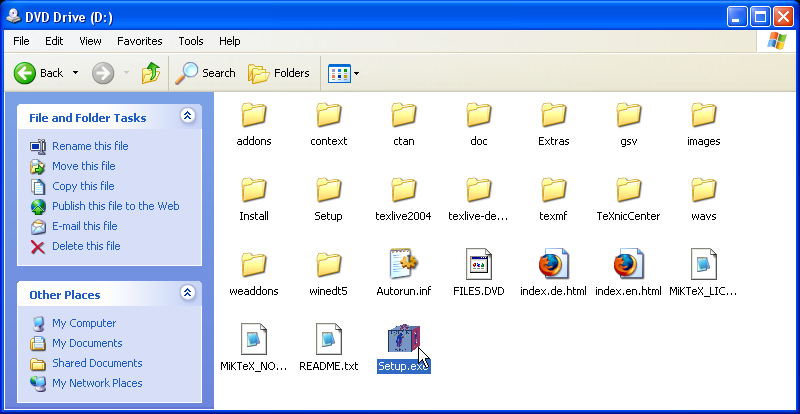
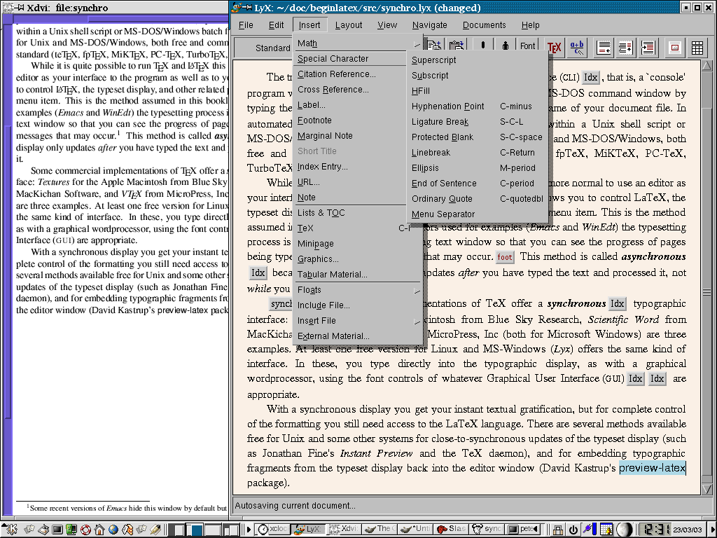
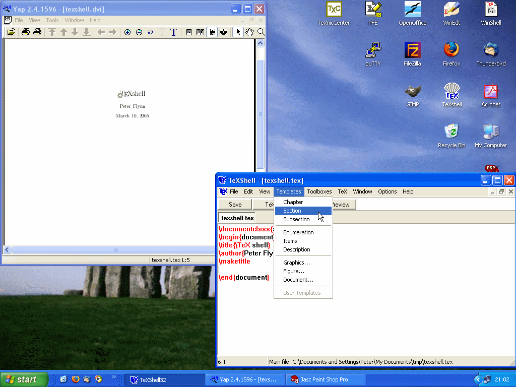
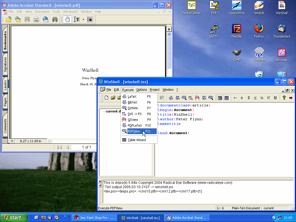
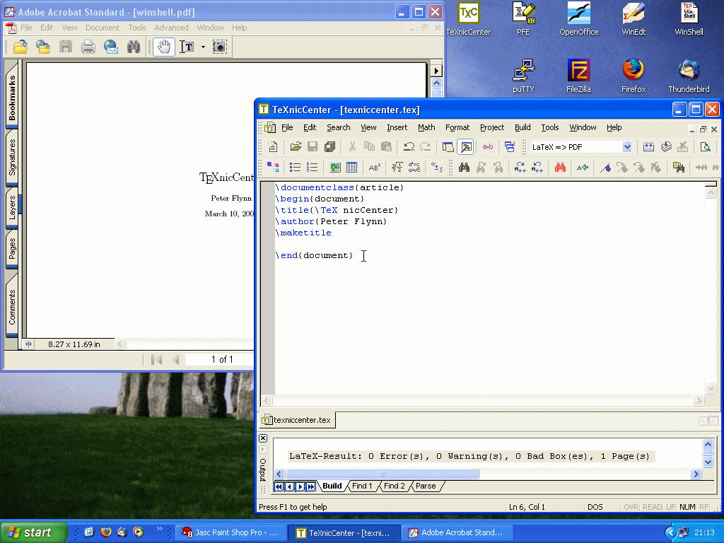
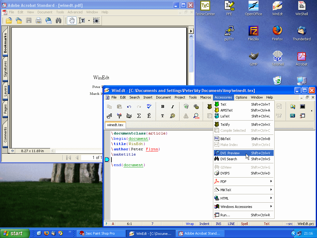
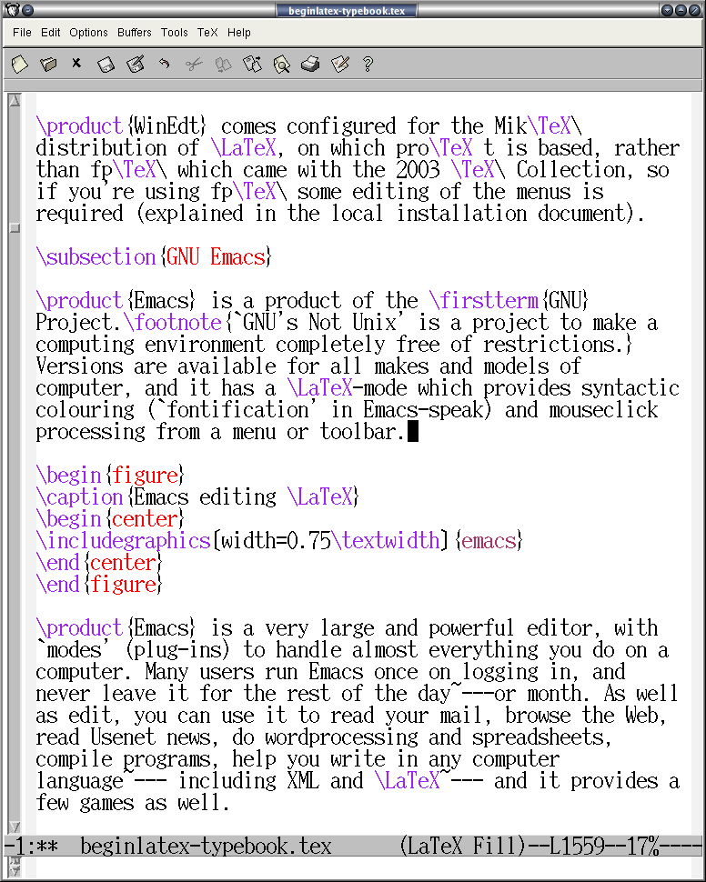
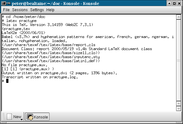
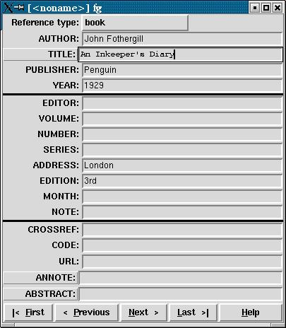

 Uses Avant Garde as the sans-serif and Courier for
monospace.
Uses Avant Garde as the sans-serif and Courier for
monospace.


 Uses Helvetica as the sans-serif font and Courier
for monospace.
Uses Helvetica as the sans-serif font and Courier
for monospace.
 Uses Avant Garde as the sans-serif and Courier for
monospace.
Uses Avant Garde as the sans-serif and Courier for
monospace.

 Uses Helvetica as the sans-serif font and Courier
for monospace. Mathematical symbols for Times are
available both free and commercially.
Uses Helvetica as the sans-serif font and Courier
for monospace. Mathematical symbols for Times are
available both free and commercially.


 Removed from recent distributions as it is not
free.
Removed from recent distributions as it is not
free.